
Probably the most popular line of tablet computers, iPad was designed by Apple. Devices from this range employ the iOS operating system. Some of the most recent versions include iPad Pro (March 2016) and the iPad Mini 4 (September 2015).


Back in 1983 Steve Jobs claimed that what they were going to create a “book” that would actually be an “incredibly great computer”. That is exactly what Apple unveiled on April 3, 2010, when the first iPad was released.
It is worth mentioning, however, that it wasn’t Apple’s first tablet computer. In 1993 the company introduced its Newton MessagePad 100, and later launched several more models on its base before the range was discontinued in 1998.
So far, there have been 6 models in the iPad range. The 1st generation introduced the 9.7-inch screen size and button scheme that stayed virtually the same in the following models. The 2nd generation offered several valuable additions, a dual-core Apple A5 processor among them.


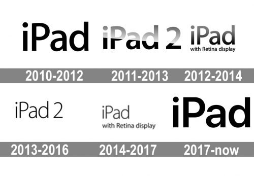
All the modifications that have been made to the iPad logo over its history have been comparatively subtle.
The logo introduced in 2010 showcases the name of the product in a minimalist san serif type. It is perfectly legible and has classic proportions and shape. Yet, you can notice that the right parts of the last two letters are not strictly horizontal but slightly curved. This adds elegance and a visual link between the two glyphs.
The iPad 2 wordmark plays with shadow and light. It is divided into two parts. The lower part is solid black, while the top part looks as if you’re looking at it through the glass.
This version already drops the “glass” effect. Yet, it also has a gradient, which looks subtler here. There is the tagline “with Retina display” below.
The logo has gone lighter without losing its original structure and shape.
The additional logo with the tagline has also grown slimmer.
At first glance, the current iPad logo may look the same as the original one. Yet, there are quite a few subtle differences. For instance, the right sides of the “a” and “d” are straight, not curved like in the old logos. The white “drop” inside the “a” isn’t as symmetrical as the original one, while the top end of the glyph is longer.
Sometimes, the wordmark is paired with the iconic bitten apple, the symbol of the brand’s owner. In this case, the apple is on the left and the word “iPad” is on the right.
As Apple was developing iPad Air, the company’s designers started to realize they needed an updated emblem, too. It was to be slimmer, so as to better correspond to the device, which was 18% thinner than a regular iPad. The thin and light font chosen for the logo conveys the idea perfectly.
As far as the iPad logo is actually a wordmark, its font is its main distinctive feature. Basically, the typeface stayed the same, without significant changes throughout the history of iPad. However, we should point out that iPad Air and Mini have thinner characters in their insignia. This looks quite reasonable, as Apple designers probably wanted to emphasize physical slimness of the devices by using a somewhat “slimmer” font on their logos.
The insignia features a font from the Myriad family. It is also worth mentioning that the iOS operating system used in iPad employs the Helvetica font.
For the iPad logo, black is the king. The company’s designers have been consistently opting for black and its shades while creating the emblem for the tablet computers. In some cases, they chose grey so as to create an illusion of light and shadow. Black is a refined, elegant, and sophisticated color (think of the little black dress or the formal dinner suit). Also, it has psychological symbolism of strength and authority.