
Innisfree is a leading cosmetics and skincare brand originating from South Korea. Celebrated for harnessing natural ingredients, primarily from Jeju Island, the brand emphasizes eco-friendly and sustainable practices. Currently, Innisfree has a strong global foothold, particularly in Asia, but also expanding in North America and Europe. It offers a diverse product range, from skincare to makeup. The brand operates under AmorePacific, one of South Korea’s largest beauty conglomerates. Innisfree’s approach blends nature with modern skincare innovations, appealing to environmentally-conscious consumers.


Innisfree, hailing from South Korea, embarked on its journey in 2000 as an eco-friendly brand, tapping into the rich resources of Jeju Island. From its inception, the brand showcased a dedication to natural ingredients and sustainable practices.
Originally an independent venture, Innisfree’s path was significantly shaped when it joined hands with AmorePacific, one of the largest beauty conglomerates in South Korea. This partnership provided the brand with the resources to expand and innovate, yet its core values remained unchanged.
Over the years, the brand’s portfolio grew, emphasizing skincare products derived from Jeju Island’s green tea, volcanic clusters, and other organic elements. This organic essence became synonymous with Innisfree, creating a distinctive niche in a competitive market.
In its formative years, Innisfree concentrated on domestic outreach. However, recognizing the global shift towards natural and sustainable products, the brand ventured internationally. It made significant inroads into countries across Asia, and later, North America and Europe, becoming a beloved global brand.
One pivotal development in Innisfree’s evolution was its commitment to eco-friendliness, not just in products but also in packaging and operations. The brand introduced initiatives like “Eco-Handkerchief” and “Empty Bottle” recycling campaigns, reflecting its environmental pledge.
While the brand’s ownership has remained consistent under AmorePacific, its production methodologies have evolved, always placing sustainability at the forefront. Innisfree’s dedication to harmonizing nature with modern skincare has been a testament to its global success and enduring appeal.
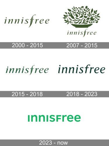
The image features the word “innisfree” rendered in a sophisticated, lowercase font. The letters are colored in a serene shade of forest green, evoking feelings of nature and tranquility. Particularly striking is the stylized “f” in the middle, which elongates gracefully. Set against a clean, white backdrop, the design exemplifies a blend of modernity with organic undertones.
The image showcases an intricate emblem consisting of diverse botanical elements—ranging from flourishing leaves, spiraled tendrils, to silhouetted seed pods—all intertwined harmoniously. Each flora component is painted in a deep forest green, emanating an aura of natural vitality and organic beauty. At the heart of this botanical tableau are two subtle bottle-shaped silhouettes, perhaps hinting at the brand’s eco-friendly ethos. Below this verdant medley sits the word “innisfree” in the same elegant, lowercase script, with the elongated flourish of the letter “f” serving as a distinctive touch. The entire design exudes an ambiance of eco-conscious sophistication against a pristine white backdrop.
Logo with the inscription “innisfree” in a dark green shade. The font adopts a modern, lowercase style, with letters gracefully spaced. A standout feature is the elongated and curved flourish of the letter “f”, which seamlessly merges into the “r”, lending the entire wordmark an organic fluidity. The design effortlessly blends sophistication with simplicity, set against a crisp white background.
The design adopts a contemporary lowercase typeface, with the letters being neatly spaced and balanced. Notably, the starting “i” is punctuated with a dot above, complementing the overall minimalistic charm. The word flows seamlessly with the letters “s”, “f”, and “r” subtly standing out due to their distinct shaping. This elegant wordmark exudes a sense of serenity and modernism, presented on a pristine white backdrop.
The displayed logo showcases the word “innisfree” in a lowercase, linear typography. The entire wordmark is painted in a vivid shade of green. The letters exhibit a contemporary design, flowing smoothly and giving an impression of simplicity and modernity. The backdrop remains uncolored, creating a stark contrast, emphasizing the green color choice, hinting perhaps at the brand’s eco-friendly and natural ethos.