
i-Ready is a web-service for education in mathematics and English, where the students can check their knowledge, and the teachers can follow their results in order to see the “gaps” and to choose a better program, suitable to the student’s needs.


The idea of creating the i-Ready portal appeared already in 2009, even though the official launch of the service happened only in 2011. It took the Curriculum Associates Center two years to polish the original idea to the perfect result. Today there are many online educational resources, so it was quite important to find a way to stand out in all the variety.
The main peculiarity of i-Ready is that it’s focused on diagnosing the knowledge of a student in two main disciplines, English (reading and writing), and Mathematics. Today the platform has versions for both mobile devices and computers. Every student, registered in the i-Ready Learning profane has access to all the materials on the website.
The portal contains various lessons, educational mini-games, and quizzes, but most importantly, tests to determine a student’s level in one (or both) of the disciplines and help them see what is causing the most difficulty. The portal also allows teachers to track the progress of their students, allowing them to tailor the curriculum more individually to the children’s needs.
What is i-Ready?
i-Ready is an online educational platform, which was created to help students and teachers diagnose their level of knowledge in mathematics and English, from the 1st to the 12th grade. The platform was developed by Curriculum Associates center, and introduced in 2011.
In terms of visual identity, i-Ready is quite simple. The logo of the platform consists of a bright yet modest emblem with just one geometric element, and a bold title case lettering in black, which adds stability and a professional feeling to the badge.
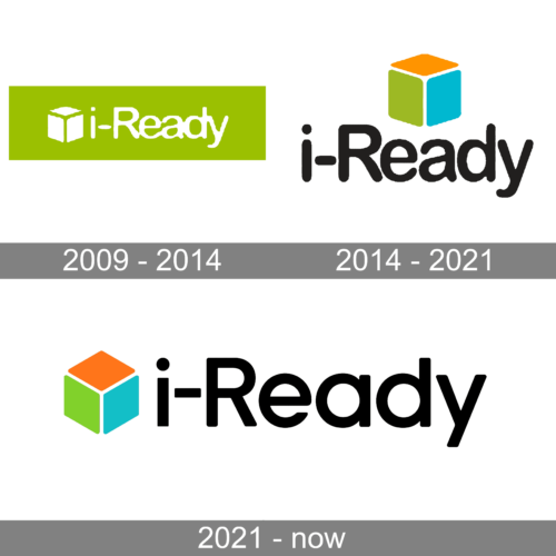
The original i-Ready badge was created in 2009 when the platform was not officially launched yet. It was a bright green rectangular banner with white lettering and a cubic emblem on it. The inscription was set in a traditional sans-serif typeface with slightly extended characters and softened contours.
The redesign of 2014 has switched the color palette of the badge, making the background white, and turning the graphical part into a very colorful element. The concept remained the same — a sans-serif inscription and a cube of the emblem, but now the cube moved to the top level and got its sides set in three different shades — orange, green, and blue. As for the lettering, it turned black but kept its style.
In 2021 the logo of the educational platform was refined. The color palette was kept, but the emblem moved back to the left from the wordmark, and the typeface was changed to a more modern and distinctive one. Now the lettering is larger than the graphical part, which looks more serious and professional.
The bold modest lettering from the official logo of the i-Ready platform is set in a bold and clean sans-serif typeface, which looks pretty similar to such famous fonts as Vilane Regular, or YD Yoonche Medium, with minor modifications.
As for the color palette of the i-Ready visual identity, it has three bright shades, orange, green, and blue, which accentuate the purpose of the platform — helping kids and showing its essence — development, and education. The Black of the wordmark adds a feeling of a fundamental and professional approach and transmits confidence and seriousness.