
Haikyuu is the name of a popular Japanese manga, created by Furudate Haruichi in 2012. The first episode of the animated series was released in 2016. By today this famous franchise about volleyball and school life has already released more than 80 episodes and several comic series.
The name of the manga, Haikyuu, is translated from Japanese as “Volleyball”, which makes sense, as the anime is fully dedicated to this kind of sport. The manga tells us a story of Shōyō Hinata, a Japanese schoolboy, who once saw the volley championship on the and fell in love with it.
Soon Shoyo creates a volleyball club at school, where she starts practicing on her own. Due to a lack of members, the club turned into a club, but in the last year of high school five more people join the club, and Hinata decides to create a volleyball team and go to a tournament.


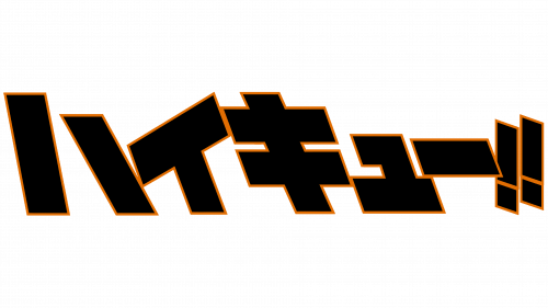
Though due to the popularity of the manga, there are lots of fanfics on the web, Haikyuu has only had one official logo, created for it in 2012. And it is composed of nothing but the name of the franchise in Japanese. Digging deeper in the etymology of the inscription, it can be read as a phrase, where the first part is taken from the English word “Tall”, and the second part represents the complex character kyu written in the katakana alphabet. And it’s meaning can be roughly translated as “achieving a level”.
So turn out, that the complete Japanese inscription from the Haikyuu logo literally means “Hight Level”.
The Japanese lettering in the katakana alphabet is written in a stylized designed font with massive geometric shapes, mainly based on rectangles. Each of the symbols is executed in plain black and outlined in thin orange, which adds a sense of passion and energy. This color combination is a great representation of the strong character of the main Haikyuu hero, his aims and intentions, as well as his willingness to play volleyball on the top level.