
Gendarmerie, or Gendarmerie Nationale, is a French law enforcement organization used in policing and investigating duties alongside the National Police. The boundaries between the two bodies are hazed, although the clear distinction of the former is that it’s part of the French Armed Forces.


Gendarmerie was introduced in 1791 during the French Revolution as a means to provide security and safety to the citizens of the First Republic. They were even then part of the Army, and their duties largely included investigating crime and enforcing the laws. They were also used for military purposes in a limited way.
The efficiency of this body inspired various other nations to adopt or reinvent their police forces to be more like Gendarmerie. Many even received the same exact name. The name is a slightly warped variation of the French phrase, which essentially means ‘men-at-arms’.
What is Gendarmerie?
Gendarmerie is a French law enforcement organization that operates alongside the National Police, as well as the branch of the Armed Forces. Their duties often coincide, although the jurisdictions typically differ, with Gendarmerie usually given the role to police the smaller cities, while the Police prefer the comfort of bigger residential areas.
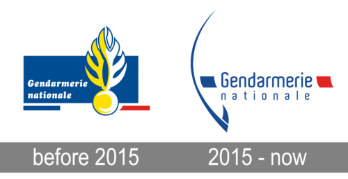
The older emblem of the organization was used until 2015 since an unknown year. It incorporated an even older symbol of a flaming grenade, an ancient symbol of the French Armed Forces. It was depicted in a minimalistic style, colored white and gold. It basically looked like a ball with two long vertical wings. They are meant to be flames, of course.
It was routinely placed in the front of a blue rectangle, on its right side. On its left, closer to the bottom of the figure, there were words ‘Gendarmerie nationale’ written in a sort of exquisite serif with round, bold letters. They were usually colored white. Beneath it was a blue horizontal stripe on the left side of the logo and a red one opposite to it, to the right of the grenade emblem.
The 2015 redesign is a simpler one. The main detail is now the name of the organization, written in a brand new font: a fluid, thin sans-serif style. The name is written in two lines of blue text, whereas the upper one uses bigger characters by comparison.
The other elements include two tilted tetragons on each side of the name piece, one blue and the other red. The other is a long curved line on the left that grows thicker near the bottom and culminates in a sharp blade-like object on its tip. This entire symbol is likely a stylized laurel wreath.
The font used in the most recent logotype uses very fluid letters that are also thin and tall. They have very few extra appendages; they are mostly created in a single stroke with very smooth, soft turns.
The colors were always mainly red, white and blue, with the latter two given preference due to their sharp visibility. Their exact shades are derived from the colors of the French flag, obviously. The other common color for the Gendarmerie is yellow, as used in their other insignias and the older logo.