Evian is a French brand of bottled water, created in 1829. The label is a part of Danone and also produces skincare products as well as owns a French spa-resort. Evian is a luxury brand, and is more of a lifestyle, than just water.
Évian is a brand of mineral water that belongs to the French corporation Danone. The same brand name is used for a range of organic skincare products and a resort in France.
What is Evian?
Evian is the name of a water brand, which was established in France in 1829.The company bottles the water from the spring, located in Switzerland. From its very beginning until now the brand has been privately owned.
The Evian logo, used but the company from the 1970s to 1990s, featured just a red lowercase lettering in a very elegant sans-serif typeface with traditional contours of the letters. The dot above the “I” featured a square shape.
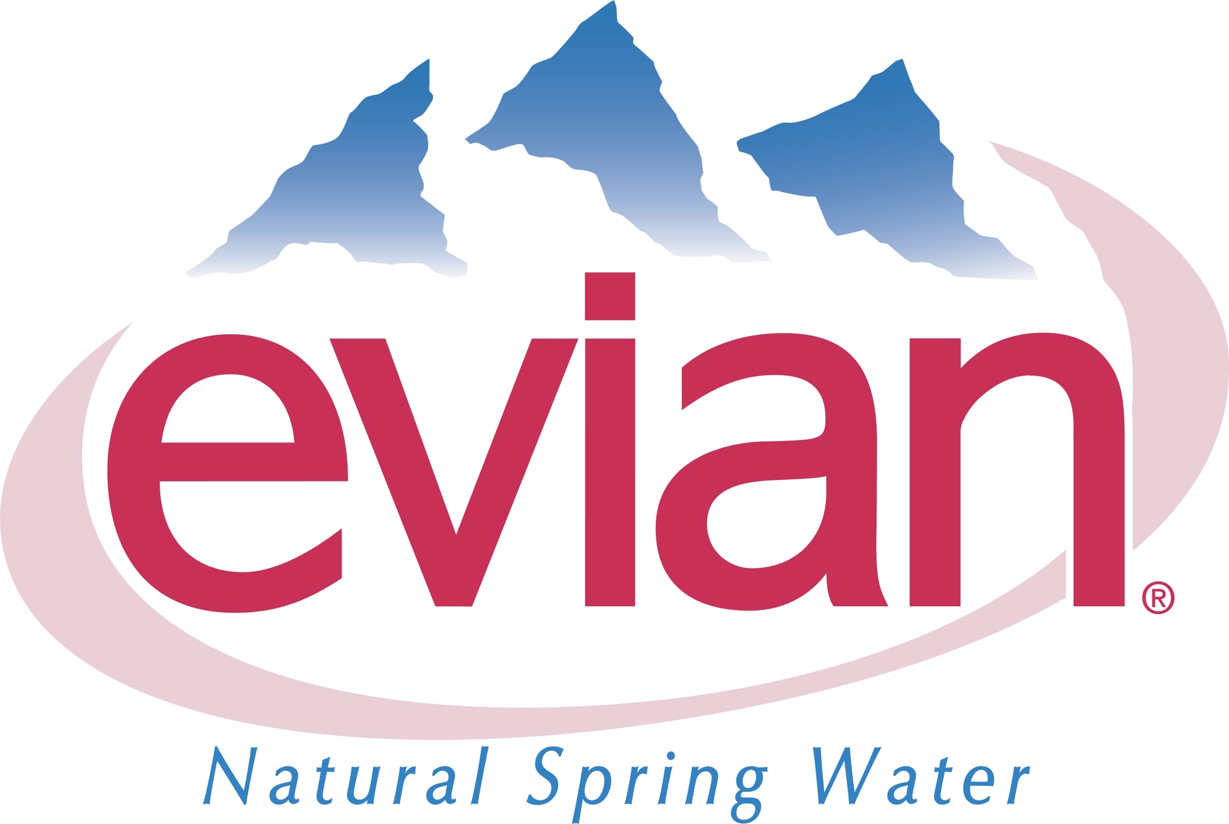
In 1978 another Evian logo saw the light. It was the same inscription, introduced in 1973, but set on a light pink banner with the voluminous image of snowy mountain peaks in white and blue. The red lettering was written over a white background, with the mountains above it, and a light pink part of the banner — beyond.
The redesign of 1994 used the logotype from 1973 as the base. The new inscription featured straighter contours of the letters and bolder lines, but the overall style and mood of the badge remained the same.
Similar to the current logo, the old one featured three mountain peaks with the wordmark below. The original mountains were blue, and there were pretty prominent clouds around them.
The wordmark featured red sans serif letters. The negative space inside the “a” formed a water drop, which symbolized the product. Also, the strokes had slightly different thicknesses (you could notice it in the “a,” for instance). An ellipse in pastel pink surrounded the design.
Below the wordmark, the lettering “Natural Spring Water” in light blue could be seen.
The light blue writing and the pink ellipse were gone leaving the logo more minimalist and easier to grasp. The shape of the mountain peaks grew simpler, too, which worked for the same purpose.
The difference in the thickness of the strokes disappeared. The dot above the “i” has moved slightly higher, which made the design lighter.
The red lowercase lettering got the mountain graphical addition again in 2013. It was actually the same emblem as on the logo from 1999, but without any framing and outlines. The pink shades were completely removed from the badge, and so was the blue cursive tagline.
The rocks have grown gray. While the previous versions featured a gradient imitating the clouds, it has now disappeared.
The bold lowercase lettering from the primary Evian badge is set in a clean and modern sans-serif typeface with thick yet sophisticated lines and contours of the glyphs. The closest fonts to the one, used in the Evian insignia, are, probably, 210 Namoogothic Bold, Vedo, or Identikal Sans, but with some modifications of the characters’ contours.
As for the color palette of the Evian visual identity, it is based on a smooth and elegant combination of pinkish-red and gray, with a plain white background, creating a bright contrast between the elements. Red here is a symbol of passion, energy, and precision, while gray mountains stand for the quality, confidence, and professionalism of the company.