
Affirm is a financial technology company founded by Max Levchin, Nathan Gettings, Jeffrey Kaditz, and Alex Rampell, in San Francisco, California. It was created to offer transparent, consumer-friendly payment alternatives to traditional credit cards. Affirm provides users with point-of-sale financing options, allowing them to make purchases and pay over time with straightforward, clear terms. This innovative service aims to make buying more accessible and manageable, without hidden fees or complex interest calculations.


Founded in 2012 by PayPal co-founder Max Levchin alongside Nathan Gettings, Jeffrey Kaditz, and Alex Rampell, Affirm embarked on a mission to revamp the traditional financial lending system. Headquartered in San Francisco, it introduced a transparent, user-friendly alternative to credit cards and loans.
By offering immediate, clear financing options at the point of sale, Affirm enables consumers to make purchases and spread their payments over time. This approach not only simplifies the buying process but also aims to foster financial responsibility by avoiding hidden fees and complex interest charges.
Over the years, Affirm has grown significantly, partnering with thousands of retailers to make finance more accessible and trustworthy for consumers, thereby challenging the status quo of consumer credit with innovation and transparency at its core.
What is Affirm?
Affirm stands as a pioneering force in the fintech landscape, conceived by Max Levchin and co-founders in 2012 to redefine the essence of consumer credit. At its heart, Affirm offers an innovative, transparent financing solution that empowers consumers to purchase now and pay later, through simple, clear-cut terms devoid of hidden fees, promoting a more responsible and accessible way to manage purchases.
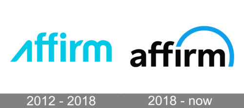
The logo unfurls in a vibrant cyan hue, a color invoking a sense of innovation and trustworthiness. Bold, sans-serif letters spell out “affirm”, with a playful twist on the double “f”s, mirroring each other and suggesting a bridge or connection. This design conveys a modern, approachable brand, emphasizing clarity and optimism, core tenets of the company it represents. The typography is sleek, embodying a digital-first, user-friendly ethos.
The logo’s evolution introduces a striking contrast with stark black lettering against a white backdrop, juxtaposed with a bright blue arc. This arching element symbolizes an overarching commitment to positivity and support, arching like a protective umbrella over the wordmark. The design retains modernity and boldness, now with an increased emphasis on strength and support, indicated by the arc’s protective curvature above the brand name. The twin “f”s still stand as mirrored pillars, but now firmly grounded, symbolizing stability and reliability.