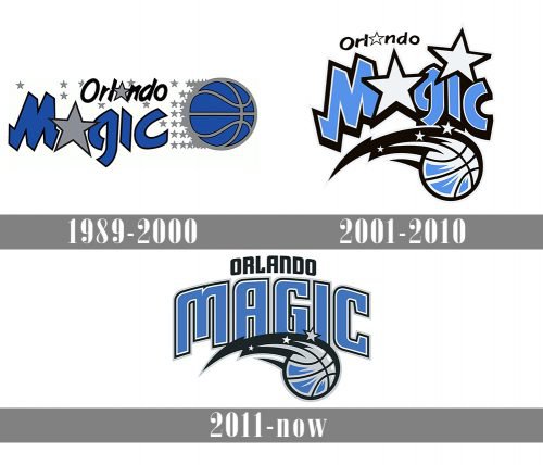
Orlando Magic has moved from a somewhat cartoonish logo with plenty of stars to a more realistic one. And yet, it has still preserved much of its Magical Kingdom look.
Meaning and history
The design concept of the Orlando Magic visual identity is based on its “magic” part, executed in a creative and imaginative blue and gray color palette, which reflects not only the professionalism and reliability of the club but also its character and approach.
1989 — 2000
The original logo version was created for the club in 1989 and featured a blue basketball in a gray outline with a custom two-levels wordmark on the left. The lettering in a handwritten typeface was executed in blue and black and had both letters “A” replaced by two gray five-pointed stars in a thin black outline.
2000 — 2010
The redesign of 2000 slightly changed the composition of the logo placing the lettering above the flying basketball and adding some more stars to the black lines, symbolizing movement and speed. Another large star was placed above the letter “I” in “Magic”. The color palette of the emblem was brightened and lightened up, though the additional black elements balanced the look, keeping it stylish and professional.
2010 — Today
In 2010 the wordmark of the Orlando Magic basketball club’s visual identity was completely redesigned. The ball remained untouched and was still placed under the arched inscription, where the “Magic” is now set in all capitals of a bold and modern sans-serif typeface, executed in light blue and outlined in black and white, and the “Orlando” part is written in solid black above the badge.
Font
Although the typeface of the current logotype looks somewhat unusual, it is still way more regular than the one used in the original logo of the 1990s. The modern version is definitely more legible and clear.
Color
The Orlando Magic logo features all the three team’s official colors: blue, black, and silver. Originally Pat Williams wanted to opt for black and gold, but eventually the team chose silver and the electric blue that was developed by the MacGregor company specially for Orlando Magic.


