

![]() Facebook Logo PNG
Facebook Logo PNG
Today, Facebook is a name that speaks for itself. Launched in 2004 by Mark Zuckerberg, the service has made a tremendous leap from an online photo directory to a global social networking service.
Meaning and history
![]()
Since its inception, the Facebook logo has not changed much except for several minor modifications. It has always been the company name written in white lowercase letters on a blue rectangle.
At the very outset, the platform was named “The Facebook”, and the logo was the bracketed solid word “thefacebook” written in light blue on a deep blue background. In 2004, the “The” was omitted and the font color changed to white. Since then, the Facebook symbol has been carrying its classic rectangular shape.
Who designed the Facebook logo?
The original Facebook logo was a custom version of the Klavika font. The font itself was developed by Eric Olson, while the modification was performed by type and graphic designer Joe Kral. The head of the project was Mike Buzzard, co-founder of Cuban Council. Buzzard was offered equity for the work but rejected the offer.

There is an interesting detail about the logo design, particularly about the choice of colors: Mark Zuckerberg suffered deuteranopia – red-green color blindness. However, he could (and can) distinguish between shades of blue most of us normally cannot detect. There is a lot of speculation over the circumstance, as many people agree to The New Yorker’s statement that it was Mark’s vision defect that prompted him to use the blue background. It should be noted that the only new things the new Facebook logo had were the font and shades of the blue rectangle.
![]()
That is true, but only partially. It is a well-known fact that color can be decisive in marketing, as it directly influences purchasing preferences. Some research has been carried out on the influence of particular colors on the degree of success, and there are conclusions on which color works better for which sphere. For instance, fashion houses, cosmetics manufacturers and retailers, and construction companies choose black as the most “elegant” and “professional” color. Green produces a soothing effect and caters to science, education, ecology, etc. Blue is more “high-tech”, clean and spacious; therefore, many IT companies, whose designer teams rely on professional opinion, use this color to mark their identity. In this respect, Facebook is no exception.
![]()
The combination of blue and white creates an even more pronounced feeling of purity and youth, and it inspires one to go for bigger endeavors. Therefore, the Facebook symbol, as well as many other known logos, which have a similar color palette, uses this combination to express optimism and determination to follow through with their strategy.
2003 – 2004
![]()
The first logo featured the original name of the project, Facemash. The name was given in white capital letters over a maroon background.
2004 – 2005
![]()
The new website, which replaced the Facemash, adopted a somewhat unusual logo. Here, you could see the lettering “thefacebook” (without space) in light blue over the dark blue background. Strangely, the name was placed between two square brackets.
2005 – 2015
![]()
“The” disappeared, as did the square brackets. The color of the letters was replaced by white. These innovations made the Facebook logo better legible.
2015 – 2020
![]()
The type was slightly updated. While the most notable update was the new “a,” other letters also underwent subtle modifications.
2019 – 2023
![]()
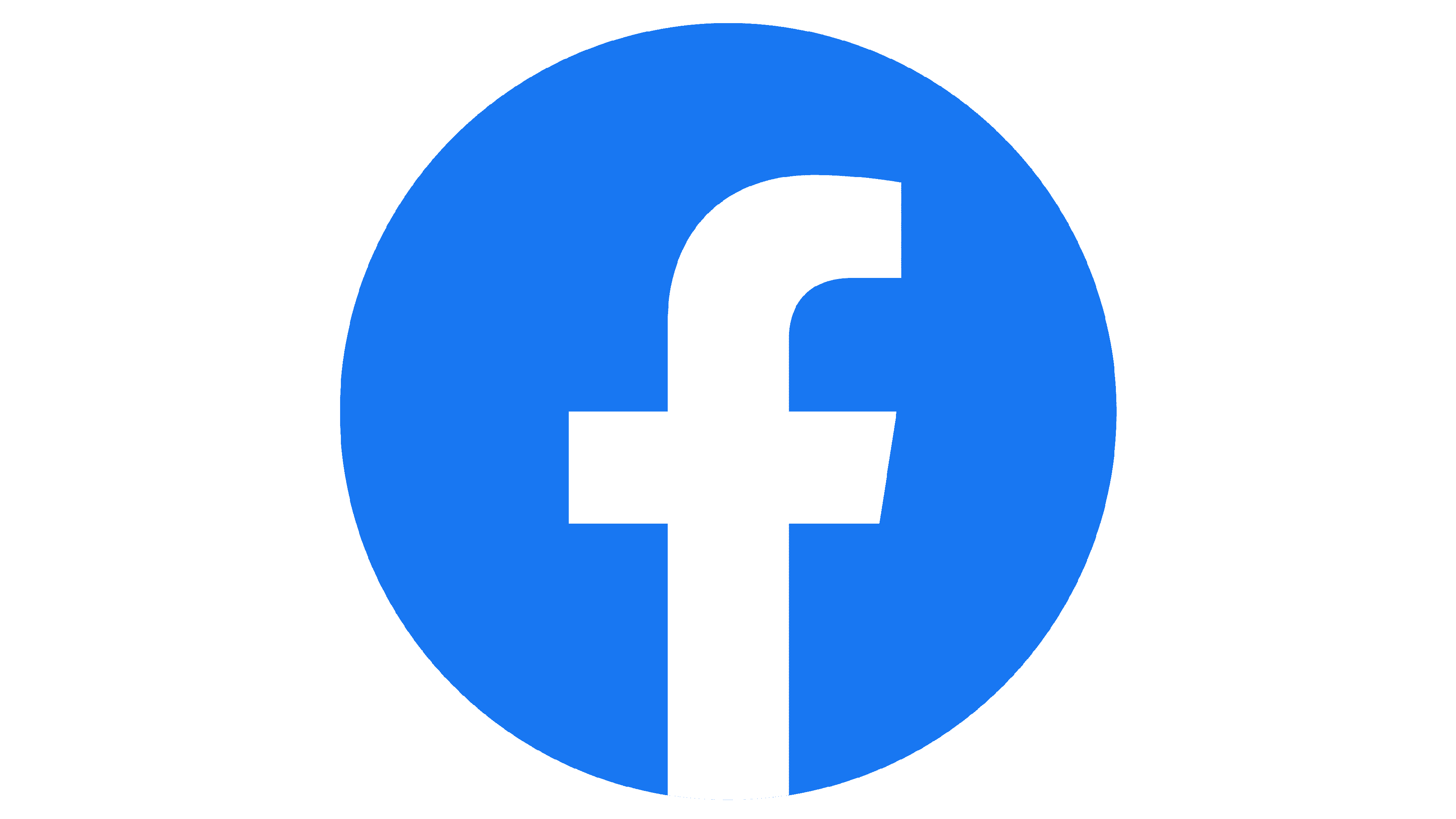
The redesign of 2019 evolved the color palette of the Facebook logo and switched the composition. Today the light blue wordmark is placed on a white background, looking fresh and dynamic. As for the icon, it was also changed and the square shape was replaced by a circular, with the same lighter shade of blue (two versions of the icon are available — a flat one, and a gradient).
2023 – now
![]()
In 2023 the company has decided to slightly refine its logo by intensifying the shade of blue and making the lines of the logotype a bit thinner. The style of the lettering has remained the same, but the logotype started to look more elegant and light, and the new shade of blue made it more delightful and eye-catching. Facebook is one of the companies, which manages to keep its minimalistic recognizability, adding invisible details to it to keep it more progressive.
Icon symbol
The Facebook icon has gone through a sequence of changes, although you probably have not noticed this fact unless you paid special attention to it. With each redesign, the symbol grew more minimalistic.
The earliest icon was definitely the most complex one. The lowercase “f” with a “wave” on the background was placed into a light blue frame. From 2009 to 2013, a faint blue line could be seen at the bottom of the “f”. Originally, it was a bar against the dark blue background, but later the line (as well as the letter itself) moved down so that its edge coincided with the edge of the box.
In the 2013 version, the line disappeared, while the “f” shifted closer to the bottom of the box. The only “overkill” the designers had afforded themselves, was a hardly visible 3D effect.
Emblems of the official pages
The icons of the Facebook official pages (for instance, Security, Mobile) have gone through several updates. One of the most notable redesigns took place in 2013. Older badges were more diverse in terms of the color palette: each of them included more than two colors or at least several shades of blue. In contrast to them, the redesigned icons featured only two colors (the iconic “Facebook” shade of blue and white).
The updated icons for the Security and Privacy pages sported the modified symbols from the previous icons (the shield and the lock), while other badges underwent a profound overhaul. Instead of the two students on the old Universities icons, the new one received just a stylized depiction of a square academic cap.
What font is on the Facebook logo?
The iconic Facebook logotypes written in the lowercase are executed in a custom sans-serif typeface which is pretty close to such fonts as Fact Bold and Nuber Next Heavy. The current logo looks pretty much alike to the previous version, written in Klavika Bold font, but with come contours modified and the “A” redrawn.
Black and white
The monochrome version of the Facebook logo keeps the composition and contours of the original blue and white emblem but looks a bit different. The black and white visual identity concept of the world’s most famous social media consists of square and circular emblems, a plain “F” on a white background color, and, of course, a nameplate. Depending on the needs, the icon can be used with or without the logotype.
![]() In the case of the square emblem, the white sand-serif “F” in the lowercase is placed on the right part of the solid black figure with rounded angles. The tail of the letter comes out from the bottom line of the square, cutting it and adding more air. The same is with the circular icon, but in this case, the white “F” is smaller and more delicate. Though since 2019 the circular Facebook emblem has its white “F” placed in the middle of the dot.
In the case of the square emblem, the white sand-serif “F” in the lowercase is placed on the right part of the solid black figure with rounded angles. The tail of the letter comes out from the bottom line of the square, cutting it and adding more air. The same is with the circular icon, but in this case, the white “F” is smaller and more delicate. Though since 2019 the circular Facebook emblem has its white “F” placed in the middle of the dot.
The third option of the monochrome Facebook icon is its sleek and bold lowercase “F” executed in black and placed on a white background. This version is the most laconic and strict, though still instantly recognizable all over the globe.
As for the logotype, it can also be used in two ways — simple black lettering on a white background, or its reverse version, where the white text is placed on a horizontally stretched black rectangle.
Font
The iconic Facebook logotype has always been written in a simple and neat sans-serif typeface, which changed its contours and style throughout the years but kept the original concept and idea — seriousness, modernity, and stability.
The most famous and long-lasting Facebook logotype was executed in the lowercase of a bold and minimalist sans-serif Klavika Bold typeface, but after the redesign of 2015, some contours of the letters were changed and rounded, giving a more traditional and timeless look to the inscription.
The new Facebook typeface was created specifically for the brand but has some resemblance with such commercial fonts as Fact Bold and Number Next Heavy, classy, full, and sleek ones.
Icons
Despite its minimalism in terms of elements and colors, the Facebook Icon catches your attention and stays in your memory. It is a simple composition with the white lowercase letter “F” placed on a solid blue circle, but the letter, placed in the middle of the geometric background, has its white vertical bar stretching to the bottom and cutting the edge of the blue circle.
This simple move created a feeling of motion and vitality, adding playfulness and intrigue to the icon. In addition to it, the bright color scheme, consisting of blue and white, evokes a sense of stability, creativity, and trustworthiness.
To summarize up, the Facebook Icon is synonymous with consistency and stability. The new Facebook logo is a perfectly complementary refined style, creativity, and minimalism.
How do I get the Facebook symbol?
You can use the Facebook icon with the link, leading directly to your profile in social media, on your website, or CV. The icon can be taken on the Facebook website, along with instructionson how to link it to your page, and how to change the address to a more personalized one.
Will the logo of Facebook change?
In terms of visual identity, Facebook has always been very stable and consistent, with only minor modifications made to the heavy lowercase inscription in a modified hire and blue palette. But after the complete rebranding of the company into Meta in 2021, the need fora new identity for the social media platform has arisen, so, probably, soon, we will be seeing the new Facebook badge.
Is the Facebook logo copyrighted?
Yes, the Facebook logo is copyrighted. Facebook is a trademark, with the Registration Number 4659777, and Serial Number 77521957. To use the Primary Facebook logo for your purposes you need official permission from the copyright owner.
What the Facebook logo really means?
The iconic Facebook logo, based on the lettering, officially has no hidden meanings, just the name of the platform, evoking a sense of confidence and professionalism. However, there are always rumors and legends about all the most popular insignias, and Facebook is one of them. According to one of the versions, the lowercase letter “F” from the icon of Facebook; looks like a silhouette of a man, rolling his heck above the phone in his hands.
Video
How to Change Your Facebook Name: Web and App
How to Unblock a Contact in Facebook and Messenger
Facebook Marketplace: get access to buy and sell
How to Download a Video From Facebook
Advertising on Facebook: Doing it Right
Guide to selling on Facebook


