

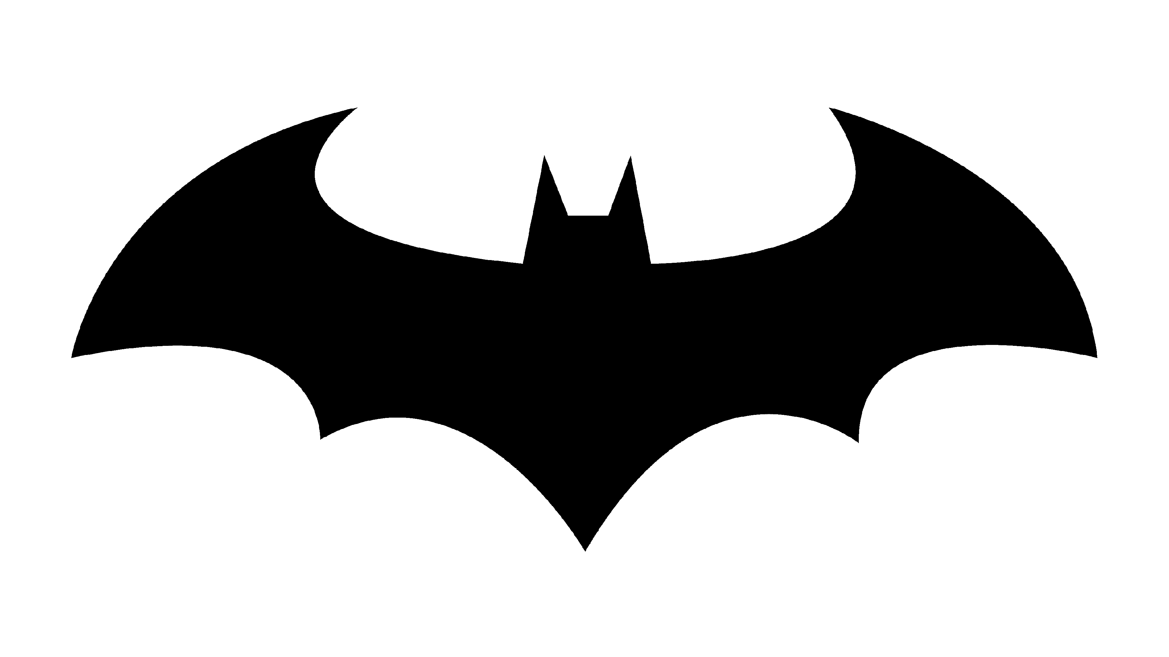
![]() Batman Logo PNG
Batman Logo PNG
Batman is a renowned character of American comic books (DC Comics). It was first mentioned in Detective Comics published in 1939, and now it is one of the most iconic superheroes.
Meaning and history
For the most part, it was a black silhouette of a bat. It has come in a variety of forms with wings changing shape in the most curious ways imaginable. This logo boasts a bright and turbulent past, as it has undergone about 30 modifications since its inception in 1940. The current logo was designed by Cathryn Laver (Calm the Ham). She derived inspiration from various versions, which she came across as she studied the comics. Another source, she confessed, was a YouTube video that presented all stages of the image’s evolution.
Emblem evolution in the comics
![]()
1939
![]()
The first version of the Batman emblem (1939) was probably the most minimalistic one – nothing but wings. The ears and head appeared later. Also, the earliest Batman logo had five wing points. The number of points was modified many times. In most versions of the emblem, it was the same as in the original one, five. The original symbol occupied little space on the superhero’s chest, in comparison with the majority of the following versions.
The same year, the logo went through a notable modification. You could see a couple of sharp ears and a head (or, at least, a hint on it). While in the original emblem the edges on the top part of the wings were rounded, they became sharper in the new version. In most pictures, there were seven wing points along the bottom of the bat, and yet, the artists sometimes drew the creature with only five points, like in the original version.
1939 – 1941
![]() In 1940, the character got his solo title. Additionally, he still could be seen in Detective Comics, which was known as the top-selling comics publisher back then. The 1940 version of the bat was at least twice as big as the original one. The head was now much more prominent, while the height of the wings grew. In some pictures, the emblem featured additional blue details on the wings, while in others, they weren’t visible (probably lost when printed).
In 1940, the character got his solo title. Additionally, he still could be seen in Detective Comics, which was known as the top-selling comics publisher back then. The 1940 version of the bat was at least twice as big as the original one. The head was now much more prominent, while the height of the wings grew. In some pictures, the emblem featured additional blue details on the wings, while in others, they weren’t visible (probably lost when printed).
1941 – 1944
![]()
The 1941 version had something gothic about it, with its long and sharp wing points. The head grew less visible, while the angles on the top of the wings grew sharper.
1944 – 1946
![]()
The number of wing points along the bottom of the rat varied from five to nine. The emblem was typically wider than its predecessors, while the exaggerated long wing points along the bottom and on the top grew shorter. The tail grew shorter, too. The sharp ears, vice versa, became even more prominent.
1946 – 1950
![]()
The 1946 Batman logo returned to the original in terms of the length of the central wing point – it now looked much longer and sharper than all the other wing points along the bottom, which grew a little less angular. Once again, the head grew larger and more noticeable.
1950 – 1956
![]()
In the issues published in 1947-1950, there was a tendency to make the point at the top of the wings more and more rounded, until eventually, the angle was replaced by a rather smooth curve. This approach was only natural taking into consideration that the emblem itself was occupying more and more space on the superhero’s chest– the curve allowed the designers to make the bat larger.
1956 – 1958
![]()
By 1956, though, the curve was gone, and the Batman logo was based on a triangular shape. To provide enough breathing space, the artists had to make the symbol more compact, especially in terms of its width. The triangular version was probably the most frequently used one throughout the 1950s.
1958 – 1960
![]()
In the course of time, the emblem was once again growing thinner and wider. By 1958, the wing points along the bottom were already rather long and sharp. The head was a bit more visible than in the previous versions.
1960 – 1964
![]()
While in 1960 the wings became almost the same as in the middle of the 1950s, the head was still rather high, like in the 1958 version.
1964 – 1966
![]()
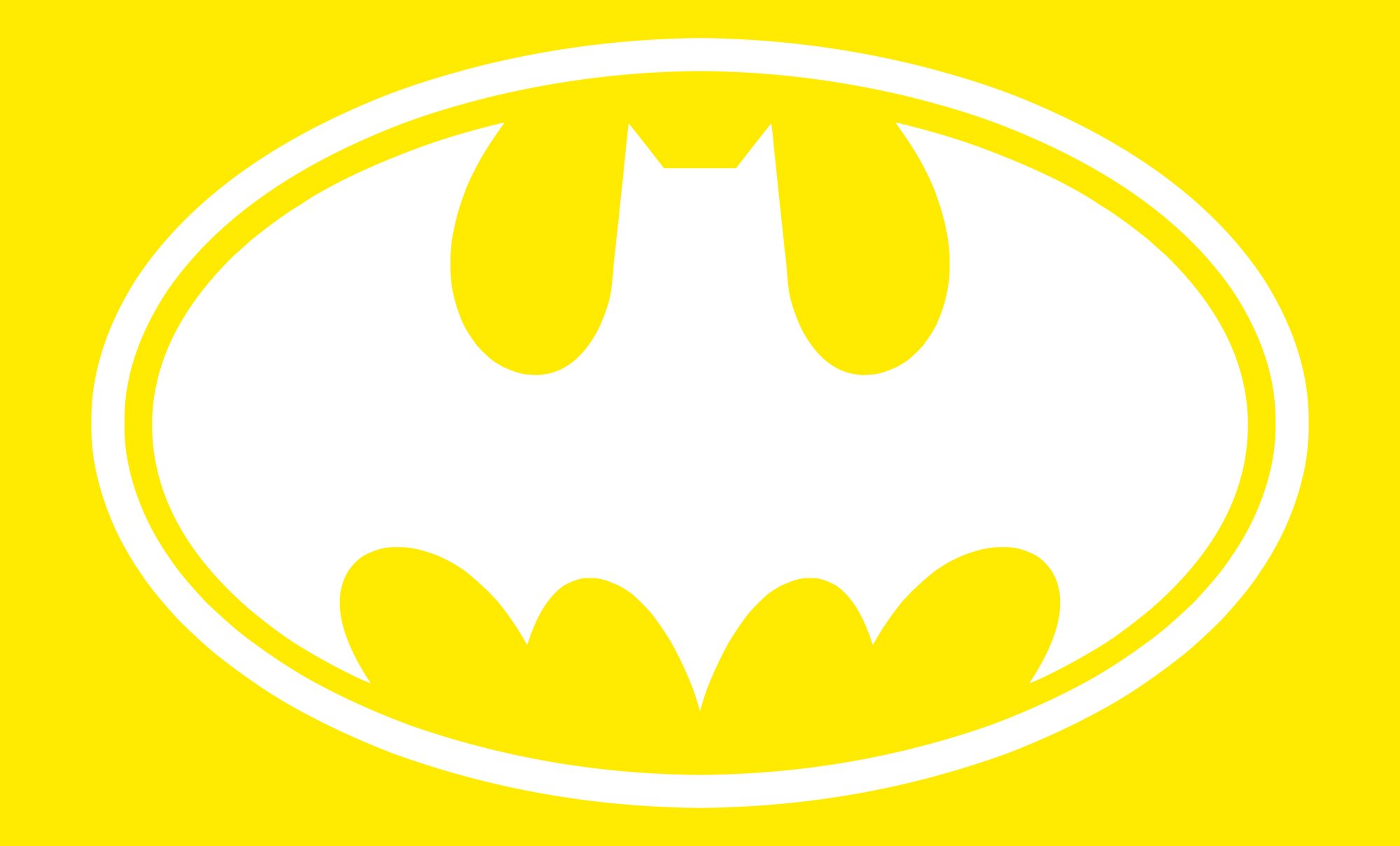
Probably the most notable modification took place in 1964 – the emblem was positioned inside a bright yellow ellipse with a black outline. There were quite a few possible explanations of this fact. While some fans supposed that it was just easier to trademark the ellipse version, others claimed that in fact, the editor just wanted to start a new era in the bat logo design and, therefore, needed an instantly identifiable difference from all the previous versions. Interestingly enough, initially, the addition of the yellow ellipse didn’t affect the shape of the emblem that much – just the sides of the wings became more curved, and the outside wing points on the right and left grew shorter. Due to this, the emblem fit the oval shape better.
1966 – 2000
![]()
In a couple of years, though, the bat already looked very different from its triangular-based predecessor. In 1966, for the first time, the sides of the wings adopted a very prominent curve. They spread out to fill the ellipse. This shape was echoed in the outline of both the top and bottom of the wings. The head and the ears also looked different: the head became more prominent, while the highest points on the ears were now directed a bit more to the sides.
A step back in the evolution of the Batman logo took place in 1986, with the release of “Batman: The Dark Knight Returns.” Here, you could see the superhero using the yellow oval to lure the enemies’ fire to his bulletproof vest. He then got a new costume where the bat was enormous, with very wide and broad wings. Its shape was very different from anything that had been designed earlier.
In the issue called “Batman: Year One” (1987), which revealed the story of the superhero’s early days, he was depicted with an emblem inspired by old versions. It was still rather large, yet occupied less space and had more pronounced angles and curves than the 1986 version.
We should point out, though, that in all the issues telling about modern-day Batman, the yellow oval was still present. This was the way the emblem looked until 2000 when a new era started in the history of the bat symbol.
2000 – present
![]()
After 36 years, DC Comics decided that it was time for another significant logo overhaul in the history of the emblem. The yellow oval was gone, while the shape of the wings became closer to the versions of the 1940s and 1950s, especially the 1946 emblem. However, the updated logo was still by far larger than the bat of the previous decades.
Typically, when the Batman logo is used by fans in various ways (from desktop wallpapers or stickers to even a pattern for a tattoo), they take the 2000 version as the major prototype.
2011 – 2016
![]()
The 2011 bat design has an elongated tail, elevated wings, and there are also no ‘claws’ on their ends.
2016 – 2018
![]()
The 2016 emblem is prominently thin and flat. The curves are less intense, and there are more straight lines. The whole symbol is also outlined with orange.
2018 – Today
![]()
The 2018 design has a prominent head with longer ears, elongated ‘claws’, but very short joints in the lower part.
Symbol evolution in the movies
![]()
1943
![]()
In 1943, the superhero made its first appearance on TV, in the live-action series Batman starring Lewis Gilbert Wilson, an American actor from New York City. Here, the emblem was rather small, like in comics of the same period. However, in comparison with the version that appeared in comics, there was much more wing detailing in the image. The bat was rather thin and wide.
1949
![]()
When costume designers were developing a new emblem for the 1949 serial “Batman & Robin,” they decided to take the 1943 version, with its wing detailing, as the major source of inspiration. However, this time, the bat became larger. The shape of its head also changed.
1966 – 1968; 2016 – 2017
![]()
The television series, starring American actor Adam West (William West Anderson), which premiered in early 1966, brought about a very different icon. It was heavily based on the one featured in the comics of the era and was somewhere in between the emblems that appeared in 1964 and 1966. The most prominent element of the updated Batman logo was, without any doubt, the yellow oval. While the sides of the wings were already close to the ellipse shape, they hadn’t yet spread out to the border of the ellipse.
1967
![]()
In 1967, they tried for a brief time to use the black silhouette of a man holding the scales (the symbol of justice) as the emblem for Batman. It was for the movie ‘Batman vs. Dracula’.
1977
![]()
This one was used for ‘The New Adventures of Batman’. This bat had a small head, long claws and longer joints.
1989
![]()
The emblem featured in the 1989 movie Batman starring Michael Keaton already featured a larger bat in a yellow oval with a thick black outline. Interestingly enough, the logo on the legendary movie poster showcased the bat with five wing points along the bottom, while in the movie itself, the bat had wings with seven points. It looked somewhat different from the way it did in the comics of the same period.
1992
![]()
For the movie “Batman Returns,” the emblem was updated. It now was much closer to the iconic elliptical insignia, with an extended tail.
1992 – 1995; 1998
![]()
Only a year later, American animated superhero film “Batman: Mask of the Phantasm” was released. Here, you could see the same Batman logo as in the comics and the poster for the first film starring Keaton (1989). In comparison with the bat from “Batman Returns,” this one had broader wings, with a shorter tail and the wing points along the bottom of the bat.
1995
![]()
The movie “Batman Forever” starring Val Kilmer brought about a whole new approach to the design meaning that the bat was now embossed on the suit rather than drawn on it. It was prominent not due to the color, like images, but because it was part of a relief pattern. Also, it occupied much more space in comparison with any of the previous emblems (almost the whole chest).
1997
![]()
The superhero’s suit in the first part of “Batman & Robin” (1997) was again embossed with the bat. While the emblem was black on black, it now borrowed the oval shape from the comics logo, although it wasn’t yellow. Also, it looked small in comparison with its predecessor. In the middle of the movie, George Clooney put on a new costume, with a different emblem. In terms of the shape, it was almost the same as the one showcased in the 1995 film starring Val Kilmer, but this time, there were a couple of additional silvery details.
1997 – 2006; 2017 – 2019
![]()
The 1997 emblem for ‘The New Batman Adventures’ show used a smaller bat with less sprawling wings and more triangular sections between the joints.
1999 – 2001; 2004 – 2005
![]()
This symbol belongs to the ‘Batman Beyond’ series. In the show, Batman uses the color red alongside black, which includes a red bat emblem with elevated wings.
2000 – 2002
![]()
This was used for a mini-series called ‘OnStar: Batman’. This bat has equally long extensions of both ends on its wings, a longer tail, as well as a yellow oval background with a black frame.
2004 – 2008
![]()
‘The Batman’ TV-series used a stouter, wider bat with many round curves in the lower section and almost right angles in the corners of the wings.
2005
![]()
Although the silvery details looked rather attractive, they disappeared in “Batman Begins” (2005). They were replaced by a stylish relief bat in black. In terms of the shape, it was closer to the iconic bat that was unveiled in the comics in 2000.
2005 – 2012
![]()
The Nolan’s trilogy used a more linear, geometric bat. The wings in particular are elevated into perfectly horizontal positions. It was modeled to be aerodynamic, because these shapes were also used as throwable weapons in the movies.
2008 – 2011
![]()
The bat introduced in 2008 was wider, bigger and thicker than the previous designs. As a result, there was no tail to speak of.
2009 – Today
![]()
The emblem was revisited for the 2008 movie “The Dark Knight.” It has preserved its style, yet grew much smaller than in the previous movie. The sides of the wings were modified – they now didn’t look like in the elliptical emblem. The same version was showcased in “The Dark Knight Returns” (2012 and 2013). In the HD version of the movie, it could be seen exceptionally well.
2016 – 2017
![]()
An utterly different bat, with large and broad wings, appeared in the 2015 movie “Batman v Superman.” It was rather similar to the emblem featured in the 1986 comic book The Dark Knight Returns, although the creature now had a more pronounced tail and more elaborate wing tops. One of the reasons why the designers opted for a larger emblem could be that they needed to use the Batman logo as the background over which the Superman logo would be placed and they didn’t want to sacrifice the bat’s visibility (symbolically speaking, the Dark Knight was to appear “vs” Superman, not “behind” him).
2016
![]()
The 2016 emblem was used in the movie ‘Batman v Superman’. It’s more mechanical and less animalistic this time around. The head is small, and there is only a few joints, most of which barely protrude from the body.
2017
![]()
We should also mention the computer-animated superhero comedy film Lego Batman Movie (2017) released by the Warner Animation Group. Here, the superhero appears with the good old yellow ellipse emblem on his chest, which looks like the logo used in comics released from 1966 to 2000.
On this page, you can find the Batman emblem in png and jpg.
2021
![]()
The 2021 emblem is used in the ‘Batman’ movie starring Robert Pattinson. This one, by comparison, is more natural. It’s small, thin, naturally proportioned and with all the right shapes of a real bat.
Symbol

The batman logo stands for Bruce Wayne, the batman, who had a terrible childhood experience of witnessing the murder of his parents. The character swore to take revenge and dedicate his entire life to fighting against criminals. The story depicts Bruce as a person who is completely devastated and broken on the inside. However, every time he faces a disaster, he grows stronger.
The black bat came in to symbolize the eternal battle against Evil, striving for justice, and man’s ability to gain strength and hope in hard times. It depicts our thirst for purity. The batman never resorts to vicious or corrupt methods even in situations that seem to justify them in a way, not even when trapped and cornered. The symbol carries you through hell and high water to the land of hope and light.
Icon
The Batman icon has changed several times throughout the years of the superhero existence. And today still several versions are in use. Of course, the most famous one is the yellow and black horizontally stretched oval with the bat image on it.
Though the most recent one is the simple and more geometric icon in monochrome, where the sharp black silhouette of the bat is placed on a white background, or its reverse version, with the white bat in a black square with rounded angles.
There is also one more version for the Batman icon, the funny caricature of the superhero’s face in the mask. But it is not for official use.
Batman vs Superman logo
![]()
The Batman logo is also part of the logo that brands “The dawn of Justice”: Batman vs Superman. It symbolizes the two powers joining in a merciless and violent fight against despair, injustice, guile, and depravity.
Font
What is the original Batman logo?
The original Batman logo, created for the famous superhero at the end of the 1930s, featured a minimalistic and sleek contour of a bat with its wings wide spread against a white background. The bar has no head, and the wings were rounded at the top, with five thin sharp elements at the bottom.
When did Batman get the yellow oval?
The iconic yellow oval was brought to the Batman visual identity only in 1964, almost thirty years after the original badge was designed. This element has strengthened the badge and added uniqueness and power to the logo of the superhero. As for the meaning part of the yellow oval, it was explained by Batman himself as the eye-catcher, which makes t the enemies shoot straight in the center of the badge, where the bulletproof element is hidden.
Is the Batman logo copyrighted?
Yes, the Batman logo is copyrighted. This is a trademark, owned by DC Comics, which means, that to use the iconic badge with the black bat on a yellow background, you need to get permission from the copyright holder.
When was the Batman logo made?
The original Batman logo was created in 1939 and has been redesigned more than a dozen times throughout the years. The yellow oval version? Which is considered to be the most popular one, was designed in 1964, refined in 1967, and stayed in use by the franchise until 2000. As for the current version of the Batman logo, it was introduced in 2018.


