

Television industry is one of the most competitive ones. This is why creating bright and memorable logo is no less important than choosing optimal video content for the target audience. Logo is an important element of image and promotion for any television brand; therefore, it is obvious that it is not easy to choose the best ones among these masterpieces of design.
1. Paramount Television
![]()
A ring of stars framing a mountain peak is a recognizable logo of Paramount Television company. Initially, the logo was monochrome, but at the end of the twentieth century, the image became photographic.
2. 20th Century Fox Television
![]()
This logo, as well as the previous one, is well familiar to all movie fans. Even today, the “golden” monument of 20th Century Fox cinema and television corporation is a kind of a quality trademark of visual products.
3. Sony Pictures Television
![]()
It is difficult to find any familiar images in this Sony Pictures Television logo. The image rather resembles a ray of light – the symbol of cinema and television. However, this image can be considered as a hint of other types of waves – in such a science as physics.
4. Warner Bros Television
![]()
Warner Bros Television logo is virtually the same as the “mother” logo of the entire Warner Bros. holding. The heart of the logo depicts stylized heraldic form while the color-material is traditionally gold. However, Warner Bros Television also abandoned planar image and widely use photographic background, as well as volumetric form of the logo.
5. Universal Television
![]()
Technically, Universal Television logo consists of an alphabetic writing of the name with a semicircular arc above it. The background is the image of the Earth as a space body in the form of a ball with the Sun looking out from behind its upper segment. The symbolism of this logo is in all-planetary coverage with potential coverage of other, yet unknowable, spaces.
6. Walt Disney Television
![]()
Since the day of its foundation, Walt Disney Television had its Disney Land fairytale castle depicted in the heart of the logo. However, initially the image was planar and highly stylized. Since 2008, the logo has a photographic image (though, undoubtedly subjected to processing) against the background of a magical sunset sky. The name has also changed – now all of its television products are produced under Walt Disney Studios brand.
7. Connecticut Public Television
![]()
Connecticut Public Television logo has undergone many changes over the years. The most global change took place in 2013, when multicolor (red and its ten shades) and consisting of many shapes (circles, hemispheres, stylized “C”, etc.) logo was minimized to a textual form. Only corporate color – dark red – remained the same. But now it’s the font color.
8. Buena Vista Television
![]()
The current logo of Buena Vista Television is quite original and has a share of abstraction. If we look for substantive analogies, then we can see three missiles flying past the globe into a deep space. The ambitiousness of the company which used (one of the few ones) the image of outer space (and scale), is very big.
9. Metro Goldwyn Mayer Television
![]()
The logos of Metro Goldwyn Mayer’s subsidiaries, including Metro Goldwyn Mayer Television, feature a roaring lion familiar to every TV viewer. This logo was the first one that the company decided to make dynamic, in full accordance with the rules of television genre.
10. New Line Television
![]()
As if highlighted on a dark background, New Line Television logo uses a slightly modified piece of first-generation film as its main image. The first films required perforation along the edge (a number of holes of the same size) which were literally “threaded” on the roller of a movie camera. Today, a frame with side perforation is a common symbol of cinema and television art.
Pay attention: this perforated film is cut off on one end and superimposed on the corner of the frame diagonally. Thus, the creators emphasize that today the company is dealing with other, much more developed technologies.
11. Dreamworks Animation Television
![]()
Dreamworks Animation Television logo changed almost every year. Almost all of the viewers’ favorite characters have been on the logo. However, today it is reduced to a monochrome structure – the silhouette of the “fisherman” sitting on the crescent moon waiting for the rod to catch the starfish.
12. Regency Television
![]()
Unlike most television companies, Regency Television managed to use only a stylized letter “R” on its logo. The main thing was the color solution and quite a comfortable combination of dark blue inscriptions and a dark blue – almost black – background.
13. CBS Paramount Television
![]()
Despite its pronounced “text” character, the most popular CBS Paramount Television logo still has its hidden meanings. In fact, Paramount word retains corporate font of the parent company, while the “mountain peak” – the symbol of Paramount – has become an element of the background in a stylized and reduced form in the logo of the subsidiary company. By the way, the light source in the image is located behind the background. This is why it is fair to say that CBS Paramount Television emphasizes what exactly represents the source of the “light” for it.
14. Tristar Television
![]()
In ancient mythology, this legendary winged horse – Pegasus – was directly connected with people of creative professions. According to the legends, this creature carried poets and writers to the heights of inspiration and talent. The central figure of Tristar Television logo depicts Pegasus, soaring in the clouds.
15. Mandalay Television
![]()
The symbol and central figure of Mandalay Television logo is the tiger. Its elegant and at the same time brutal face in a highly stylized form is enclosed in the square. The text (name of the company) is taken out of the box, which this is understandable, since humans should be very careful in dealing with this predator.
16. Amblin Television
![]()
Modern logo of Amblin Television combines both photo (cloud background), and graphics (the silhouette of a cyclist-cameraman in the background of the moon), and almost a neon sign (the actual text). The contrasting combination of colors – orange and blue – is no less a source of internal dynamics than a biker flying in the background of the moon.
17. Pioneer Public Television
![]()
Pioneer Public Television logo has a complex design roughly consisting of three elements – each of them might be used as a stand-alone logo. The first one a double hemisphere to the left of the alphabetic element, the second one is a text element, the third one is a double stylized profile of imaginary viewers. However, it is this paradox that makes the logo especially memorable.
18. Jim Henson Television
![]()
The logo of Jim Henson Television is characterized by conciseness and elegance. This stylish font specially designed for Jim Henson and original green color (on a black background) look fresh and cool. In turn, the color of the bottom part of the text adds intrigue and inner movement.
19. CMU Public Television
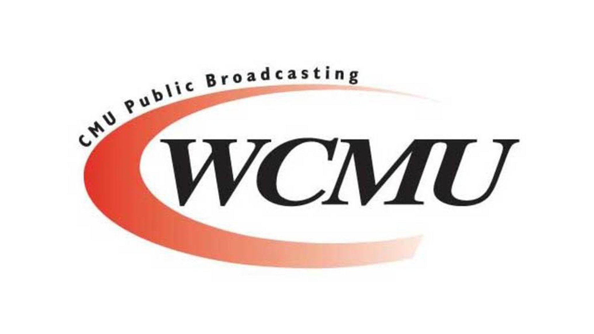
For their official logo, CMU Public Television chose the simplest form – an asymmetrical crescent surrounding the first part of its abbreviation. The selected shade of red, smoothly dissolving in the background, as well as the dynamic thickness of this graphic element create necessary sense of stability and breakdown strength.
20. MTV Music Television
![]()
The logo of MTV Music Television is well known all over the world. MTV is the first fully musical television channel and its logo – a voluminous letter “M” and graffiti-like “TV” inscription – create the right mood for the channel’s audience consisting of young and energetic people.
Conclusion
In the dynamic landscape of television branding, the essence of a TV channel’s identity is encapsulated in its logo. Crafting the perfect TV logo requires a blend of creativity, strategic thinking, and technical prowess. Through the meticulous filter of design principles, the most famous logos emerge, resonating with audiences across North America and beyond. These logos not only symbolize the channel’s ethos but also serve as a beacon for high-quality entertainment and information.
The journey to designing the perfect TV logo often involves numerous revisions, as each iteration brings us closer to a visual identity that speaks volumes. Utilizing vector graphics ensures that these logos maintain their integrity across a variety of formats, from promotional content to digital platforms. Moreover, the integration of new premium graphics elevates the design, making it more engaging and memorable.
In the United States, where TV channels vie for viewers’ attention, a well-crafted logo is a key asset. It acts as a gateway to the channel’s offerings, from groundbreaking series to captivating news segments. The most successful logos go beyond mere illustrations; they encapsulate the essence of the channel, making them instantly recognizable and fostering brand loyalty.
As channels continue to evolve and expand their reach, the significance of a compelling logo remains paramount. It is not just about visual appeal but also about creating a connection with the audience. In an era where purchases and viewer preferences are increasingly influenced by brand identity, a distinctive logo can be a powerful tool in a high-quality TV channel’s arsenal.
In conclusion, the journey to creating the perfect TV logo is a nuanced process that intertwines artistic vision with strategic branding. As we look towards the future, it is clear that those who invest in high-quality, thoughtfully designed logos will continue to stand out in the competitive landscape of television in North America and beyond.


