

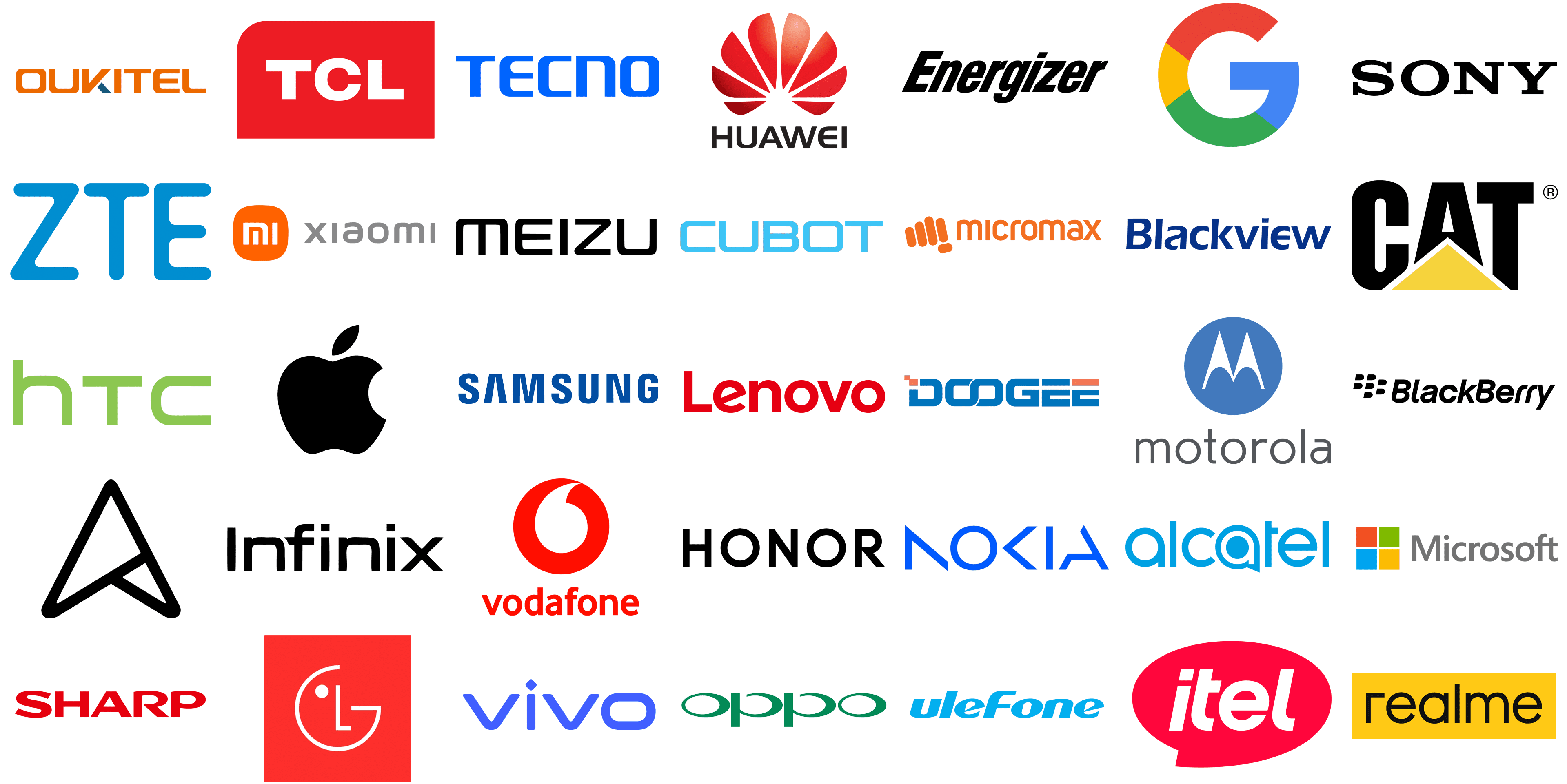
In the dynamic world of mobile technology, the power of a logo transcends mere visual appeal. It is the silent ambassador of the brand it represents. A mobile phone brand’s logo is often the first point of interaction for consumers, a visual handshake that introduces the values, technology, and promise of innovation that lies within the device. This emblematic imagery is a testament to the brand’s legacy and its vision for the future, often reflecting the technological prowess and design philosophy that users can expect from their products.
Every curve, color, and font choice in a mobile phone logo is a deliberate decision, aimed at evoking certain emotions and thoughts. These symbols have evolved to become shorthand for the user experience, encapsulating the essence of what the company stands for in a single glance. For instance, when a logo is seen on billboards, online banners, or storefronts, it’s not just a name being presented, it’s an entire narrative of innovation, quality, and user experience being told.
The logos are more than just marketing tools. They are the bearers of trust and the standard-bearers of quality in a market that is saturated with options. They need to stand out not only on the crowded shelves of a retail store but also in the digital scroll through online marketplaces. The challenge for these brands is immense: to capture the essence of their identity and the cutting – edge nature of their technology in a simple, yet profound visual statement.
In this exploration of mobile phone brands and their logos, we delve into the stories behind these iconic symbols. We examine how they have adapted to the times, how they resonate with consumers, and how they reflect the innovation and functionality of the devices they mark. From the choice of color to the typography, each element is a clue to the brand’s identity. As we dissect these visual codes, we gain insight into the art and science of logo design in the mobile phone industry, a sector where the logo is not just seen – it’s experienced.
Alcatel
![]()
Founded as a collaboration between France’s Alcatel-Lucent and China’s TCL Communication, Alcatel specializes in creating affordable mobile phones and tablets. These products have gained popularity in emerging markets for their perfect blend of functionality and cost-effectiveness. The logo features a vibrant azure wordmark of ‘alcatel’, with a stylized ‘a’ at the end that resembles a chat bubble. The font is modern and rounded, suggesting approachability and innovation.
Apple
![]()
Revolutionizing the smartphone industry, American multinational Apple Inc. introduced the iPhone in 2007. This product stands out for its sleek design, cutting-edge technology, and distinctive iOS operating system, continually influencing mobile technology and user experiences. Apple’s logo is a minimalist fruit silhouette, missing a right-side bite, making it iconic and instantly recognizable. The logo’s simplicity, with a solid black shape on a plain background, creates a striking contrast. A slightly right-angled leaf adds to its unique identity, ensuring global recognition.
Asus
![]()
Taiwanese multinational AsusTek Computer Inc. is renowned for high-quality, innovative electronics, including the user-friendly and advanced-camera-equipped ZenFone smartphone series. Its logo features an abstract geometric design, with triangular shapes interlocking to resemble a stylized ‘A.’ The bold, uniform black lines give an edgy, modern look. The logo’s shape, implying motion and advancement with an upward-pointing peak, symbolizes progress and ascent.
Blackberry
![]()
Initially known as Research In Motion, Blackberry Ltd. made a name for itself with Blackberry smartphones. These devices, pioneers in providing secure email and internet services on mobiles, were business essentials before the rise of touchscreen phones. The logo ingeniously combines imagery and typography, reflecting the brand’s mobile communication legacy. The black dots imitate the fruit’s drupes and hint at the name. The bold sans-serif typography, with uniquely square-curved ‘B’s, evokes the keys of a keypad, nodding to the brand’s history with physical keyboard devices.
Blackview
![]()
Established in 2013, Blackview targets outdoor enthusiasts and professionals in demanding environments with its rugged smartphones. These durable handsets are designed to endure extreme conditions. The brand’s logo is typographic, showcasing the name in a bold, blue sans-serif font. The evenly spaced characters and uniform blue color convey reliability and trust. Relying on clean, clear text without additional imagery, the logo’s choice of blue symbolizes depth and stability, aligning with the brand’s market values.
CAT
![]()
Caterpillar Inc. diversifies beyond heavy machinery with its CAT brand of rugged phones. These phones, designed for durability, cater to users in challenging environments like construction sites. The brand’s logo combines bold black lettering with a yellow triangle under the ‘A’, symbolizing stability or upward growth, reflecting toughness and reliability. The inclusion of a registered trademark symbol underscores the brand’s established market presence and legal protection.
Cubot
![]()
The Chinese smartphone maker Cubot has carved a niche in the budget market. Their devices, featuring high-resolution cameras and long-lasting batteries, are affordably priced for cost-conscious consumers. Cubot’s logo sports a sky-blue wordmark in a modern sans-serif typeface. Its squared characters imply robustness, while the rounded edges add approachability. The logo’s uniform color suggests clarity and simplicity, mirroring the brand’s commitment to transparency and user-friendly technology.
Doogee
![]()
Doogee, another Chinese smartphone brand, is known internationally for its innovative, budget-friendly phones with features like modular designs and rugged builds. Its logo blends blue lettering with a unique font that incorporates geometric shapes. The distinct ‘O’s and a touch of orange in the mostly blue palette suggest a mix of innovation and enthusiasm, embodying the brand’s creative and accessible smartphone solutions.
Energizer
![]()
Energizer, renowned for its durable batteries, has ventured into the rugged smartphone market. Their phones, known for long battery life, suit users in outdoor or industrial settings. The Energizer logo, a bold and italicized wordmark, conveys strength and dynamism. The elongated ‘E’ and ‘G’ in the design imply speed and efficiency. Its stark black color on a white background provides a classic, versatile look, ensuring visibility across various mediums.
![]()
Google, a tech industry titan, entered the smartphone arena with its Pixel series, celebrated for its camera technology, Google service integration, and pure Android experience. The Google logo features a segmented uppercase “G” in a sans-serif typeface, colored in blue, red, yellow, and green. This simple, playful design represents diversity and inclusivity, mirroring the wide array of services Google offers.
Honor
![]()
Originally a Huawei sub-brand, Honor now operates independently, catering to the youth market with its stylish, innovative smartphones. These devices are known for their camera technologies and competitive prices, appealing to a younger, tech-savvy audience. Honor’s logo features the word “HONOR” in bold, capitalized letters against a white background, employing a modern font with a mix of sharp and rounded edges for a contemporary, professional look. The logo’s “O” stands out as fully rounded, possibly symbolizing unity or completeness.
HTC
![]()
Taiwanese consumer electronics company High Tech Computer Corporation (HTC) is a pioneer in the smartphone industry, noted for its design, user interface, and hardware innovations. The HTC logo uses lowercase letters in a bold, rounded sans-serif font, colored in vibrant lime green. This choice of lowercase letters suggests approachability, while the green color symbolizes growth, freshness, and environmental awareness. The logo’s simplicity ensures easy recognition and versatility.
Huawei
![]()
Huawei Technologies Co., Ltd., a leading Chinese multinational technology company, excels in smartphone photography, battery life, and hardware quality, playing a significant role in the development of 5G technology. Its logo features a stylized red flower, arranged in a circular, blossoming pattern. The company name appears in uppercase letters in a simple, clean, modern sans-serif font. The red color conveys energy, passion, and action, reflecting the brand’s dynamic and innovative nature.
Infinix Mobile
![]()
Hong Kong-based Infinix Mobile targets developing countries with feature-rich, affordable smartphones. The brand focuses on stylish designs, large displays, and powerful batteries, appealing to younger users. The Infinix logo is a simple, all-uppercase wordmark in black, using a sans-serif font with geometrically precise letters. Notably, the “I” and “N” feature squared-off edges, and the “X” has a unique cut, giving the logo a modern, tech-savvy appearance. The stark black color adds sophistication and elegance, signifying the brand’s commitment to reliability and professionalism.
Itel Mobile
![]()
Itel Mobile, part of Transsion Holdings, offers budget-friendly mobile phones in Africa and South Asia. The brand focuses on basic functionality and accessibility, making technology more attainable in these regions. Its logo features a bold, red speech bubble with the brand name “itel” in a white, sans-serif font. The speech bubble design implies communication and social interaction, fitting for a telecommunications or mobile technology brand. The red color is vibrant and eye-catching, used to attract attention and symbolize excitement and passion.
Lenovo
![]()
Known primarily for its computers, Lenovo Group Ltd. also ventures into the smartphone market, manufacturing devices ranging from budget-friendly to high-end. These smartphones are recognized for their solid build quality, innovative features, and seamless integration with Lenovo’s technology ecosystem. The brand’s logo features “Lenovo” in a bold, uppercase sans-serif font, colored red. This evenly spaced lettering conveys solidity and reliability, with the red color symbolizing energy and strength, aligning with the company’s dynamic, innovative presence in the tech industry.
LG
![]()
A major player in the tech industry, LG Electronics from South Korea is celebrated for its innovative contributions to the mobile phone market, including pioneering ultra-wide angle cameras and high-resolution displays. The LG logo consists of the initials “LG” within a red circle, forming a stylized face. The “L” creates the nose, the “G” outlines the face, and a dot represents the eye, giving the logo a friendly, humanized character. The use of red enhances the warmth and friendliness of the brand, reflecting its customer-focused identity.
Meizu
![]()
Meizu Technology Co., Ltd., originating from China, is recognized for its smartphones that merge high-quality hardware with user-friendly software at competitive prices. The Meizu logo displays the brand name “meizu” in a modern, minimalist, lowercase sans-serif font. The black color and simple design of the logo give it a sleek, contemporary look, typical of tech companies.
Micromax
![]()
Indian manufacturer Micromax Informatics made a name for itself with a range of affordable smartphones, catering to budget-conscious consumers in India and other emerging markets. The dynamic “micromax” logo features a stylized orange font, with a lowercase “m” and uppercase for the remaining letters. Preceding the brand name are orange vertical bars of varying heights, possibly symbolizing signal strength, sound waves, or innovation.
Microsoft
![]()
Microsoft Corporation, known for its software prowess, entered the mobile phone arena through acquiring Nokia’s devices and services division, introducing the Lumia series smartphones. These phones were notable for their integration with Microsoft’s services and the Windows Phone operating system. The “Microsoft” logo showcases a four-colored square comprising smaller squares in red, green, blue, and yellow, accompanied by the brand name in a simple, light gray sans-serif font. The colored squares represent the company’s diverse product and service range, while their window-like design hints at Microsoft’s flagship operating system.
Motorola
![]()
Motorola Mobility LLC, once part of Motorola Inc., boasts a significant history in mobile communications, including launching the first commercial portable cell phone and the innovative Moto G and Moto Z series. The Motorola logo is marked by the iconic “batwing” emblem in a blue circle, with the company name in a simple, clean typeface below. This emblem, resembling an “M”, is a longstanding symbol of the brand, recognized globally. The blue color suggests depth, stability, trust, wisdom, and confidence.
Nokia
![]()
Once the world’s largest mobile phone vendor, Finnish multinational Nokia Corporation is known for its durable, reliable handsets. It has recently returned to the smartphone market with Android-based phones praised for their build quality and clean software. The Nokia logo features the brand name in a distinctive, custom blue typeface. The bold, italicized letters imply motion and innovation, while the blue color symbolizes reliability and strength, reflecting Nokia’s longstanding reputation for dependability and quality in mobile technology.
OnePlus
![]()
OnePlus Technology Co., Ltd., a Chinese smartphone manufacturer, is renowned for its premium yet relatively affordable smartphones. They focus on high performance, sleek designs, and user-friendly OxygenOS, winning over tech enthusiasts. The OnePlus logo includes the company name in bold, sans-serif typeface next to a stylized “1+” symbol in a red square. The “+” sign represents positivity, addition, or enhancement, symbolizing the brand’s commitment to value addition. The red color in the logo signifies boldness and energy, echoing the brand’s passion and drive.
OPPO
![]()
OPPO Electronics Corp., a Chinese consumer electronics firm, stands out for its innovative camera technology and fast charging solutions in smartphones. It has become a major global player, offering advanced features in stylish designs. The OPPO logo, in a simple, sans-serif green font, communicates growth, freshness, and eco-friendliness. The mirrored “P”s in the logo create a balanced, symmetrical look, reflecting the brand’s emphasis on harmony in design and technology.
Oukitel
![]()
Chinese smartphone brand Oukitel specializes in rugged and battery-centric smartphones, known for their high-capacity batteries and durable designs, ideal for users needing long-lasting, robust phones. The Oukitel logo features the brand’s name in a bold, orange font, symbolizing energy and creativity. The logo’s “K” includes a blue triangle, suggesting innovation and dynamic progress, consistent with the brand’s focus on durable, high-performance smartphones.
Realme
![]()
Realme, initially an Oppo sub-brand, has quickly become popular, especially in Asia, by offering high-end smartphones at affordable prices. These phones feature powerful processors and impressive cameras, appealing to young consumers who value performance and style. The Realme logo uses a bright yellow background with the brand name in black, symbolizing optimism and the ability to attract attention. The black text stands for clarity and precision.
Samsung
![]()
A global leader in the smartphone market, South Korean giant Samsung Electronics is renowned for its innovative Galaxy series. These phones boast high-resolution displays, advanced camera systems, and pioneering foldable technology. Samsung’s logo features a soothing blue color, with uniformly rounded characters that create a friendly and accessible look. The unique ‘A’ without a horizontal bar gives a futuristic, simplified appearance, while the uniform character height adds a sense of stability and balance.
Sharp
![]()
Sharp Corporation, a Japanese multinational, has been at the forefront of mobile phone innovation, especially in screen technology. It was among the first to introduce high-quality LCD displays in mobile phones and continues to create unique, feature-rich smartphones. The Sharp logo is in a confident red shade, using a bold, sans-serif typeface that exudes clarity and directness. The characters’ equal height conveys uniformity and order.
Sony
![]()
In the smartphone market, Sony Corporation’s Xperia series stands out. This Japanese multinational conglomerate integrates its expertise in camera, audio, and display technologies to offer devices with high-resolution cameras, superior sound quality, and vivid displays. These features cater to users looking for a multimedia-rich experience. The logo is a stark, bold, sans-serif typography spelling “SONY” in black. Its letters boast a balanced combination of thick and thin strokes, exuding a modern and sophisticated feel. The design is minimalist, yet the strong presence of the lettering conveys a sense of reliability and professionalism.
TCL
![]()
TCL Corporation, known for its televisions, has branched into the mobile phone sector. Its smartphones are recognized for their display quality and innovative features like NXTVISION technology, offering performance and value. The TCL logo features a bold, minimalist design with “TCL” in white font against a red background. The capitalized letters suggest strength and reliability. The traditional shapes of “T” and “L” are complemented by a more stylized “C”, nestled snugly between them, projecting modernity and simplicity. This design portrays a brand confident and straightforward in its offerings.
Tecno Mobile
![]()
Focusing on African and South Asian markets, Tecno Mobile, a Transsion Holdings subsidiary, offers smartphones designed to meet local preferences and needs. These include features like dual SIM capabilities and cameras optimized for various skin tones, helping the brand establish a strong presence in these regions. The Tecno logo features a cool color palette with “TECNO” in bright, electric blue. The uppercase letters, evenly spaced in a sans-serif font with clean lines, suggest the brand’s focus on technology and innovation. This clear and straightforward design reflects a user-friendly approach to their products and services.
Ulefone
![]()
Ulefone specializes in rugged smartphones, catering to outdoor enthusiasts and users in demanding work environments with devices that are durable, water and dust resistant, and have long battery life. The Ulefone logo displays “uleFone” in a two-tone color scheme, combining dark blue for “ule” and a lighter shade for “Fone.” The logo showcases “uleFone” in a sky-blue hue, with a modern sans-serif font that’s both playful and professional. The “ule” and “one” are lowercase, while “F” is capitalized, emphasizing the brand’s uniqueness. The typography is rounded, conveying a friendly and accessible image. The use of a single, light color suggests simplicity and a tech-savvy nature.
Vivo
![]()
Vivo Communication Technology Co. Ltd., a Chinese technology company, has made its mark in the smartphone market with innovative designs and a focus on high-quality audio and photography features. The Vivo logo showcases “vivo” in a vibrant royal blue, using a bold, sans-serif typeface. The lowercase letters lend a modern, accessible feel to the brand. A distinctive diamond-shaped dot above the ‘i’ adds sophistication, possibly indicating a focus on quality. The smooth curves of the letters give the logo a friendly and dynamic look.
Vodafone
![]()
Vodafone Group Plc, a multinational telecommunications giant, also provides a line of mobile phones designed for accessibility and ease of use, often bundled with its network services for integrated telecommunications solutions. The Vodafone logo stands out with its bright red open circle and lowercase black font. This circle, resembling a “speech mark”, symbolizes open communication and the company’s global reach. The vibrant red color reflects a dynamic, passionate approach to connectivity and services, while the simple, clean font makes the brand name approachable and readable, aligning with the company’s goal of clarity and accessibility for consumers worldwide.
Xiaomi
![]()
A global player in the smartphone market, Chinese electronics company Xiaomi Corporation offers high-quality devices at competitive prices. Known for features like high-resolution cameras and long-lasting batteries, Xiaomi appeals to consumers seeking value. The Xiaomi logo features the letters “mi” in white inside an orange square, accompanied by the company name “xiaomi” in light grey, sans-serif font. The white “mi” contrasts strikingly with the orange background, symbolizing energy and vibrancy. The orange square represents solidity and reliability, adding a sense of youthfulness and innovation. The lowercase letters convey approachability and friendliness, making the logo simple yet effective in projecting modernity and accessibility.
ZTE
![]()
As a significant player in the smartphone market, Chinese multinational ZTE Corporation offers a range of mobile phones, from budget-friendly to high-end models, noted for their network technology innovation and affordability. The ZTE logo displays the company’s initials in a bold, geometric sans-serif typeface, colored in a trust-inducing shade of blue. The design of the letters, with right angles and straight lines but softened corners, suggests a blend of technological precision and user-friendliness. The symmetrical and balanced design gives the logo a stable, harmonious look, making it easy on the eyes and memorable.
Conclusion
In conclusion, the landscape of cell phone brands is both diverse and dynamic, encompassing a wide range of technologies, aesthetics, and functionalities. From the leading mobile phone brands that dominate global markets to the largest smartphone manufacturers that continuously push the boundaries of innovation, there is a device out there for every type of user. Apple smartphones, with their seamless integration of Apple Pay and cutting-edge features, continue to set the benchmark for high-end devices, while Google Pixel phones impress with their exceptional photography capabilities and water resistance, showcasing the best of what Android has to offer. Meanwhile, Chinese telecom giants are rapidly ascending in the rankings, offering competitive alternatives that excel in both quality and affordability. These cell phone brands, each with their unique logos and brand identities, contribute to a vibrant ecosystem where high-end features, from water resistance to advanced payment options, are no longer exclusive to premium models. As technology advances, we can only expect this trend to continue, with future devices offering even more sophisticated capabilities to meet the evolving demands of consumers worldwide.
All brands:
| ACER ALLVIEW AMAZON AMOI ARCHOS AT&T BENEFON BENQ BENQ-SIEMENS BIRD BLU BOSCH BQ CASIO CELKON CHEA COOLPAD DELL EMPORIA ERICSSON ETEN FAIRPHONE FUJITSU SIEMENS GARMIN-ASUS GIGABYTE GIONEE HAIER HP ICEMOBILE | I-MATE I-MOBILE INNOSTREAM INQ INTEX JOLLA KARBONN KYOCERA LAVA LEECO MAXON MAXWEST MITAC MITSUBISHI MODU MWG NEC NEONODE NIU NOTHING NVIDIA O2 ORANGE PALM PANASONIC PANTECH PARLA PHILIPS PLUM | POSH PRESTIGIO QMOBILE QTEK RAZER SAGEM SENDO SEWON SIEMENS SONIM SONY ERICSSON SPICE TEL.ME. TELIT THURAYA T-MOBILE TOSHIBA UNNECTO VERTU VERYKOOL VK MOBILE WIKO WND XCUTE XOLO YEZZ YOTA YU |


