

![]() Pittsburgh Steelers Logo PNG
Pittsburgh Steelers Logo PNG
To numerous fans, this almost ninety-year-old sports brand is still a symbol of the highly professional American football.
Meaning and history
![]()
The visual identity of the football club from Pittsburg varies from average sports emblems, as it is colorful and light, resembling a big corporation’s insignia, or something connected with astronautics. Though this badge was only introduced at the end of the 1960s, and the first two emblems were executed in a completely different style.
1945 — 1961
![]()
The very first logo for Pittsburg Steelers was introduced in 1945 featured a smooth oval badge, which repeated a shape of a horizontally placed football. The main part in white, gray, black, and yellow was enclosed in a thick white frame with strict black lettering around its perimeter. The inner part of the emblem was vertically divided into three segments, where three different images with Pittsburg landscapes were drawn. The internal line of the frame and three separate lines of the badge featured a calm pink shade.
1962 — 1968
![]()
The redesign of 1962 brought a bright and funny image to the Pittsburg Steelers’ visual identity. It was a funny man in a helm walking along a steel armature and kicking a football. The emblem was executed in yellow and black and looked bright and confident.
1969 — 2001
![]()
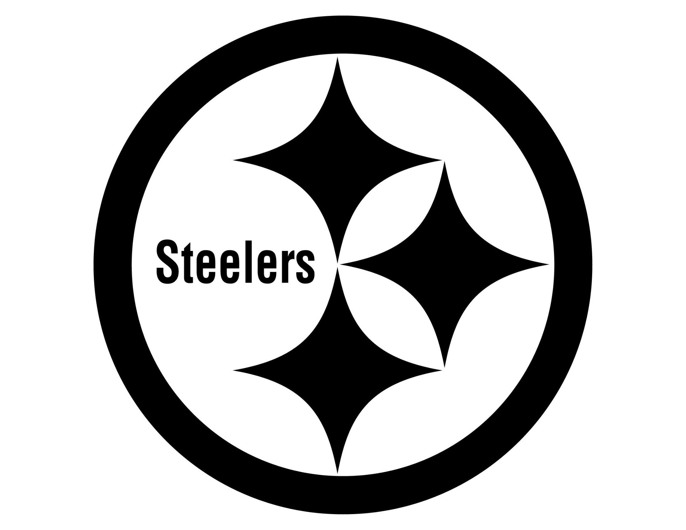
The iconic Pittsburg Steelers badge we all know today was adopted by the team in 1969 and boasted a circular composition in a gray frame with three four-pointed stars and a wordmark in the middle. The stars were colored in yellow, red, and blue, while the “Steelers” inscription in the title case was written in black. This badge was fully based on the image of the US Steel Mark.
2002 — Today
![]()
With the redesign of 2002, the circular badge gained a thin black outline and the contours of the inner emblem’s elements were modernized and cleaned. The wordmark in sans-serif got its lines bolder and stronger and started looking more professional and distinct.
Symbol

The first graphic symbol of Steekers was the Pittsburgh town arms featuring elements of the city’s architecture. Later, in 1940, it was replaced by the image of factory chimneys on a blue background. During the 1961 season, the emblem sported a punting worker, but the logo would not work. However, the good old Steely McBeam is still the club’s good luck charm.
The Steelers symbol, initially an outdoor advertisement element, became part of the team’s uniform design in the 1950s. The logo sported players’ numbers. They were expelled from the logo for good around 1962, but the logo, though slightly corrected, is still in use. It should be noted that the logo had been integral to the Steelers’ uniform design since the 1940s. Some fans soon began to incorporate their favorite team’s logo in memorabilia and accessories.
![]()
The subject matter was well thought out too. However, it was the group of designers who had done the thinking, and they had cooperated with the American Iron and Steel Institute (also referred to as the Steel and Alloys Institute). It was all forgotten over so many years. Well, here is what the tri-color rhomboid sparks meant: steal would shine on hard work and leisure time, as well as broaden the opportunities given by the world around us. This logo was used to promote new steel brands and products made of it.
Partially, the subject matter is similar to the ideological concept of the Steel Institute’s symbol. Sport was to be a bastion of peace in the life of a working man and an opportunity to see the world. The team did its uttermost to promote these principles.
The somewhat strange decision to place the symbol on helmets deserves a separate mention. At first, the club managers were reluctant to decorate the uniform with the logo and decided to place it on the right side only instead of placing it on both sides. That was supposed to be temporary and would clarify if the logo would look great on the golden helmet. After a while, the golden color was replaced with black, but the logo was still on the right only. By the time, the design became a kind of trademark feature. Also, the first season (1962), when the new logo appeared on the players’ helmets, was truly successful, the club came second in the Eastern Division and qualified for the Playoff Bowl (a game for silver champions from different divisions).
However, the team lost the playoff to a stronger club – the Detroit Lions, but, given the time that has passed since then, there is no need to focus on that nasty incident.
Emblem
Needless to say, the club’s uniform has featured the Steelers emblem since its foundation. Gold and black were the team’s signature colors. These are the colors, which make up Pittsburgh’s flag. That comes as no surprise, because they stand for iron ore (gold) and coal (black), which, when merged at the cost of tremendous efforts and under high temperature, make high quality steel.
The very first uniform was a black jersey and golden helmet. Later, vertical strips were added, which made the players more visible in the field. However, now they looked more like prisoners than professional football players. There was more work for the designers to do. They decided not to replace the vertical strips with horizontal ones. The new uniform design did not last long either. In 1936, a solid black uniform was introduced with stripes remaining on sleeves only.
However, the club entered its day in the sun, which started from the 1960s, dressed in gold trousers, black jerseys (the team uses white jerseys for some away matches), and the helmets were black with a yellow strip in the middle and the Steelers emblem on the right. In 1968, the final corrections were made (a slight change in the rhombuses’ size).
The club owners have carried our numerous polls to find out if the uniform needed any changes, and they heard ‘no’ every time they did. Both Steelers fans and Pittsburgh citizens firmly insisted on preserving the traditional uniform color design. The team also has a ‘folklore’ name – “The Black and Gold” – after the team’s signature colors. That’s another story, though.
Font and color
The bold title case lettering from the iconic Steelers badge is set in a heavy sans-serif, which is pretty close to such fonts as Neue Plak Condensed Extra Black and Apron Condensed Heavy, but with the vertical bar of the lowercase “T” cut diagonally, which adds sharpness to the logo.
As for the color palette of the Steelers’ visual identity, it is based on yellow, red, and blue elements, set on a white background and enclosed into a light-gray frame, with black used for the outline and the lettering. This palette makes the simple badge look dynamic and memorable, adding individuality to minimalistic shapes.
What does the Pittsburgh Steelers logo represent?
The iconic logo of the Pittsburgh Steelers, created in 1969, is a modified depiction of the Steel Mark of the United States. All the elements of the logo are connected to the steel industry of the USA: blue — scrap steel, red — iron ore, and yellow — metallurgical coal.
What is the Steelers logo called?
The Pittsburgh Steelers logo is nicknamed the “Steelmark”, which only enhances the affiliation of the club’s visual identity to the steel industry. Although, it is not an official nickname for the club’s badge.
What are the diamonds on the Steelers logo?
The three colorful diamonds on the logo of Pittsburgh Steelers represent the elements of the American steel industry: the red one stands for iron ore, the yellow Diamond symbolizes metallurgical coal, and the Blue Diamond is a graphical representation of scrap steel.
What was the Steeler’s first logo?
From 1945 to 1962 the Pittsburgh Steelers club has been using a horizontally stretched oval medallion with black and yellow pictures on it as the primary badge. That was a celebration of two main things for the club: American football — depicted in the shape of the badge, and the Stella industry, which was presented in the images of a steel plant in the center of the logo.
Font
Pittsburgh Steelers Colors
STEELERS GOLD
PANTONE: PMS 1235 C
HEX COLOR: #FFB612
RGB: (255, 182, 18)
CMYK: (0, 30, 75, 0)
BLACK
HEX COLOR: #101820;
RGB: (16, 24, 32)
CMYK: (100, 40, 0, 100)
PANTONE: PMS BLACK 6 C
BLUE
PANTONE: PMS 287 C
HEX COLOR: #003087;
RGB: (0, 48, 135)
CMYK: (100, 75, 2, 18)
RED
PANTONE: PMS 186 C
HEX COLOR: #C60C30;
RGB: (198, 12, 48)
CMYK: (10, 100, 100, 0)
SILVER
PANTONE: PMS 429 C
HEX COLOR: #A5ACAF;
RGB: (165, 172, 175)
CMYK: (0, 0, 0, 20)


