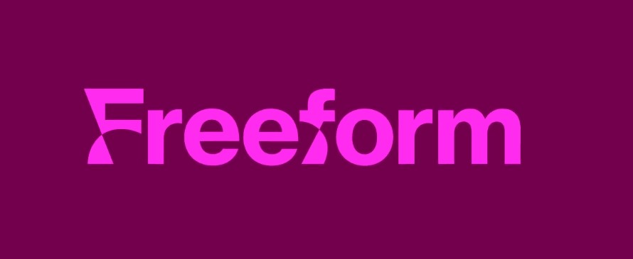
When a brand experiences some unsteadiness, revision of its visual identity can be an effective means to stabilize the business and make the goals clearer. And the recent rebranding of Freeform, a Disney-owned cable channel, is a good example of this idea.

Formerly owned by ABC, the channel has undergone three changes in its visual identity over the past five years. Initially family-oriented with some Christian content, Freeform switched to programming focusing on repeats of comedy series and cartoon sitcoms, like The Griffins, The Simpsons, and The Office. It also airs original prime-time shows directed mainly by females and persons from different ethnic communities.
To create an identity that would match the new streaming content, Freeform hired the New York-based design agency Collins that visualized the new strategy of the channel. The inspiration for the rebranding was the channel’s active investments in original programming. One of the goals of the brand’s rebuilding was to reimagine Freeform’s young audience as a community, “a tribe of the people united by one mood”.

“They haven’t come of age yet, and are in a state of constant becoming, so they need shows which will help them expand the world, but not escape from it”, Collins says. So the uniqueness of the brand is in the attractiveness to its audience, embodied in productions with profound stories giving people different points of view.
Visualizing Freeform’s positioning, the design team bet on custom typography. The basic typeface, also used for the logo, was elaborated in cooperation with Monotype, based on Neue Haas Grotesk designed in 1961 by Max Miedinger and Eduard Hoffman. It is distinguished by uneven and wavy lines, combining readable and abstract forms. Although it seems quite generic as if it was created in a vector graphics application, like Illustrator, the design has its plus in that it’s rather distinct and recognizable.

The font characters are connected with a versatile color palette combining contrast hues: bright shades of purple and green adjoin pale shades of yellow, violet, or blue. At the same time, pink is obviously designated as the main brand color.
This literal interpretation of the channel’s name brilliantly reflects the constantly changing way of thinking of Freeform’s audience. The forms are initially conceived to be asymmetric, fluffy, and spiky, conveying the “state of becoming”.


