Although the Cincinnati Bengals logo has been heavily modified more than once, the tiger theme has always been present here.
Brand Overview
Cincinnati Bengals is a very strong team with a lot of achievements. Recently the club almost regularly make the playoffs, but are often eliminated in the first round. In their long history, the Cincinnati Bengals have made it to the Super Bowl three times: in 1981, 1988, and 2021.
The team’s history can be divided into five periods. The first is the 1970s, when the Cincinnati Bengals were fairly comfortable in the middle of the standings, making the playoffs three times and each time stalling in the divisional round. The rest of the time, they fought for the relegation games, but did not qualify for them.
The second era was the 1980s. It was pretty much the same scenario as in the 1970s, but the team managed to break into the Super Bowl twice, in 1981 and 1988. And both times they lost to the club from San Francisco.
The third era is the 1990s – 2000s. The most inglorious part of the team’s history. Bengals didn’t make playoffs for 14 years and were already starting to be forgotten.
The fourth era was the work of coach Marvin Lewis and quarterback Andy Dalton. Under Lewis, the Bengals made the playoffs seven times (including a streak of five straight) and lost in the wild-card round each time.
Well into the fifth period, which is happening now. Already in 2021, the team made it to the Super Bowl again, but again was defeated. However, the new phase has just begun, and there is still much to come.
Meaning and history
Cincinnati Bengals were named after the football team, which played for the city in the late 1930s, which in its turn decided to take the “Bengals” part from the white Bengal Tiger in the local zoo. So here is how the football club shows its respect for the roots and the value of history.
Not that Cincinnati Bengals had ever been on top of the competition list in any of the leagues they played in, but they have definitely always been one of the most memorable and eye-catching clubs, due to an interesting use of their visual identity. Those orange helms with black stripes are impossible not to notice and not easy to forget.
What are Cincinnati Bengals?
Cincinnati Bengals are the name of the professional football team from the United States, which was established in 1967, and played its first season in 1968. The team is a member of both the National Football League and the American Football Conference.
Though the football Club from Cincinnati has had numerous redesigns of its visual identity throughout the years, they’re all us one thing in common — a unique orange and black color palette, the first combination to be associated with tigers, no matter what contours of the image are.
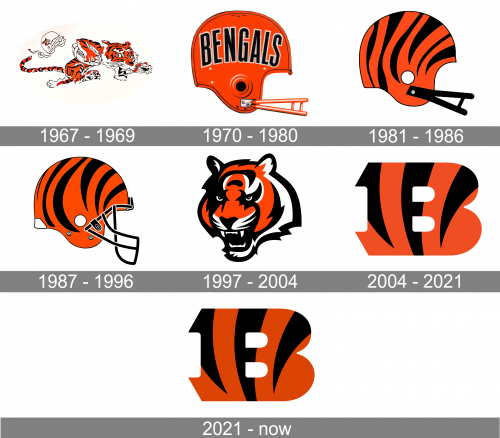
1967 – 1969
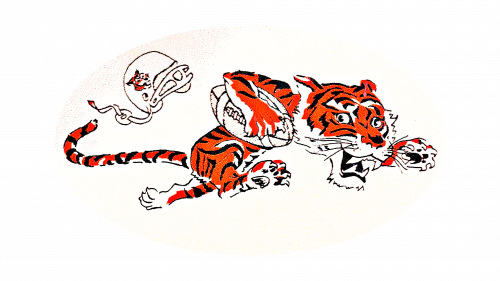
The very first emblem for Cincinnati Bengals was introduced in 1967 and boasted a funny and bright tiger caricature. The cartoonish animal was running to the right with a white football in his paws, and the white helmet fell off his head, pointing at an extreme height speed. It was a friendly and cheerful image, though evoking a sense of determination and willingness of the club to fight and win.
1970 – 1980
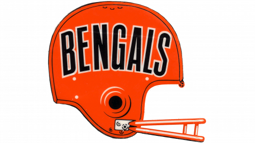
The redesign of 1970 simplified the Bengals logo to an orange helmet with a black inscription on it. Though there was no image of a tiger in this version, the color palette still resembled an animal. The bold black lettering in a narrowed sans-serif typeface was outlined in white, creating a strong contrast with the solid and bright background.
1981 – 1986
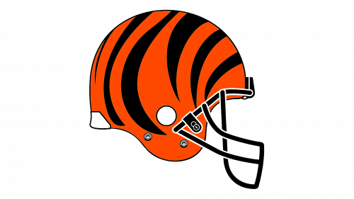
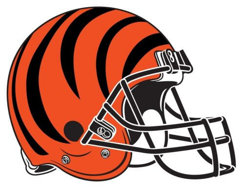
In 1970 the logo of the club was redrawn, and now the orange helmet with its contours modernized featured a black pattern resembling the tiger’s coat. Smooth black stripes were placed all over the orange background of the helm, making it look stylish and modern. There was also a small white element — a solid dot, placed on the side from the black grill.
1987 – 1997
The logo, created for Cincinnati Bengals in 1987 featured a refined version of the previous emblem, with the lines and contours of the orange and black helmet strengthened and modified. The black grill became more massive and a small white element was added to the backside of the helmet. The black stripes were cleaned and placed with more space between each other, making a pattern more balanced and tiger-like.
1997 – 2003
The redesign of 1997 brought a new image to the club’s visual identity, and the emblem, used by Cincinnati Bengals during that period still exists as the secondary logo version of the team.
The emblem boasts a strong and modern portrait of a tiger with its mouth opened. The dangerous animal is executed in thick and smooth lines in black, orange, and white and featured its contours clean and sharp. The eyes of the tiger look intimidating and determined, which reflects the character of the team and its purpose.
2004 – 2021
In 2004 Cincinnati Bengals introduced their new emblem, which featured a stylized extra-bold letter “B” in orange with three thick black stripes, which start on top of the letter and become pointed to its bottom. The massive letter with large square serifs and sharp angles looks confident and serious, while the tiger pattern evokes a sense of energy, power, and speed.
2021 – Today
The redesign of the Bengals logo, held in 2021, has created a stronger and more confident image, only by deepening the shade of orange. All contours of the emblem remained untouched, and the overall concept was kept as it was introduced in 2004, although the refinement has made the badge more stylish and powerful.
Font
The current Bengals logo includes only one letter, while the wordmark is comprised of the full name of the team. Its highlight is a custom fontinstantly recognizable due to the unusual serifs.
The sleek and unique Bengals typeface is based on one of the massive geometric serif fonts, such as Rude Slab ExtraBold Wide Black or Rockwell Std Extra Bold, but those diagonally placed sharp serifs and slightly extended contours made the inscription look completely different.
Color
The team’s official colors are black, orange, and white. The logo is black and orange, while the background is white.
This palette was inherited by the current team from its predecessors — the Cincinnati Bengals, who played from 1937 to 1942. Although the new owner has played with shades and hues and made the new image deeper and more distinctive.
Helmet
The helmet design of Cincinnati Bengals players differs a lot from all other teams, as there is no logo on it, but a tiger-like pattern, composed of several black stripes with sharpened ends, placed on a solid orange background. The mask only the helmet is also made black, creating a brutal and strong look. This bright yet very powerful design makes the players of the club stand out on the field.
Uniform
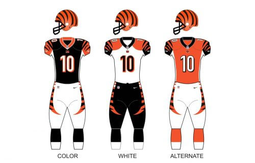
The official color palette of the Cincinnati Bengals uniform is composed of three shades: orange, black, and white; and has three options of the uniform design. The color version features black jersey and pants with sharp orange stripes and a white number in an orange outline. The white uniform has black stripes with small orange details, and the alternate version of the uniform design boasts a bright orange jersey with black stripes and white number, and white pants with orange stripes.
Home Ground
Since 2000 Cincinnati Bengals play on Paycor Stadium, an outdoor arena with a capacity of 65,515 seats. The first name of the stadium was Paul Brown Stadium, in honor of the Bengals’ founder.
Before Paycor the club played on Riverfront Stadium, and for just one season in the end of the 1960s, — on Nippert Stadium.
Cincinnati Bengals Colors
ORANGE
PANTONE: PMS 1655 C
HEX COLOR: #FB4F14
RGB: (251, 79, 20)
CMYK: (0, 85, 100, 0)
BLACK
PANTONE: PMS BLACK 6 C
HEX COLOR: #000000
RGB: (0, 0, 0)
CMYK: (70, 50, 50, 100)
What is the Cincinnati Bengals logo?
The current Cincinnati Bengals logo is a heavy and stable capital letter “B” set in a custom serif font with sharp slightly elongate serifs, resembling the claws of a tiger. The color alerts and patters of the letter also symbolize a Bengal tiger with its bright orange fur and black stripes.
When did Mike Brown take over the Bengals?
Mike Brown took over the Cincinnati Bengals club in 2011, when he bought out the shares of Austin Knowlton. Brown came to the Bengals in 1991, after the inherited his shares from his father, Paul Brown, but those shares were not enough to become the major owner of the team.
Why are Cincinnati Bengals?
The “Bengals” name was given to the club by their initial owner, Paul Brown, who enjoyed the brightness and uniqueness of the orange and black color palette, and the power and determination of the Bengal tigers. Plus, there have already been two more Cincinnati Bengals clubs years before.
Where did the Cincinnati Bengals name come from?
The Cincinnati Bengals name of the club from Cincinnati was given to it by Paul Brown, the club’s owner. It is also a tribute to the previous AFL team, representing the state, which was called Cincinnati Bengals.


