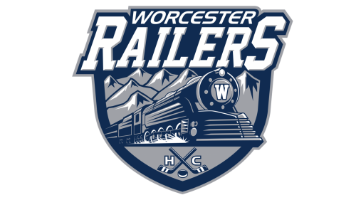
The Worcester Railers HC is the newest professional ice hockey team in North America. The abbreviation HC stands for “Hockey Club”. It is used by analogy with a European model.
The team’s hometown is Worcester, Massachusetts, where they replaced the Worcester Sharks. The Railers played their first game in the 2017-2018 season.
Meaning and history
The ownership group started with choosing a name for the franchise. They considered it to be very important that the name should represent the city’s rich history. Of the three submitted names they preferred “Railers” as Worcester is known for its railroad industry dating back to the 1800s.
The Railers’ logo unveiled in 2016 displays a classic steam train moving forward from the snow-capped seven hills of Worcester. The letter “W” on the train stands for “Worcester”. Underneath the train there are two crossed hockey sticks with a puck between them and the letter “H” on the left and the letter “C” on the right. The team’s name in white and trimmed in gray is above. Everything is placed on a shield bordered in steel blue and gray.
The color scheme consisting of gray, steel blue and white represents the railroad image perfectly well.


