

![]() Woolworths Logo PNG
Woolworths Logo PNG
There is nothing in the Woolworths logo South Africa that would give any hint about the company’s specialization. It has always been minimalistic, built just around the name of the company.
Meaning and history
![]()
The retail company dates its history to 1931. That year Max Sonnenberg and his son opened their first store of the Woolworths chain in Cape Town. Now there are more than 600 stores of this retail chain in South Africa as well as 65 stores in the other countries of the continent.
Though the Woolworths logo history is more than 80 years old, the design of the brand identity has been basically consistent throughout these years. There has been just one subtle modification. The meaning attached to the chosen color, font and shape of the mark is that of simplicity, balance and stability.
Before 2010
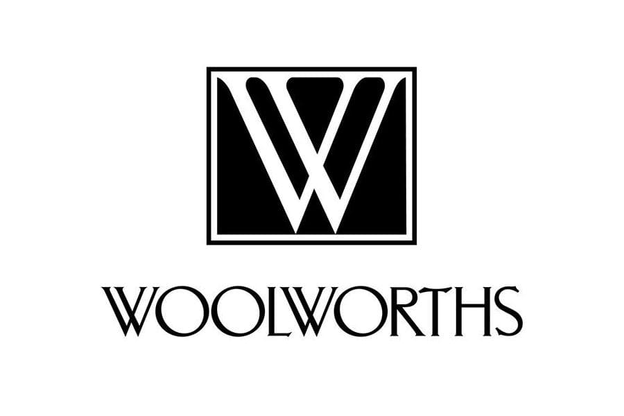
The original symbol was introduced when Woolworths was just facing its first consumers. The image soon became iconic in South Africa.
The letter “W” with intersecting elements was depicted in white against a black background taken in a square frame with a white and black outline. It was paired with the wordmark “Woolworths” depicted below. The letters “W” in it also feature intersecting elements.
2010 – Today
![]()
The modification that took place in 2010 applied mainly to the typeface. As before, the company sticks to a simple design. The color scheme remained unchanged. The overall looks didn’t change much, except that the emblem looks more contemporary now. To achieve this effect they simply chopped off the serif. The most remarkable change has been introduced to the letters “W” ‒ their elements do not intersect now. The black square is without any trimming. The wordmark “Woolworths” can be either below the square or to the right of it.
The author of the new identity was Vince Frost, an Australian based designer.
Font
![]()
In the 2010 version the wordmark “Woolworths” is in bold sans serif typeface, and the letters are smaller in size then in the old Woolworths logo. Everything looks simple and clear.
Color
![]()
The company has always used the black and white color scheme. Alternatively, the logo can be given in reverse colors ‒ the black “W” placed in a white square and the word “Woolworths” in white against a black background.
White implies openness and something which is good, while black is associated with professionalism. This color combination depicts commitment towards quality and balance.


