

![]() White Sox Logo PNG
White Sox Logo PNG
The Chicago-based baseball team White Sox has gone through not less than twenty logo modifications since it entered the Major League in 1901.
Meaning and history
![]()
For the first decade after the baseball club’s establishment, its visual identity was based on just one symbol — the letter “C”, which was redesigned several times and was introduced in various shapes and styles. After 1912 the new text-based concept appeared, and the logo depicted stylized “Sox” inscriptions, which gave place to some graphical badges in the 1970s and came back in 1991. To stay.
What is the Sox logo?
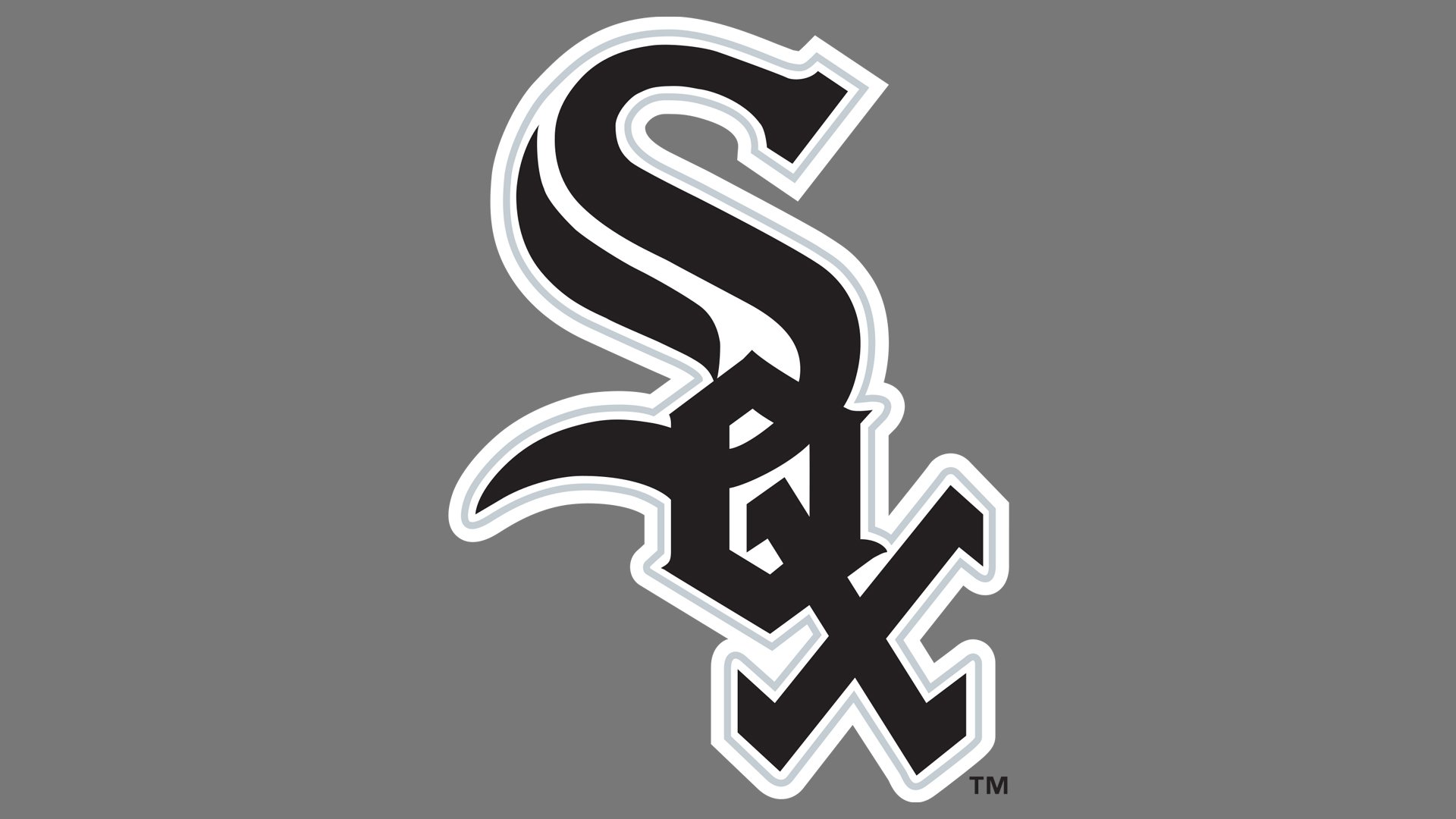
The logo of the famous professional baseball club from Chicago, Illinois, is based on stylized gothic lettering, with thick black lines featuring sleek slightly arched contours and sharp angles. The lettering is set diagonally, with the “S” enlarged, and the “O” and the “X” overlapping each other. All three black characters are outlined in white, which allows placing the logo on various backgrounds without losing its visibility.
1901 — 1902
![]()
The first logo for the White Sox baseball club depicted a pretty modest and strict letter “C” executed in a custom sans-serif typeface with angular contour and a diagonal cut of the upper line’s end. The dark red color of the emblem made it look powerful and professional, evoking a sense of passion and determination.
1903
![]()
In 1903 the “C” was drawn in a bright blue and its style was changed to a smooth and partake one, with massive serifs and a curved middle part of the rounded letter. It was a completely different “C”, which pointed to the individuality and authority of the club.
1904
![]()
The redesign of 1904 brought a wishbone-style “C” in the same bright and intense shade of blue. The pointed element of the letter was placed only from its inside part, which made the logo look unique and remarkable.
1905
![]()
In 1905 the logo was refined again, and now the “C” featured a more traditional wishbone contour and a vertically oriented small white oval on its left part. The upper serif was enlarged and rounded, adding elegance and smoothness to the image.
1906 — 1907
![]()
The blue “C” changed its contours again in 1907, is written in a traditional serif typeface with delicate sharp and playful ends of the line, which made the emblem look stylish and modern.
1908 — 1911
![]()
The last “C” version of the logo was created for White Sox in 1908 and stayed for three years. It was a cleaned and modified blue wishbone “C”, executed in very delicate lines and looking exquisite and chic.
1912 — 1917
![]()
The new concept of the club’s visual identity was introduced in 1912 and featured an enlarged letter “S” in a classy typeface with sharp and elongated serif, a small “O” placed in its upper part, and an “X”, in the bottom. All three letters were executed in the same font and used a calm yet intense blue color.
1918
![]()
Four white sock images were added to the logo in 1918. They were placed right on the blue “S” and added some fun and playfulness to the composition, which stayed almost untouched, just the “O” and “X” had their contours shortened and widened a bit.
1919 — 1929
![]()
The emblem from 1912 came back in 1919 and stayed with White Sox for another ten years. The contours were slightly refined and the serifs — sharpened, looking elegant, and confident in the same blue and white color palette.
1930 — 1931
![]()
Blue turned red and all the elements of the logo gained a thin yet strong black outline in 1930. The contours of the letters remained the same, though the size of all three symbols became smaller, making the logo more balanced and solid. The new color palette stood for passion and energy and reflected the powerful character of the club.
1932 — 1938
![]()
In 1932 the club adopted a new emblem for their visual identity. It was a yellow baseball bat placed behind the diagonally oriented red “Sox” inscription in capital letters. Inside the letter “O” there was a white ball with red stitches. The redesign letters were outlined in black and slightly overlapped each other.
1939 — 1948
![]()
In 1939 the club redesigns its emblem from 1930, making the letter contours bold and square. The outline of red letters now turned dark blue, which gave a more modern and fresh look to the whole composition.
1949 — 1970
![]()
A completely new logo designed for White Sox was introduced in 1949 and featured a bright yellow circular badge in a black outline, with a gradient white sock placed on it and a black cursive “Chicago” inscription over the image. The sock had a fancy wing on it, executed in the same color palette, and having some black details. It was a light and playful logo, which stayed with the club for more than twenty years.
1971 — 1975
![]()
The redesign of 1971 kept the circular shape of the badge but changed its color palette to red and white, and its style to a stricter one. The new emblem featured a white sock placed on a solid red circle and a baseball player’s silhouette executed in thin black lines, located over the sock. No framing and letters accompanied the badge these years.
1976 — 1990
![]()
The logo, created in 1976 was something new for the club. A stylized blue image of a baseball player hitting the red ball was complemented by a modern blue “Sox” inscription and a red underlines “Chicago White Sox” set in two levels under the badge. The wordmark featured a contemporary bold sans-serif typeface and added a sense of professionalism and power to the club’s visual identity. This version stayed as a primary for more than a decade and came back in 2014 as a secondary logo.
1991 — Today
![]()
In 1991 the visual identity of the Chicago White Sox has undergone dramatic changes 1991. The color palette, the style, and the mood of the logo, everything was elevated. Three letters, “Sox”, were placed diagonally, from the upper left corner to the bottom right, and boasted a strict yet powerful monochrome palette. The lettering of the current version is executed in a sleek gothic style with thick sharpened lines and clean contours.
The additional logo of the club depicts a white sock placed on a black rhombus in a white outline. It looks simple yet serious and solid, reflecting the character of the team and its values.
Current emblem
Each of the club’s official colors – black, silver, and white – is featured on its logo. The logotype itself represents the letters “S,” “O,” and “X” in an Old English font. The letters are positioned in such a way that actually “o” resembles “e”, so the word can be read as “sex.” The hidden message creates a funny contrast with the medieval typeface.
Font
![]()
While the primary White Sox logo doesn’t contain any text, the team does have a wordmark. Here, its name is given in three lines, the letters seem to have been taken from the Gotham Bold font.
White Sox Colors
BLACK
PANTONE: PROCESS BLACK
HEX COLOR: #27251F;
RGB: (39,37,31)
CMYK: (00,00,00,100)
SILVER
PANTONE: PMS 877
HEX COLOR: #C4CED4;
RGB: (196,206,212)
CMYK: (5,00,00,20)
What does the MR stand for on the Chicago White Sox uniform?
The letters “MR”, which appeared on the uniforms of the Chicago White Sox professional club in the 2020s, as a tribute to Martyl Reinsdorf, the wife of the club’s chairman, Jerry Reinsdorf, who passed away in 2021 at the age of 85. The club was having her initials on the players’ uniforms for the whole season, showing their respect and gratefulness to a woman, who did a lot for the Sox throughout the team’s history.
What is the nickname for the Chicago White Sox?
Actually, the “Chicago White Sox” is already a nickname, as this is what the Chicago White Stockings club, established in 1903, was called by its fans. The club got officially renamed in 1904, with the nickname becoming a title of the professional club, and staying with it for decades.


