

![]() West Ham United Logo PNG
West Ham United Logo PNG
The history of the team goes back to the soccer club Thames Ironworks, which was established in the summer of 1895.
Meaning and history
The club was founded in 1895 by Football League referee Dave Taylor and proprietor Arnold Hills, which was printed in the local paper. During 1895 the team played as an amateur team with a large number of laborers.
In 1895 the club, then called Thames Ironworks F.C., won the West Ham Charity Cup and then the London League championship in 1897. They gained professional club status in 1898, entering the Southern League Second Division and shortly afterward joining the First Division of the same league. In 1900 the team changed its name to its current name, West Ham United F.C..
West Ham United plays in the English Premier League and is considered one of the most traditional clubs in the country. The team plays its home matches at the London Stadium, which seats about 60,000 spectators.
There have been various successes and achievements in West Ham’s history. The club won the League Cup (FA Cup) three times, in 1964, 1975 and 1980. In 1965, West Ham won the Cup Winners’ Cup (now the UEFA Europa League).
The club is famous for its academy, which has produced many talented players. West Ham is known as an “academy” for developing young footballers, including players such as Bobby Moore, Geoff Hurst, Frank Lampard, and Rio Ferdinand.
The club also has a huge fan base known as The Hammers. West Ham fans are known for their passionate support and commitment to the club.
Originally, the club’s emblem was a pair of crossed hammers – tools widely used in heavy industry. Hence the joking nickname of the team – “Hammers”. Later, in 1904, a lock was added to the emblem. In 1990, the image of the castle was slightly corrected, and after the reconstruction of the stadium facade, two towers repeating the emblem became part of its central entrance.
1895 — 1900
![]()
The history of the famous British football club starts in the middle of the 1890s when it was established under the name “Thames Ironworks FC”. It was founded by a metallurgical company, and its influence still can be seen on the club’s logo, though the name of the team was changed to West Ham United already in 1900.
1923 — 1950
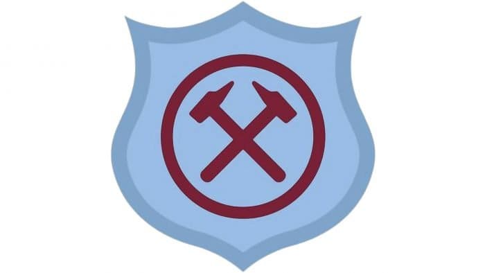
The first official logo for the club was designed in 1923 and depicted two crossed burgundy hammers enclosed in a circular frame and placed on a smooth curved crest in sky-blue. This unique color palette made the team’s logo stand out and stayed with them until the 1970s.
Hammers on the logo celebrate the “Iron” part of the club, and the thick burgundy circle is a symbol of unity and team game.
1950 — 1952
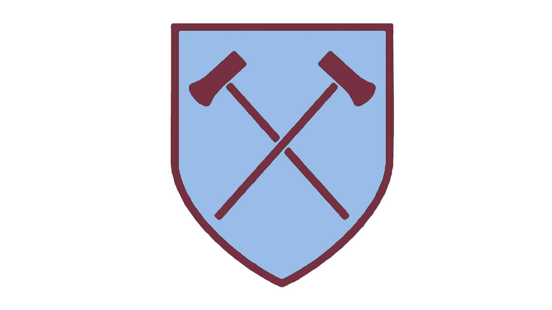
The redesign of 1950 brought more elegant and delicate contours to the logo, making the hammers shape smoother and the handles — linger. The circle was removed from the club’s emblem and now the crossed hammers were placed on a light blue shield with a thin burgundy outline.
1952 — 1958
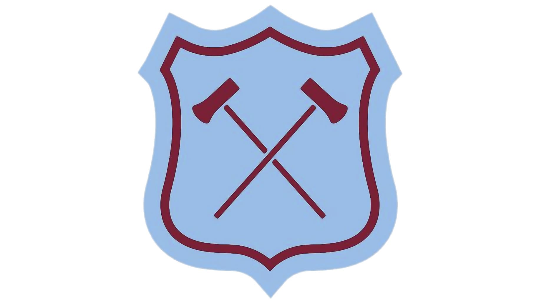
In 1952 the crest is being redrawn. Its sides became curvy and the top part gained two arches. The logo started to look more classy and old-style. Though this version didn’t stay with the club for long.
1958 — 1963
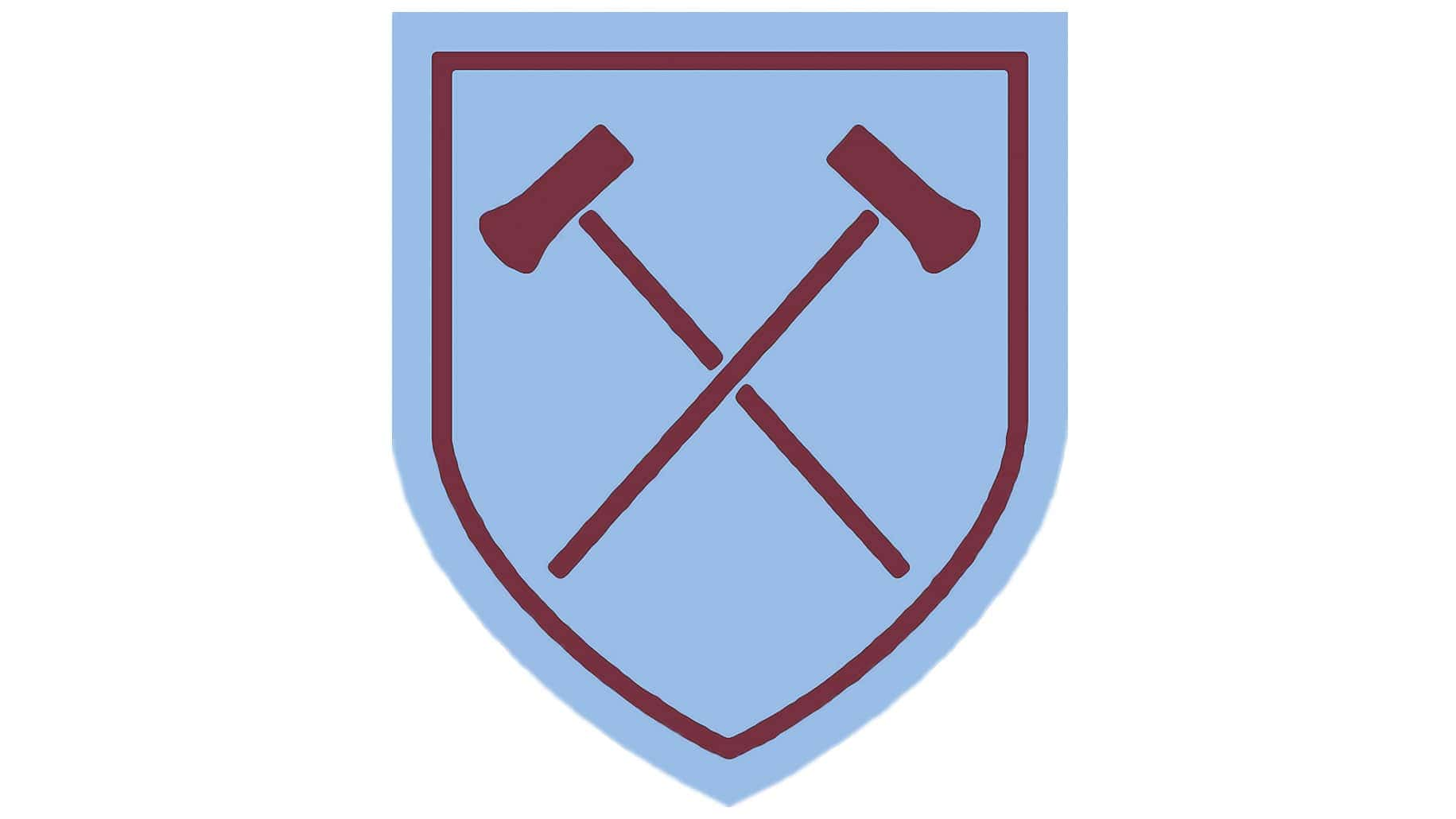
The version of 1959 comes back in 1958. The cleaner and more minimalist shield shape looks professional and delicate, showing the club’s strong points and not losing the connection with its roots and heritage.
1963 — 1968
The shape remains the same, but the colors are being switched between each other in 1963. The burgundy hammers on a white background enclosed in a burgundy shield frame are now placed inside a square with a light blue frame. It simplified the visual identity but made it possible to place it on various backgrounds, so it became more universal.
1968 — 1975
The sky-blue color left the logo in 1968 for the first time. It was a completely new image that kept the main old elements but in a different execution.
The white shield was now outlined in burgundy and had an ornate image of the castle and two crossed hammers in the middle. Both the castle and the symbol of the hammer had only delicate burgundy contours, while the body left white.
Under the shield, an arched white ribbon with a burgundy “West Ham United F.C.” inscription was placed.
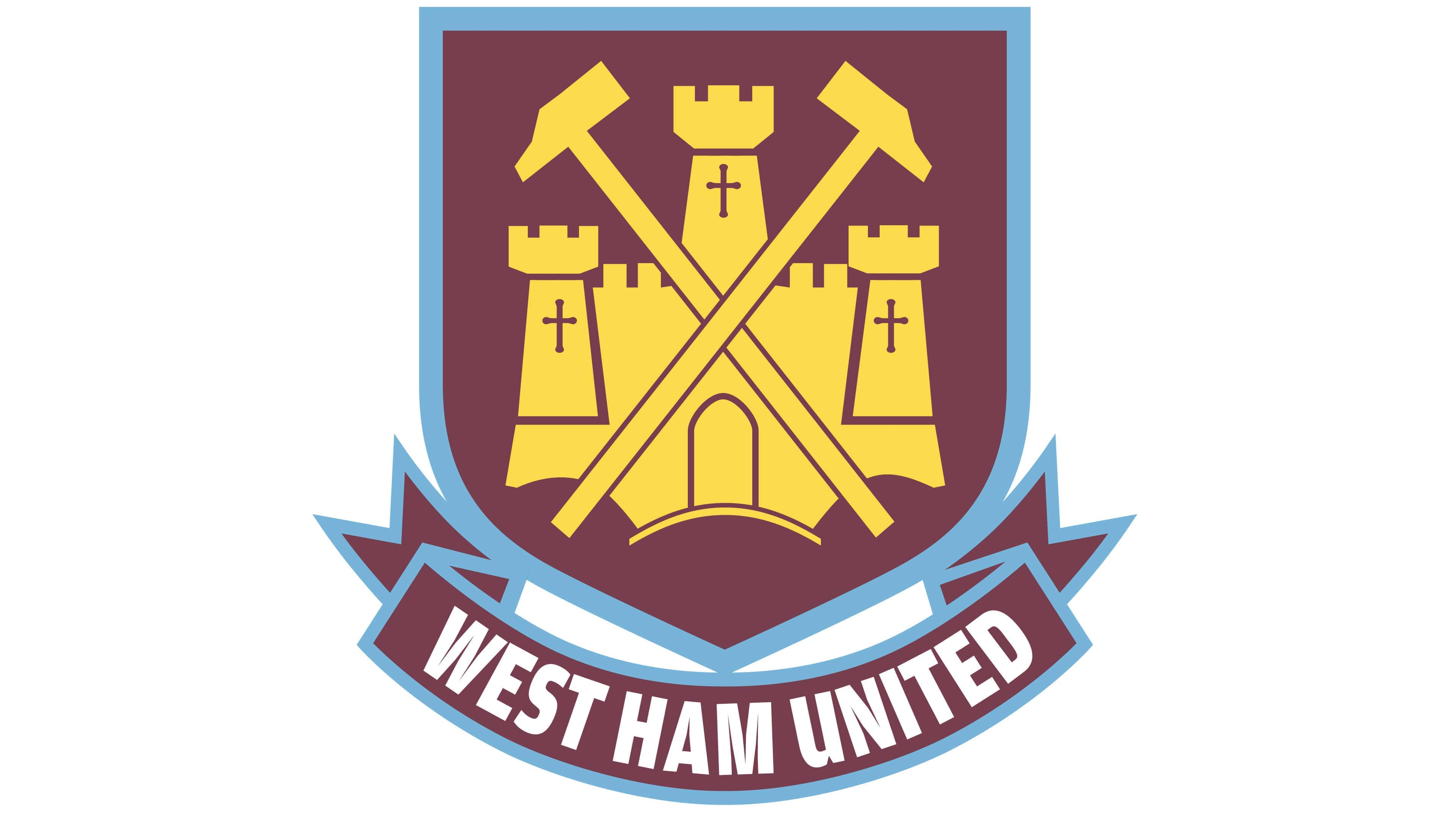
1975 — 1980
In 1975 the crest was replaced by a solid burgundy circle with a white castle in it. Two thin and long hammers in the middle of the emblem featured an iconic sky-blue color. The same logo was used by the team after they won the Cup of 1975, it was just placed on a square instead of the circle.
1980 — 1983

The logo, created in 1968 comes back in 1980, but in a completely new color palette for West Ham United. Now the emblem features bright yellow and blue colors and looks vivid, energetic, and fun.
1983 — 1985
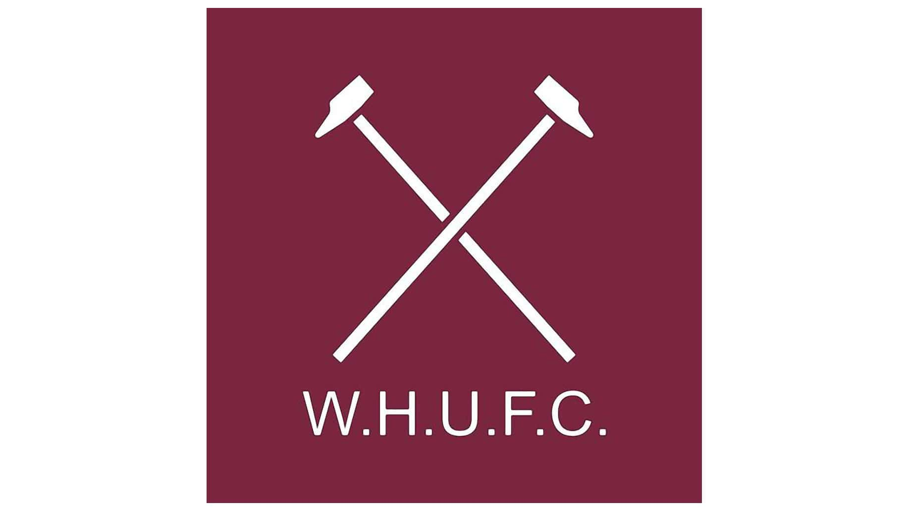
After three years of colorful version, the team decided to go minimalist and just placed two white hammers and a “W. H. U. F. C.” Inscription on a solid burgundy square. It was the most laconic logo in the club’s history and only stayed official for two years.
1985 — 1987
The blue and yellow crest from 1980 is back again, for two more years. The contours of the emblem have been refined, but no significant changes were done to the logo.
1987 — 1999

In 1987 the color palette of the crest was changed to red and yellow, while the ribbon with the wordmark remained blue and yellow. It was a bright and instantly recognizable emblem, which made the team stand out.
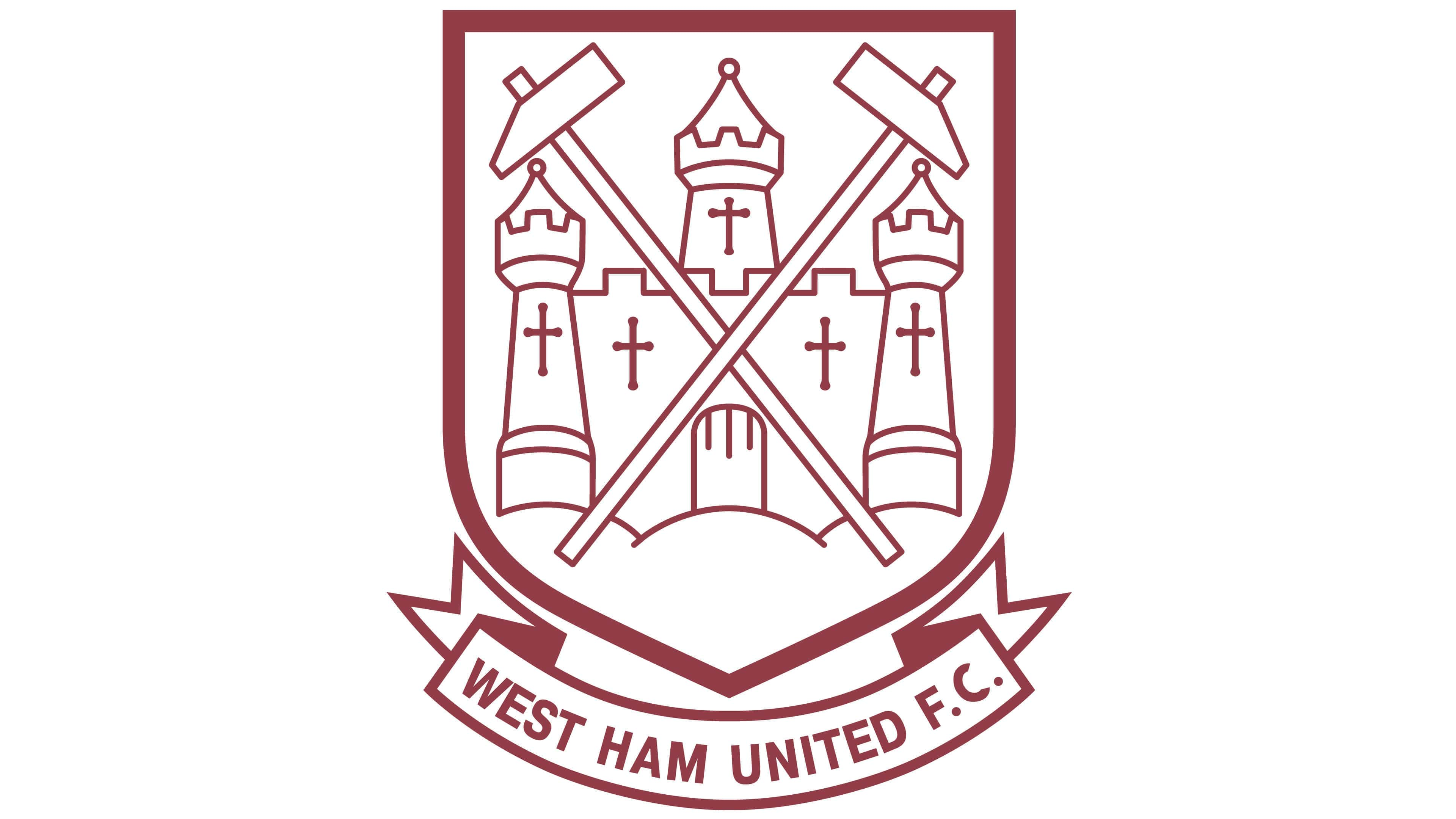
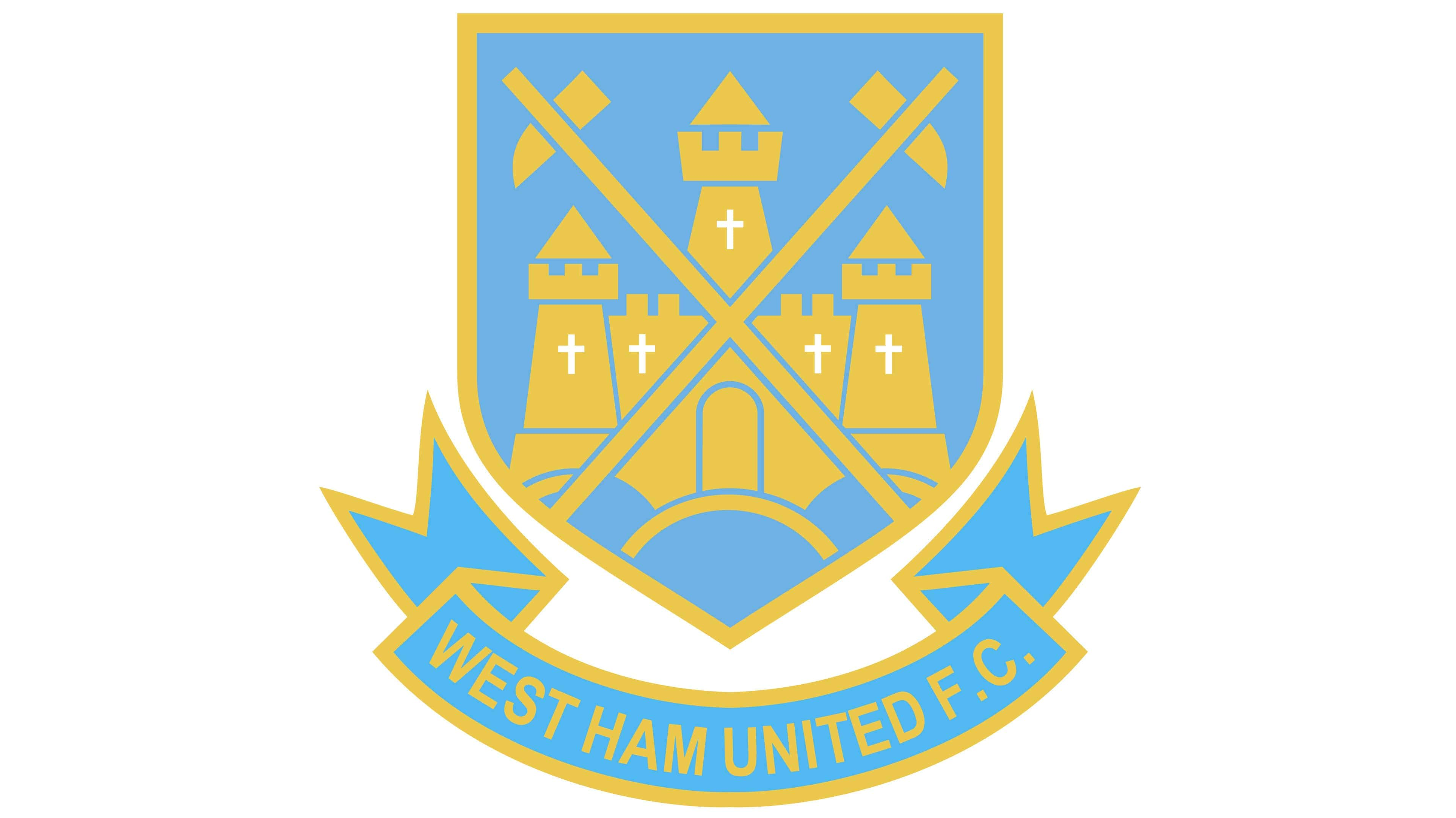
1999 — 2016
The original burgundy and light blue color palette are back, but now with yellow as the third main color. The dark shield in a blue outline features a yellow castle and hammers on it and has a ribbon with white lettering under.
The “West Ham United” inscription is executed in a bold and slightly narrowed sans-serif typeface, which looks professional and strong.
Later in 2014, the new set of logos was created for the team, but they started to be used officially only in 2016.
2016 — Today
![]()
The logo of West Ham United we all know today is a modern sleek crest in burgundy with a blue outline. The two yellowhammers are placed in the center of the crest, between two parts of the inscription: “West Ham United” on top, and “London” on the bottom.
The lettering in all capitals is executed in a simple yet stylish sans-serif typeface in white color.
The team also started using its old logo from the 1920s as an alternative one, so the smooth blue shield with arched sides and two crossed burgundy hammers still can be seen on the player’s uniform.
Colors
![]()
The West Ham United logo features maroon, several shades of gold, white, and an eye-catching shade of light blue.![]()
West Ham United Colors
MAROON
PANTONE: PMS 7638 C
HEX COLOR: #7A263A;
RGB: (122, 38, 58)
HSL: (344, 68, 47)
CMYK: (36, 92, 63, 35)
BLUE
PANTONE: PMS 306 C
HEX COLOR: #1BB1E7;
RGB: (27, 177, 231)
HSL: (194, 88, 90)
CMYK: (69, 11, 0, 0)
YELLOW
PANTONE: PMS 121 C
HEX COLOR: #F3D459;
RGB: (243, 212, 89)
HSL: (46, 63, 95)
CMYK: (5, 13, 78, 0)


