

![]() ViewSonic Logo PNG
ViewSonic Logo PNG
The vivid, colorful design of the ViewSonic logotype has a deeper meaning behind it – it reflects the industry where the company works.
Meaning and history
![]()
ViewSonic Corporation established in 1987 is headquartered in the United States and Taiwan. The company focusing on visual display technology manufactures LCDs, projectors and more.
Symbol
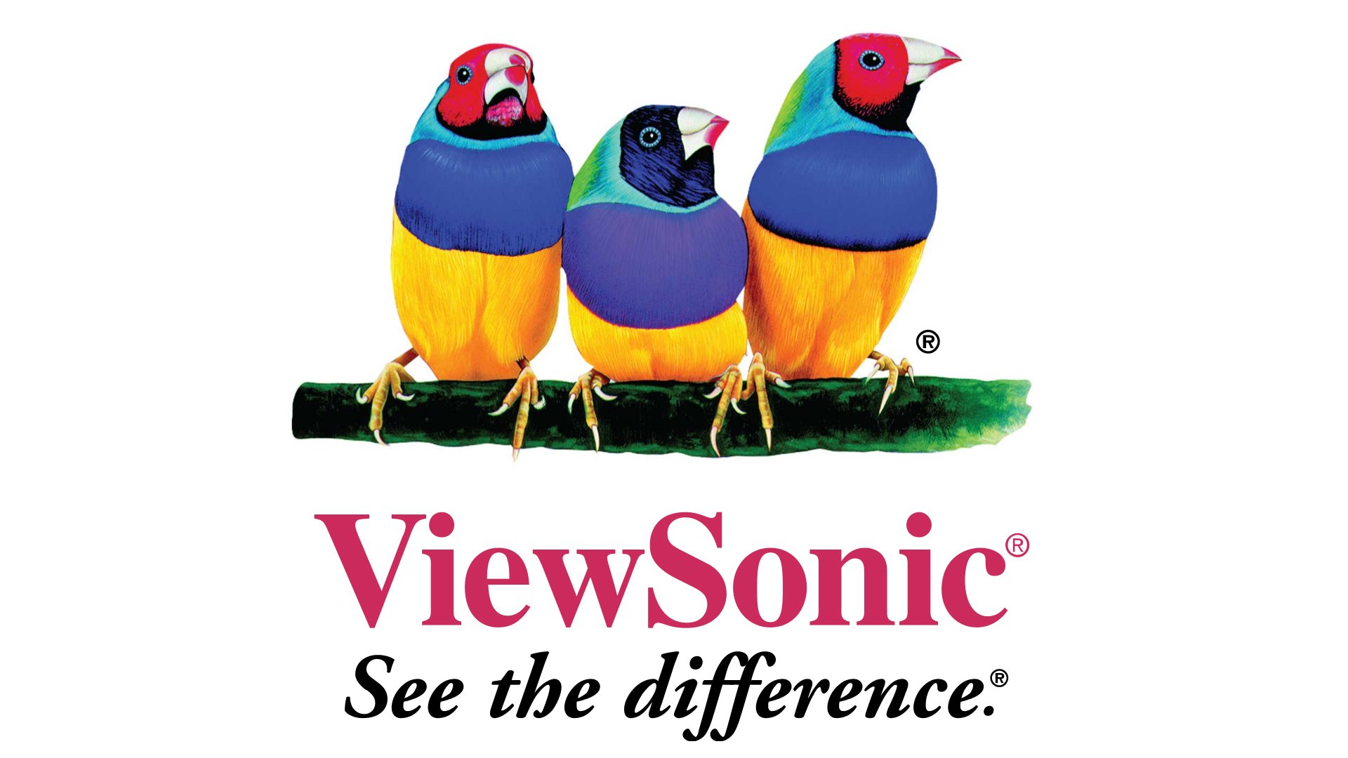
Taking into consideration ViewSonic’s specialization, it’s hardly a surprise that it opted for a bright multicolor logo. The birds that can be seen on it are Gouldian finches endemic to Australia.
Emblem

If you take a closer look, you will notice that the breast of the bird placed in the middle differs in its color from the breasts of its neighbors. This makes perfect sense when paired with the motto “See the difference,” which can be seen below the emblem.
Font
![]()
The current ViewSonic logo features a bold serif typeface given in a dark shade of red, which looks traditional and perfectly legible.


