

![]() VanossGaming Logo PNG
VanossGaming Logo PNG
While the VanossGaming’s very first logo was based on his initials, the second version is a more interesting emblem with a story of its own.
Meaning and history
![]()
VanossGaming is the online pseudonym of the Canadian video game commentator Evan Fong, who started his YouTube channel in 2011.
2011 – 2015
![]()
That’s the YouTuber’s first logo, and it depicts to first letters from both parts of his name. They are written in diagonal using a linear, geometric style. Moreover, where the ‘V’ touches the ‘G’, the latter is cut. The coloring of the letters is either black or white with a black square as background.
2015 – now
![]()
In 2015, Mr. Fong decided to reinvent his brand. He used a mask his character in the game GTA Online used for a long time as a base for a new logo. It’s basically a head of an owl, simplified to just the beak, eyes, forehead and ears. As a result, there’s a prominent ‘V’ in this design.
Emblem
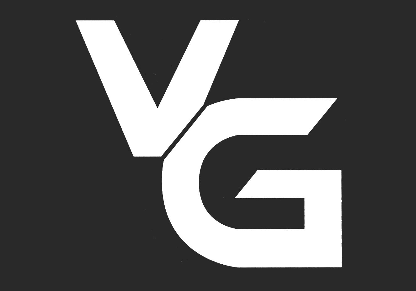
The earliest VanossGaming logo depicted the letters “V” and G” in white against the black background. The two letters were joined together to form a single emblem.
Symbol
In late 2015 VanossGaming launched the limited edition merchandise featuring an entirely new logotype. Instead of the interlacing initials, there was a stylized depiction of an owl face against the black background. The owl’s beak and ears created a diagonal cut forming the letter “V”.
The picture actually represented the mask on Fong’s character model in the open world online multiplayer video game Grand Theft Auto Online, which had been created by the UK video game developer Rockstar North Limited.
Font
The VanossGaming logo, in its current form, does not include any text. The previous version featured a custom sans serif typeface with clear geometric shapes.
Color
The inverted colors help to make the simple black-and-white scheme more unique.


