

![]() Van Halen Logo PNG
Van Halen Logo PNG
The “winged” Van Halen logo would have never appeared if the band had not had a violent conflict with its record company.
Meaning and history
![]()
The Van Halen logo is considered to be one of the most iconic insignias in rock-music history. Though the most famous version of the logo was first introduced in 1978, the original logo, created in 1972, was also outstanding and unique, reflecting the essence of the band and its passion for music.
1972 – 1974
![]()
The original logo was a wordmark that said ‘Mammoth’ in big, isometric letters. They were almost hand-drawn, had cracks all over them and were generally jagged, resembling stone.
1974 – 1978
![]()
The very first Van Halen logo featured a black stylized logotype placed on a white background. The handwritten sans-serif typeface of the wordmark was accompanied by the letters “V” and “A”, which elongated bars were drawn like notes. It was an elegant and smooth badge, which stayed with the legendary band for six years.
1978
![]()
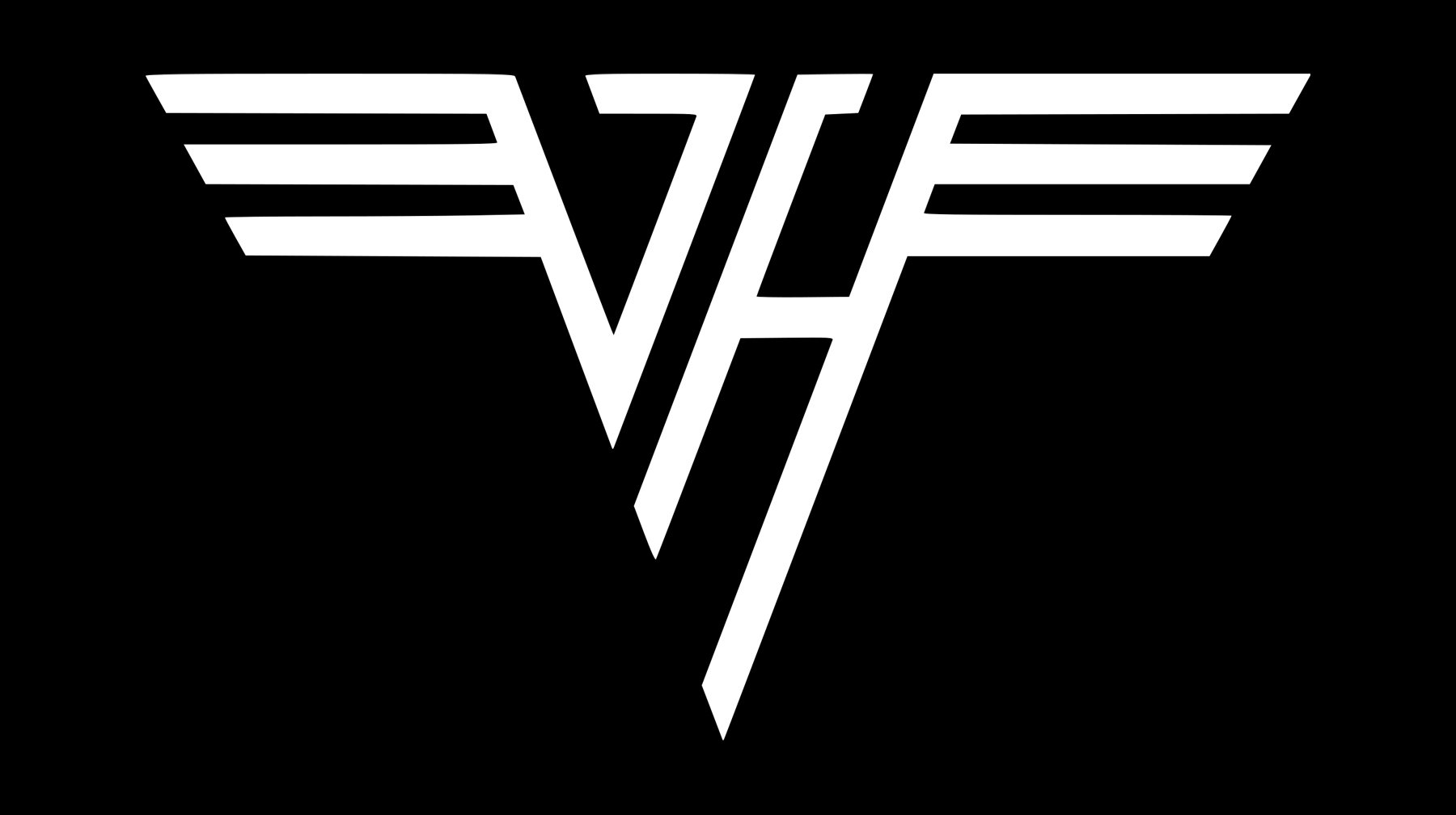
The iconic winged Van Halen logo in the silver color palette was introduced in 1978. It was a stylized monogram, where sharp silver letters “V” and “H” had their bars extended to the sides, repeating the shape of the square wings. The aviation-style silver badge was complemented by a horizontal banner with the band’s name in black on it. The banner was colored in gradient shades with bright blue as the main one.
1979 – 1986
![]()
The 1979 emblem uses the same winged letters as the predecessor, except it has a lot of perspective to it and is colored black-and-white instead of the rich color scheme from before.
1986 – 1998
![]()
The silver geometric monogram was redesigned in 1986 and gained a new mood and color palette. The banner with the logotype was removed and the square wings of the emblem turned into a ring, formed by three lines coming out of the letters. The gold color of the new badge made it look more delicate and elegant without losing its special character and individuality.
2012 – 2020
![]()
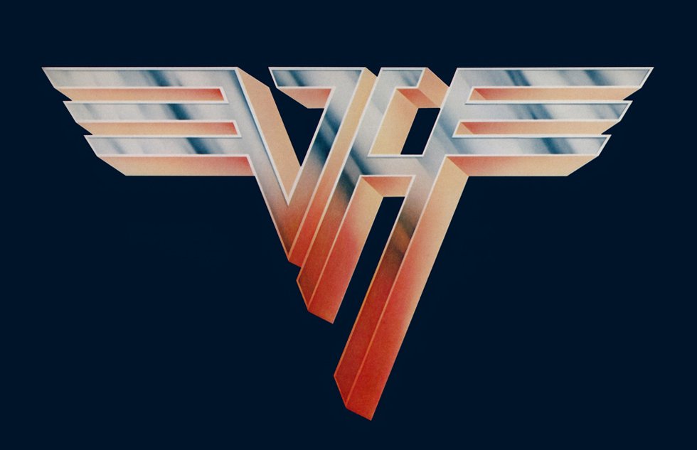
In 2012 the band comes back to its badge, created in 1978, slightly refining the lines and keeping the original color palette and style untouched. The gradient rainbow colors of the emblem make it look bright, vivid, and cool, showing the essence of Van Halen and accenting on its style.
Emblem
The band members were strongly opposed to the album cover and had a row with their record company. A new one was introduced soon. It featured four individual photos made by Elliot Gilbert with the now-iconic logotype in the center.
The logo was created by designer Dave Bhang. It featured the band’s initials with “wings”. One of the reasons why the band members liked it much more than the previous version was that the Bhang’s logo made it clear they had nothing to do with the punk movement.![]()
Surprisingly enough, the “punk rock” emblem was still introduced to the audience. It could be seen on the “Looney Tunes” red-vinyl promotional EP. The band insisted that the album with this cover should not be sold, so the record company eventually had to scrap it.
One more surprising fact was that the iconic winged logo was placed at a prominent position only on the first two albums.
Symbol after 1986
The beginning of the Sammy Hagar era was marked by an updated logo. The lines of the letters were extended so as to form a ring.
In March 2007, when it was announced that Eddie Van Halen was in rehab, the logo at the band’s website was changed to the original one that debuted in 1978.
Font
![]()
None of the letters belong to an existing font. Both of them were created from scratch for the Van Halen band.
Color
![]()
The combination of dark and light shades of grey make the Van Halen logo look as if it was made of metal.


