

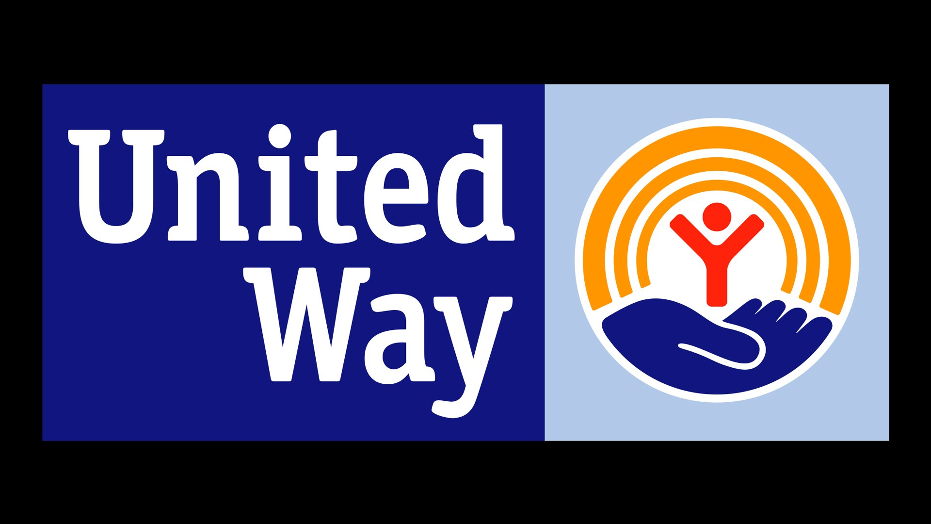
![]() United Way Logo PNG
United Way Logo PNG
While the three main elements of the United Way logo have been preserved since its introduction nearly 50 years ago, minor details were updated to make the emblem contemporary.
Meaning and history
![]()
The original symbol was created by Saul Bass, an American graphic designer and Academy Award-winning filmmaker. His most known works include motion-picture title sequences, film posters, and corporate logos. Among the Hollywood filmmakers for whom he worked were Alfred Hitchcock and Martin Scorsese.
1922 – 1952
![]()
The central piece of the first logo was a white feather. Around it, they’ve scattered the inscription ‘give through your Community Chest’ in black, although the styles differed from a bold serif to thin, small letters to very tall, bold characters.
1952 – 1972
![]()
The 1932 design is six black lines arranged side by side into a shape of the letter ‘U’. Through its middle, they’ve also written the word ‘United’ made from tall, bold letters in a pretty basic sans-serif style.
1972 – 2004
![]()
The logo was introduced in 1972. It comprised three main symbols: a rainbow, a human figure, and a helping hand. Each of the symbols is in one way or another relevant to the organization’s mission. The human figure, for instance, represents the mankind, while the helping hand stands for the services and programs organized by United Way. It also emphasizes that the organization is supposed to put people on a higher level. Probably symbol that’s the most difficult to understand is the rainbow. Here, it was used to represent the hope of a better life, as well as harmony and human diversity.
According to the author of the logo, his work expressed the following characteristics: “vibrant, exciting, colorful, positive, and changing.”
In 1994, the logo was slightly modified, and a new slogan appeared: “Reaching those who need help. Touching us all.”
2004 – Today
![]()
The following important event in the United Way logo history took place in 2004. The logo was updated in collaboration with the global brand consultancy Futurebrand. While the core symbols remained, the overall logo became cleaner, bolder, and more up-to-date.
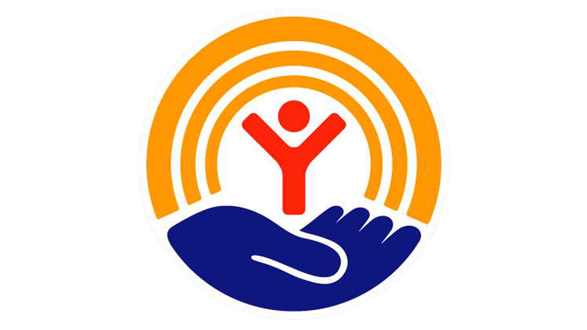 To begin with, the red-to-yellow gradient rainbow of the original logo was replaced by a gold rainbow. In the current version, there’re three rings instead of the four rings of its predecessor. The human figure given in red was placed on a blue hand, which now doesn’t look as angular as the original one.
The emblem is positioned in a light blue square (presumably to discourage the use of the icon by itself).
Font
The United Way logo font looks very much like the font called Officina Serif Std Bold, although there’re several notable differences. The custom type looks more friendly and attractive.
Color
![]()
The palette includes a bright shade of yellow (PMS 143), pure red (PMS 179), light blue (287 at 52%), and dark blue (PMS 287).


