Although Uber is a quite a young company, it has already gone through several logotypes. The current Uber logo looks friendlier, yet carries a deeper symbolism than its predecessors.
Meaning and history
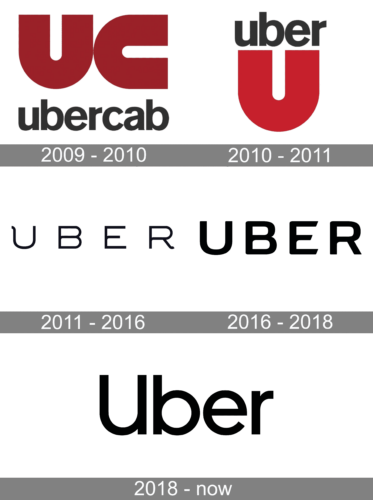
Though Uber had its logo redesigned three times throughout not so long history of the company, each of the emblems was minimalist and stylish, following the latest world’s design trends and sometimes being one step ahead of them. Simplicity, confidence, and casual chic — these three main principles can be seen in every Uber logo.
2009 – 2010
During the first months of its history, the Uber taxi service was called UberCab, and its logo for it was designed in 2009. It was a dark-red emblem, composed of two enlarged letters, “UC”, drawn in completely the same way, but the first character set vertically, and the second — horizontally; and the lowercase lettering, placed under the graphical part, set in a modern sans-serif font, in a very dark shade of gray, closer to black.
2009 – 2011
The very first emblem, created for the company in 2009, featured a red and dark gray color palette, where the dark gray lowercase wordmark was placed above the unlatched and extra-bold letter “U” in an intense shade of red. Both elements were placed on a white background without any framing and looked solid and powerful.
2011 – 2016
The redesign of 2001 brought a new logotype to the brand. The uppercase inscription was executed in a lightweight and elegant sans-serif typeface, which could seem very usual, it not the small curve on the upper part of the “U”s left bar. This small detail completely changed the look and mood of the logo and made the brand’s brutal and strict badge more balanced.
The Uber badge, designed in the same year was composed of a dark gray square in a double outline of silver and gray and a masculine silver letter “U” in the middle. The “U” had its ends horizontally bent to the center, looking strong and confident.
2016 – 2018
The logo was redesigned by the in-house team in 2016. The inscription in black was bolder and smoother than in the previous version. The lines of the letters became simpler, yet the wordmark didn’t lose its confidence and style. The horizontal bars of the “E” had their edges cut diagonally, which added a sense of dynamics and movement.
In the same year, the iconic badge was introduced for mobile apps. The patterned dar blue square with rounded angles had a white abstract composition inside: the solid white circle was “cut” on the left and had a square in the center. It was a stylized representation of “atoms and bits”, which the company believes to be the main building material for everything around us.
2018 – Today
In 2018 the Uber logo was simplified by its in-house team. The lettering in the title-case is executed in monochrome and uses a traditional sans-serif typeface with classic shapes of the letters and clean lines. The font was designed exclusively for the brand and for named “Uber Move”.
Font
The 2016 wordmark is bolder and tighter than its predecessor, so the name of the company is now readable even on small screens. Probably the most distinctive feature of the previous wordmark, the little curl on the “U”, has disappeared.
Some of the unique features of the updated typeface are the inner curves on the bottom halves of the letters “B”, “E”, and “R”. In fact, they look the same as in the previous version, yet they have become more visible because of the bolder typeface. Also, the corners of the three last letters are rounded (or even elliptical), while the previous typeface had straight angles at the same places.
Color
Instead of the steely-looking palette, which included black, white, and blue, the designer team developed 65 local color palettes for different countries in which Uber operates. Due to this innovation, the company’s employees have received more freedom in crafting messages for their own regions. The standard icons comprise white and two shades of blue (the rider’s icon) or a combination of white, brown, and orange (the driver’s icon).


