The founder of Britain’s oldest travel company whose name was Thomas Cook started his business in 1841. Now Thomas Cook Group plc is the second largest tour operator in the UK and in Europe boasting of its own fleet, almost a hundred aircraft and more than 19 million annual customers.
Meaning and history
Having undergone numerous changes over 177 years of its history, the logo has evolved from a picture abundant in elements into a laconic but meaningful image.
1880 – 1914
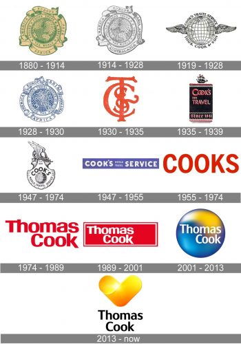
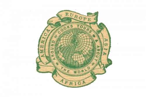
The first Thomas Cook logo appeared in1880. It could be seen on brochure covers for more than 30 years. It was a globe symbol depicting the four continents. The globe was enclosed in a circle with the company’s name “Cooks Tours” and the wording “Around and about the world”. Besides, there were four ribbons around the whole thing with the words “Asia”, “Africa”, “America” and “Europe” on it to emphasize the global nature of the company.
1914 – 1928
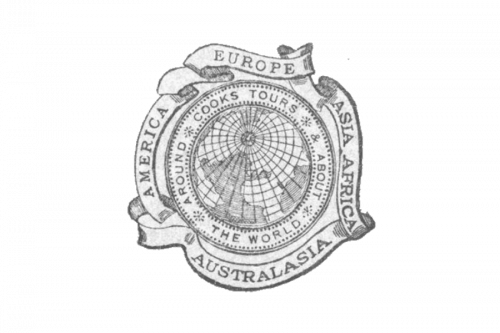
In 1914 “Australia” was added to the words on the ribbons reflecting the company’s expanding business.
Fourteen years later as the brand name changed to Cook’s Travel Service it was reflected in the logo. They also added a fifth ribbon, a hint that the company could offer a lot more than just package tours.
1919 – 1928

The very first logo for Thomas Cook was introduced in 1919 and featured a traditional and elegant badge in monochrome with the globe image in the center. The globe had two thin delicate wings and was outlined in a text frame, with the “Cook’s Travel Service” arched above it and the “Thos. Cook&Son” — under. Both parts of the inscription were set in the uppercase and executed in a bold and strong serif typeface.
1928 – 1930

The redesign of 1928 switched the color palette of the logo to blur and white. This new scheme evoked a sense of stability and trustworthiness and at the same time added some freshness and lightness to an elegant badge. The globe was still the main part of the company’s visual identity, but it was redrawn and outlined in an ornate ribbon with the new lettering on it. The white ribbon and blur inscription looked professional and sophisticated.
1930 – 1935
In 1930 the era of the globe symbol ended. The logo became simpler. It consisted of TC&S which stood for “Thomas Cook and Son”. In the mid-1930s it was abandoned in favour of a ship logo with the “Cook’s For Travel” slogan.
The symbol that followed it in the 1940s incorporated a scallop shell with a globe and the company’s name against it and the winged helmet of Mercury at the top.
1935 – 1939
The logo, used by the company in the second half of the 1930s was different from all the previous emblems. It was a vertically oriented black rectangle with stylized red lettering in it and a black clipper above it. The clipper had its sails colored Ted, which balanced the color palette of the image and made it brighter. The bottom line of the logo was taken by a gothic style “Since 1841” datemark in red and white.
1947 – 1974
The globe was back to the Thomas Cook visual identity in 1947. This time it was placed on a new crest with the lettering set around it and the winged helmet on the upper part of the composition. The “EST. 1841” datemark was set under the helmet, in small-sized symbols. As for the main inscription, the “Cook” part was enlarged and arched above the globe, while the “World Travel Service” in all capitals was executed in smaller letters, and placed under the image.
1947 – 1955

Another logo created in 1947 was a simple rectangular banner with a blue background and white lettering on it. The inscription was set in the uppercase and executed in an ExtraBold sans-serif typeface with massive shapes of the letters and clean neat edges. This badge was used by the brand for only eight years.
1955 – 1974

In 1956 the company started using a minimalist yet powerful and professional “Cook” logotype as the main badge. The uppercase inscription was executed in a traditional yet slightly narrowed sans-serif typeface, where the thick clean lines of the letters looked strong and confident in the new intense red color.
1974 – 1989

The redesign of 1974 kept red color as the main theme but extended the wordmark to “Thomas Cook” its strict sans-serif typeface to a smooth and modern one. Now the inscription was set in the title came and featured rounded angles and distinct sits of the letter lines. Some letters were glued to each other, while others had pretty much space in between.
1989 – 2001
Then there was something entirely different. Cooks switched over to a wordmark logo ‒ the word “Cooks” in various colours and fonts. It had been in use for 14 years until the “flame red” mark was introduced.
The brick logo appeared in 1989. It was red and white with the same inscription as in the previous logo.
2001 – 2013

The Thomas Cook logo from 2001 featured a new blue, yellow and white color palette, with the white sans-serif lettering set on a voluminous gradient circle in blue and yellow. The inscription on this version of the visual identity was set in the title case of a simple modern sans-serif typeface.
2013 – Today
 The logo unveiled in 2013 looks more consumer friendly. It is a sunny heart designed by the Swedish agency Happy F&B. It means commitment, warmth and sunny emotions. There is also a wordmark “Thomas Cook” underneath.
The “Sea and Sun” Logo
Thomas Cook again revised its identity in 2001 and launched the “sea and sun” logo. It was blue and yellow (the “holiday” colours of the company that had acquired Thomas Cook by that time) and featured the Thomas Cook name in white.


