TCU is the abbreviation standing for the Texas Christian University, a private American university established in 1873. The main building is located in Fort Worth, Texas. Today the university has about 10 thousand students and 2 thousand teachers.
Meaning and history
Texas Christian University (TCU) is a private university in the United States that has been in existence since 1873. It was founded by two brothers, Addison and Randolph Clark. Every year the institution is ranked among the top educational institutions in all of America.
TCU started from being just a male and female college, established in Thorp Spring. In 1885 it moved to Waco and got University status in 1889. The current name was given to the University only in 1902.
Today Texas Christian University offers 14 bachelor’s programs in more than 80 fields and about 14 advanced degrees in more than 30 fields, including research doctorates and professional ministerial degrees.
What is TCU?
TCU, or Texas Christian University, is a private educational institution, which was established in the United States in 1873. TCU is considered to be one of the most successful and reputable universities in the USA and yearly has about 10 thousand students, attending one of its14 bachelor or 14 advanced programs.
In terms of visual identity, the Texas Christian University has been very constant, despite the number of its logo redesigns. Those were more small modifications and refinements, as the concept and color palette of the TCU badge has been chosen decades ago. Apart from the primary logo, the University also has a seal and a mascot — a horned frog, which can be seen on many TCU materials.
Seal
The TCU seal features a traditional circular shape with a double outline, where the uppercase inscription in a bold and elegant serif typeface is set. The central part of the seal is taken by a classic crest, with a widened upper part, where the horned frog is drawn, and the softened angles of the bottom. In the middle of the crest, there is a solid torch with a five-pointed star replacing the flame. The torch is underlined by the “1873” datemark and has several straight lines of different lengths placed diagonally on the sides. There are also three Latin words “Disciplina Est Facultas” written in a small cape around the crest.
Logo
Although the University got its current name in 1902, the first official logo for it was designed in 1939, and it is definitely the most complicated and ornate badge of all, created for TCU throughout the years.
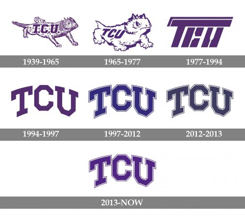
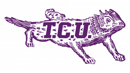
1939 — 1965
The first TCU logo features a very detailed image of a lizard, executed in thin purple strokes, with a bold square “T.C.U.” Inscription in solid purple letters, written over its body. The heaviness of the letters made the inscription pretty well visible, despite the use of the same colors. The logo stayed in use for almost thirty years.
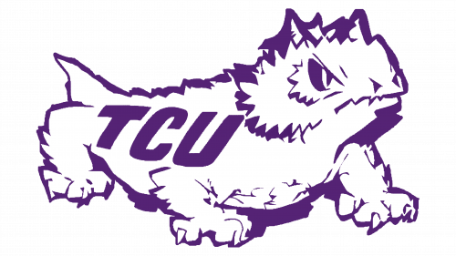
1965 — 1977
The redesign of 1965 introduced a modernized emblem: a horned frog with a white body and a thick purple outline. Compared to the previous version, the new mascot had leas details and looked more powerful, and even dangerous. As for the lettering, its typeface was switched to a contemporary smooth sans-serif, and the dots after the letters were removed.
1977 — 1994
The TCU logo, introduced in 1977, was the most interesting and stylish of all. It was a progressive slanted inscription in a bold and heavy custom sans-serif typeface, with the letter “T” enlarged and its horizontal bar elongated to the right, covering the following “C” and “U”. The bar was decorated by a thin white line, and the caller letters were divided into segments. The abbreviation was not easy to read, but it looked very cool and futuristic.
1994 — 1997
With the redesign of 1994, the logo started looking almost the same as we can see it now. It was an arched uppercase inscription in a geometric serif typeface with square angles and cuts. The bars of the letters were pretty thin, which made the badge look light and evoked a sense of energy. The shade used for the logo was medium-dark purple, a symbol of wisdom and knowledge.
1997 — 2012
In 1997 the TCU purple was replaced by the classic blue, and the lettering was rewritten. The new typeface featured thicker lines, and a double white and blue outline of each letter. The space between the symbols was refused, so now the corners of the letters were touching each other.
2012 — 2013
In 2012 the style and contours of the badge remained unchanged, but the shade of blue was muted and became darker and calmer. Due to the use of the new shade, the badge started looking more confident and professional.
2013 — Today
The TCU purple comes back with the redesign of 213. It was the same shade, used by the University for its badge for years — intense, deep, and bright at the same time. As for the main elements, the letters, everything stayed in its place, and the contours remained untouched.


