

![]() Subaru Logo PNG
Subaru Logo PNG
The Subaru brand appeared after the Second World War when the car industry became for Japan literally one of the principle areas of application of economic power and economic realization. The military industry was eliminated, but thanks to the car industry it became possible to create both jobs and the product that quickly reached the level at which its quality throughout the world became a household name.
Meaning and history
![]()
Subaru was the first automobile company to use the Japanese word for its name. The name of the brand, Subaru, can be translated from Japanese as the Pleiades, or a group of stars in the Taurus constellation.
The Subaru logo has always been based on the brand’s name and always depicted six stars.
What is Subaru?
Subaru is the name of the luxury Japanese automaker, which values the speed and technical characteristics of its car above everything else. The cars of the brand are known for their reliability and comfortable driving.
1953 – 1980
![]()
The Subaru badge has always been based on the same image, though the color palettes and execution varies from year to year. This, the very first badge, created for the company in 1953, was drawn in monochrome, with the sharp four-pointed stars enclosed into a thin yet distinct horizontally oriented oval frame.
1953 – 1958
![]()
Another badge, introduced in the same year, featured a three-dimensional version of the monochrome starry badge. It was executed in a glossy metal, with silver gradients and lines of all elements bolder and smoother. This badge was placed on the bonnets of Subaru cars and looked great on any possible color of the background.
1958 – 1959
![]()
The first Subaru logo was designed in 1958 and featured a gold oval with six golfed stars, connected with thin lines. It was a very beautiful and elegant badge, that looked chic on the Subaru cars.
1959 – 1970
![]()
In 1959 the logo became more colorful. Now it featured a silver framing and stars of the same color, placed on a red background. The new Subaru color palette is a representation of the brand’s passion for progress and movement.
1970 – 1980
![]()
In 1979 Subaru creates a new emblem. The oval with stars remain, but it is now placed into a U-shaped figure with the flattened bottom part. It boasts thick lines and silver-black color scheme.
1980
![]()
The Subaru logo, designed in 1980 looked pretty much the same as the one the company used in the 1950s, but with the lines of the stars shortened, and the oval frame extended. Another difference was in the contours of the elements — the silver voluminous lines of the badge all featured a visible black outline, which added a sense of confidence and professionalism to the Subaru visual identity.
1980 – 2003
![]()
The base of the today-popular Subaru logo was designed in 1979. The emblem is now composed of the same oval with stars, but the color palette is changed. The silver stars are placed on deep blue background.
The shapes of the pattern are refined, and the gradient gray is added, which resembles the shining stars in the night sky.
1999 – 2003
![]()
The Subaru logo was modernized again in 1999. The oval shape is wider now and looks stronger, the color of the background boasts gradient shades, which adds a three-dimensional effect to the emblem.
The stars are executed in the cleaner and bolder lines, as well as the oval outline.
2003 – Today
![]()
The redesign of 2003 adds a wordmark to the Subaru emblem. All capital letters of the nameplate are executed in a traditional sans-serif typeface and feature black color.
The simplicity of the wordmark’s bold lines balances the bright ornament of the emblem and makes the brand’s visual identity outstanding and remarkable.
The Subaru logo is a representation of the brand’s history and legacy. It is timeless and sophisticated, yet shows the style and strength of one of the most powerful and influential automakers in the world.
The Subaru brand owes its name to the director of Fuji Heavy Industries (parent company), Kenji Quit. Being oriented to the realization of the national idea in production, he certainly wished “a Japanese name for the Japanese car”. He even initiated a competition for the best name. As a result of this competition the name Subaru was chosen (this is the way the Japanese call the Pleiades constellation).
It would be interesting to know that in a verbatim translation the very name of the brand sounds like “getting together”. It is necessary to take into consideration the prehistory of the brand (the merge of six companies) so as to understand the additional meanings of the brand.
Symbol
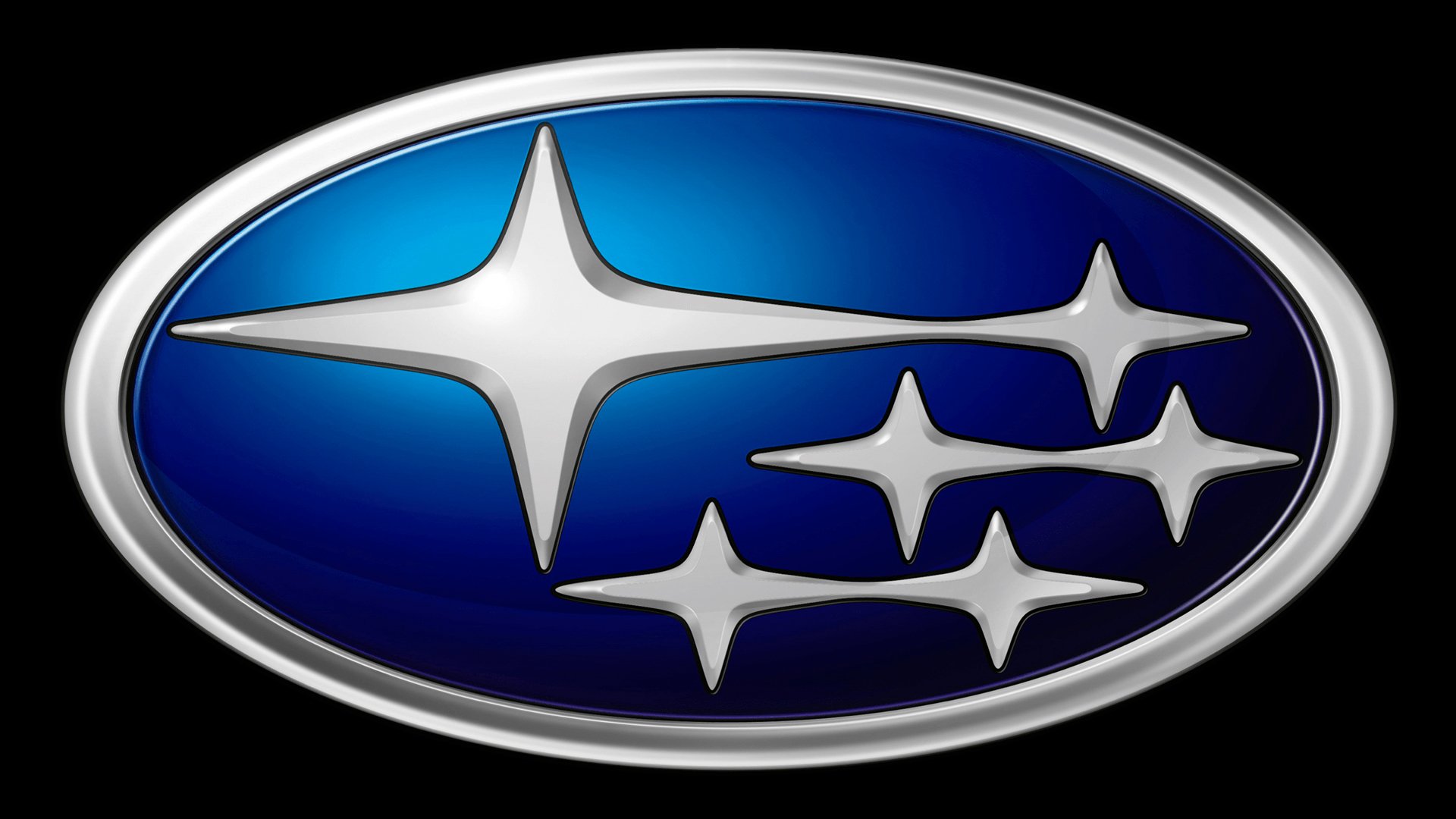
The symbolism of the logo, as it has already been mentioned above, is the visible Pleiades (6 stars), that is 6 companies merged into Fuji Heavy Industries which actually became a mother company for the brand. The blue background simultaneously performs the functions of the symbolic “sky” and “sea” (“the reflection of stars in the sea water makes them more accessible”, as one of the popular Japanese sayings says about the necessity to set ambitious but achievable goals).
As for the joining the stars on the logo in pairs, it means both cooperation with the partners of the company and cooperation with customers.
Emblem
When choosing the basic form of the emblem, designers deliberately moved away from the heraldic structure which is more familiar to the Europeans, as well as from a perfect circle. It is an oval, stretched horizontally, that has a special significance for Japanese culture. It is both harmony and stability (including respect for the best traditions) and yearning for perfection. Indeed, the Subaru logo, precisely because of its form, turned out to be as informative as possible for the target group ‒ the eastern consumer.
What concerns the placement of the stars on the logo, originally it repeated the location of the brightest stars of the Pleiades constellation. Now it has been changed to suit the rules of design. A whole segment on the left side of the logo was allocated for the brightest star, while the others are concentrated on the right side.
Font
The function of the font in the Subaru logo is to emphasize the symbolic image and make the information about the name clear for the consumer in the most comfortable way. Even those who are not familiar with this brand can easily read the font used in this design structure. The thickness of all the lines is the same, and this fact definitely indicates to Japanese consumers that the name has a secondary meaning (the thickness of any hieroglyph is variable, and therefore at the symbolic level the font used for Latin letters emphasizes the European consumer focus). It is the image that is primary and carries the most important information, including symbolic information.
Color
In the logo the main color is blue. On the one hand, it is the color associated with the sky, on the other hand ‒ with water. In addition, blue was interpreted in Japanese culture as a mystical, supernatural color.
The second most important color is white. It is the color of light and the sun, an imperial color.
Black, used for the font, mostly appeals to European culture, and symbolically refers to aristocracy and dignity.
What does the Subaru logo represent?
The Subaru logo is a stylized graphical representation of The Seven Sisters constellation. The badge features six silver stars, as one of the stars in the galaxy is invisible. Another meaning, hidden behind the number of stars on the Subaru badge is the number of the company’s founders. Subaru was formed as a result of a merger of two businesses, the Fuji Heavy Industries, with five founders, and FHI with one.
Is Subaru owned by Toyota?
Not exactly. Only twenty percent of Subaru is owned by Toyota. Although, if his amount doesn’t sound very significant, it should be specified, that Toyota is the largest shareholder of Subaru.
Why are there only six stars on the Subaru logo?
The Subaru badge depicts The Seven Sisters Galaxy but has only six stars in it. This is because the seventh star of the constellation is invisible. Also, six is the number of Subaru’s founders, hence the badge is also a representation of the company’s history and roots.
Is Subaru an Australian company?
No, Subaru is a Japanese company, which was established in 1953, and is headquartered in Ebisu, Shibuya. The company has nothing to do with Australia, even though the cars of the brand are very popular in that part of the world.


