The Stockton Ports (Cal League) were founded in 1941 as the Stockton Flyers. In 1946 they became the Stockton Ports which is their current name. Though, there was a period (2000-2001) when the franchise was called the Mudville Nine.
This baseball team’s location has always been Stockton, California. The name “Ports” is homage to the city’s in-land seaport, the largest in California.
Meaning and history
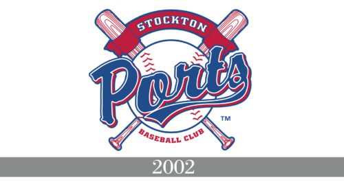
The primary logo that the Ports have had since 2002 is classic and conservative, and they are not inclined to abandon this traditional look. Their customary red, blue and white color scheme is easily recognizable.
The imagery includes a baseball against the background of two crossed bats, a red banner on the top with the word “Stockton” written in white and the wordmark “Ports” across the baseball. The “Ports” is in a blue westernized script trimmed in white and red. The letter “S” has a long stylized tail that looks like a ribbon worn on the Navy uniform. The wordmark “Baseball Club” in red is beneath the baseball.
To some extent the logo resembles a ship’s steering wheel. One feels it embodies the team’s deferential attitude to the city and at the same time is baseball-oriented.


