The ice hockey team Stockton Heat has had only one primary logo since it acquired its current name not long before the 2015/16 season. The franchise, which has more than 50 years of history, is a relocation of the Adirondack Flames.
Meaning and history
Stockton Heat was a professional ice hockey club playing in the Pacific Division of the American Hockey League’s Western Conference from the 2015-16 to 2022 season. It was based in Stockton, California, USA, and was the NHL team’s Calgary Flames farce club.
But the club’s history dates back to the 1970s when it was established under the name Maine Mariners, which changed to Utica Devils in 1987, and Saint John Flames in 1993. In 2005 the team moved to Omaha, being renamed Omaha Ak-Sar-Ben Knights, and in 2009 — Quad City Flames. The next chapter of the club’s history lasted from 2009 to 2014, when it was called Abbotsford Heat, then for a very short time — Adirondack Flames, which finally turned into the Stockton Heat in 2015. This name has become “past” in 2022, after the club got renamed Calgary Wranglers, and completely changed its visual identity.
What is Stockton Heat?
Stockton Heat is an American professional ice hockey team based in Stockton, California. They compete in the American Hockey League (AHL) and serve as the primary affiliate of the NHL’s Calgary Flames. The team is known for its vibrant gameplay and role in developing future NHL talent.
1977 — 1987
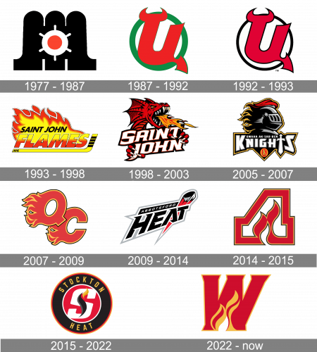
The first logo was created in 1977 and featured a bold and solid black red and white composition, with the sea theme as the main one. The red and white ship steering wheel was drawn on a black smooth background with arched shapes. No lettering was added to the badge, which made it look stylish and memorable.
1987 — 1992
The redesign of 1987 introduced a new concept of the club’s visual identity. It was a badge in a fresh green and red color palette with both elements of the logo placed on a white background. The main “hero” was a stylized monogram, which resembled a Russian letter “Ц” and had its left bar stretched on top and curved, creating two bull horns. The red elements was enclosed in a green circular frame of a medium thickness.
1992 — 1993

The contours of the logo were refined and the color palette switched to a more elegant and timeless one in 1992. The stylized signifier remained untouched but got outlined in black, which made its lines look stronger and neater. Now it was placed on a white background and enclosed into a black circular frame, which was way thinner than on the previous badge.
1993 — 1998
The logo, introduced in 1993, had a completely different style and structure. It was a colorful yellow and red badge with the yellow hockey stick placed horizontally and forming an underlined for the stylized two-leveled logotype. The upper part of the inscription featured solid black “Saint John” in the uppercase of a traditional bold and slightly slanted sans-serif typeface, while the bottom “Flames” was written in thicker lines, using a yellow and red gradient for its capital letters and a thin black outline. The whole logo was accompanied by a wide frame image coming up from the inscription.
1998 — 2003
A new symbol was adopted for the club’s logo in 1998 — a red dragon with the flame coming out of its mouth was drawn above and behind the sharp uppercase logotype in white, with a black and red outline. It was a cool and elegant logo with pointed angles, arched lines, and full shapes. The red Sharon represented power and determination and showed the club as a strong and dangerous competitor.
2005 — 2007
The redesign of 2005 was made for the new team’s name, Omaha Ak-Sar-Ben Knights. The badge featured a profile of an armored knight drawn in gradient gray and black and placed above the banner with a wordmark. The lettering was set in a custom typeface with the letter “I” replaced with a sword pointing down. The whole badge was outlined in yellow, which allowed placing it on almost any background.
2007 — 2009
In 2007 the name and logo of the hockey club were changed again. The new concept included only two stylized overlapping letters in red and yellow, with left parts of both letters drawn as flames. Both elements of the logo featured a thin black outline, which made the badge look cleaner and more confident, creating a delicate and elegant contour and contrast.
2009 — 2014
The logo for the Abbotsford Heat hockey club was introduced in 2009. It was a sharp Iago ally placed wordmark banner with a red black and white graphical element — a hockey puck with a sharp red trace, placed vertically above the last two letters of the “Heat” part. The inscription was set into two levels, with the “Abbotsford” in all capitals of a classic sans-serif font written in white on a solid black background, and an enlarged stylized “Heat” with sharp cuts and angles, outlined in white and gray.
2014 — 2015
The club’s name was changed to Adirondack Flames in 2014, so the need for the new visual identity design appeared again. The badge of this season featured a stylized letter “A” in red, with the smaller white letter as its negative space and a delicate smooth stylized flame in it. The letters featured a double yellow and black outline both from its outside and inside.
2015 — 2022
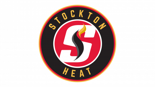
The Stockton Heat logo is based on the roundel shape. A large “S” with black and yellow flames can be seen in a red circle with the white outline. The emblem, in its turn, is placed inside a black ring housing the name of the team in yellow.
2022 – Today
The Stockton Heat hockey club was renamed Calgary Wranglers in 2022, and the logo was changed in the same year. The new concept of the club’s visual identity is still based on the flame theme and red and orange color palette, but with the enlarged stylized capital “W” being the main element now. The solid red letter in a thin yellow outline is placed against a plain white background and features two delicate yellow flames at its bottom. The badge has no additional lettering.
Colors
While the palette extensively uses yellow and red, the two colors most often connected with everyone’s idea of heat, it also features black and white as additional colors.


