The franchise was founded in 1976, as a result of a lawsuit. The city of Seattle and the state of Washington sued the American League for breach of contract. The word “Marines” was discovered among more than 580 versions submitted during a contest.
Meaning and history
The logo of the baseball team Seattle Mariners has almost always been based on the “sea” theme. While in the earlier versions, it was represented by a trident, the current logo sports a compass.
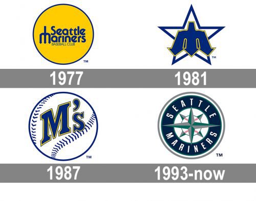
1977 — 1980
 The original Seattle Mariners logo, which was used in 1977-1980, featured a dark blue trident serving as the letter “M” in the word “Mariners.” The name of the team, together with a smaller lettering “Baseball club,” was placed inside a circle with the dark blue outline and the bright yellow filling.
1981 — 1986
 The trident “M” probably seemed a smart idea, as the team refused to get rid of it in 1980 when a new logo was being developed. The trident acquired a completely different shape, though. It was now much bolder, with more pronounced triangular “arrows.” The trident itself was dark blue, while its outline was yellow. The emblem was positioned over a dark blue star with the white filling. This time, the old Seattle Mariners logo didn’t comprise any text at all.
1987 — 1992
 As you probably know, the players of the team are nicknamed the M’s – the fact that was reflected in the 1987 logo. Here, “M’s” was featured on a big white basketball with the dark blue outline and seams. The letters were dark blue with a yellow outline.
1993 — Today
Not only did the 1993 logo introduce a new color scheme, it brought about an entirely different approach to the design. This time, a pointed compass is used as the core “sea” metaphor. The designer has managed to create a link between the sea theme and sport by placing a baseball inside the compass. Being white, with subtle red streaks, it doesn’t seem intrusive or overbearing.
Seattle Mariners Cap Logo
Font
The condensed sans serif type seen on the wordmark appears to be a modified version of the Compacta Regular font, which was created by Fred Lambert and published by the type foundry Linotype. The Seattle Mariners logo, though, features a different typeface comprising cleaner sans serif letterforms.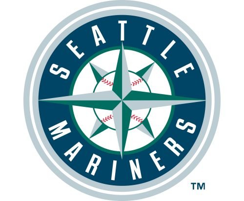
Colors
The list of the franchise’s official colors includes Navy Blue, Metallic Silver, Northwest Green, yellow, and cream. While yellow and cream can’t be seen on the primary logo, they are present on the alternative emblem.
Seattle Mariners colors
NAVY BLUE
PANTONE: PMS 289 C
HEX COLOR: #0C2C56;
RGB: (12, 44, 86)
CMYK: (100, 60, 00, 56)
NORTHWEST GREEN
PANTONE: PMS 7721 C
HEX COLOR: #005C5C;
RGB: (0, 92, 92)
CMYK: (100, 00, 47, 47)
SILVER
PANTONE: PMS 877 C
HEX COLOR: #C4CED4;
RGB: (196, 206, 212)
CMYK: (5, 00, 00, 20)
RED
PANTONE: PMS 199 C
HEX COLOR: #D50032;
RGB: (213, 0, 50)
CMYK: (00, 100, 65, 00)
Why did the Mariners change their logo?
The logo of the Seattle Mariners club has been redesigned several times throughout the years, with the original version introduced in 1977, changed in 1981, redesigned again in 1987, and finally, rethought to the version we all can see today in 1993. The latest redesign was held in order to create a more logical graphical representation of the club’s name, emphasizing the “Mariners” part.
What are the Seattle Mariner’s colors?
The Seattle Mariners club has six official colors: Navy Blue and Royal Blue, Metallic Silver, Northwest Green, Yellow, and Cream. All of the colors apart from yellow and and cream can be seen in the logo of the club, and all 6 are used for the uniforms of the players.


