

![]() RCA Logo PNG
RCA Logo PNG
Although the RCA brand has a rather long history, its logo hasn’t been altered all that much since the company name was changed from the Radio Corporation of America to RCA in 1969.
Meaning and history
![]()
RCA is an abbreviation for Radio Corporation of America, the first name of the company, established in 1919. The short name started to be in use in 1929, so the history of the RCA visual identity can be split into two main periods, — the beginning and the modern era.
1919 — 1929
![]()
The logo for Radio Corporation of America was introduced in 1919 and featured an extended horizontal badge with the bold black lettering and an emblem between the words. The lettering was set in two levels, with the “Corporation” enlarged and the “of America” set as a tagline, under the right part of the main level. The rounded serif typeface of the wordmark looked smooth and friendly, and was balancing the sharp black underline, composed of two stylized zig-zag lighting bolts, coming out from the emblem, which was placed between “Radio” and “Corporation”. The emblem featured a delicate image of a globe with a “WorldWide Wireless” lettering on it.
1929 — 1968
![]()
The name of the company was changed to RCA in 1929, and this is when the need for a new visual identity appeared. A bright yet laconic emblem was created in the same year and featured a solid red circle with a double white and red outline and a white monogram in the middle. The lettering was executed in a custom serif typeface with the left bar of the letter “A” elongated at its bottom part, and stylized as a lighting bolt.
There was also a monochrome version of this logo, but when set in black and white, the circle had no outline.
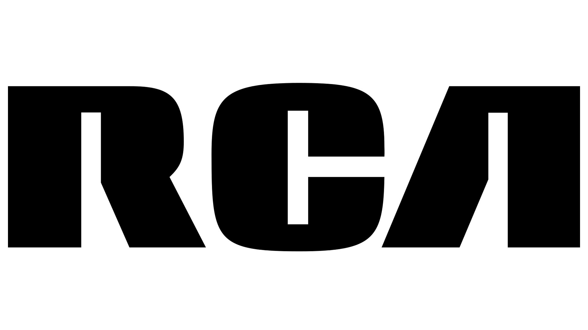
1968 — Today
![]()
Today the company uses the logo, created in 1968, and it is definitely the most laconic and minimalist version among all three. The RCA lettering in an extra-bold custom sans-serif font is the only element of the current brand’s visual identity. The wordmark is usually set in black and placed on a white background, but sometimes it is executed in red on white, or white on red. The most unique thing about the inscription is in the shape of its inner parts. With no horizontal bars, the upper segments of “R” and “A” have rectangular shapes and resemble of keyholes.
Current emblem
While the emblem is still based on the company name, the letters have hardly anything in common with the previous version. The typeface is bold and solid; the lightning bolt shape has disappeared. The shade of red has become lighter.
Font
The RCA logo was definitely drawn by hand and doesn’t look identical to any of the existing typefaces.


