 Public Broadcasting Service Logo PNG
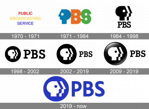
Although the Public Broadcasting Service has gone trough a succession of logotypes, in fact, almost all of them have been built around the so-called P-Head.
Meaning and history
The US Public Broadcasting Service was established in 1952 as the National Educational Television and Radio Center. The most distinctive of its four logos was probably the one with a stylized depiction of a house.
1970 – 1971
 The first Public Broadcasting Service logo introduced after the service adopted its current name (1970) was just a wordmark in red, yellow, and blue on a black background.
1971 – 1984
 As soon as in 1971, though, a new emblem created by Herb Lubalin was introduced. The design featured the letter “P” resembling a human face, while the shape of the letters “B” and “S” was almost regular. The emblem nicknamed the “Tri-Colored Everyman P-Heads” also comprised the full name of the company in the ITC Avant Garde Gothic type, also developed by Lubalin.
1984 – 1998
In 1984, the logo went black and white, while the head was turned so that it faced forward. The design developed by Chermayeff & Geismar also featured two additional facial outlines (a white one and a black one).
In the 1998 version, the logo was placed inside a black circle. The 2002 redesign resulted in altered proportions.
1998 – 2002

The logo, designed for Public Broadcasting Service in 1998, was based on the previous version but extended. The monochrome emblem got placed on a solid black circle and accompanied by a “PBS” lettering, executed in a modern gravimetric serif typeface and set on its right. The wordmark was written in black and added balance to the whole image.
2002 – 2012

In 2002 the composition of the PBS logo remained untouched, as well as its color palette, though slight refinements were done. Now the circular black and white emblem was enlarged, and the inscription got smaller, so the elements switched their “leadership” on the service’s visual identity.
2009 – 2019
In 2009, they decided to take their previous logo and make it a 3D picture by adding illumination effects inside the black circle, making it look more like a button.
2019 – Today
The redesign of the 2019 balanced emblem and lettering in terms of size and switched the color palette of the monochrome logo to bright blue and white, these all-black elements are now colored electric blue, which makes the whole image brighter and evokes a sense of reliability and competence. Another thing that was changed in 2019 is the typeface of the wordmark, and now the PBS lettering is executed in a clean and simple sans-serif.
Font
Although the company states its official typeface is PBS Explorer, the logotype actually features a different font. The logo font is a perfectly legible serif type with slightly unusual serifs, while PBS Explorer is a sans serif type. The current logo font was designed by Chermayeff & Geismar specifically for PBS in 1984.
Color
While some of the earlier versions included lively colors, the current Public Broadcasting Service logo comprises the white symbol on the black background. The 3D version of the logotype involves grey and white nuances.


