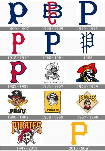
Almost all the logos the professional baseball team Pittsburgh Pirates has had so far have belonged to one of the two categories: they featured either a capital “P” or a stylized pirate’s head. Although there’ve been around twenty modifications so far, only the original logo represented something different than the two groups mentioned above.
Meaning and history
The visual identity history of Pittsburgh Pirates is pretty intense, considering the number of its emblem’s redesigns, though all of the versions created can be divided into just two groups: the “P” and the Pirate Portrait. Both groups have an equal amount of badges, executed in different styles and colors.
1900 — 1907
The very first Pittsburgh Pirates badge depicted a dark blue wishbone “P” with its vertical bar forked at the bottom. The letter was executed in smooth sharpened lines can which looked modern yet elegant and strong.
1908 — 1909
In 1908 the wishbone “P” was replaced by a PBC monogram, where the blue “B” was enlarged and red “P” and “C” were placed over it one under another’s the ends of the letter lines were fancy widened and slightly arched, which added individuality to the simple composition.
1910 — 1914
The single blue “P” comes back to the Pirates’ visual identity in 1910, changing its style to a classy yet strict serif, with clean contours and square cuts of the edges. The elongated serifs of the “P” made it look solid and confident.
1915 — 1919
The redesign of 1915 changed the Royal blue color of the emblem to the scarlet red, which made the redrawn in a wishbone style “P” evoke a sense of passion and determination, along with elegance represented by its smooth lines and pointed ends.
1920 — 1921
In 1920 the royal blue color comes back to the Pirate’s logo. As for the contours, the new “P” gets more geometric and strict, which shows the strength and determination of the club, pointing to its professional qualities and confidence.
1922
In 1922 there was another experiment with the style of the blue letter “P”. The new logo featured a gothic typeface with thin lines, which added sophistication and style to such club’s qualities as reliability, expertise, and solidness.
1923 — 1933
The red color comes back to the Pirates’ logo in 1923, and this time it is the main color of the bold wishbone “P” with a thick blue outline. The clean and modern contours of the letter make it look stylish and sleek, while the bright color palette represents power and passion.
1934 — 1957
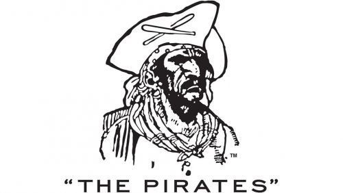
The first portrait logo was introduced by the club in 1935 and stayed with it for almost twenty years. It was a monochrome image of a pirate in a tricorne that with two baseball bats crosses on it. Under the portrait, there was “The Pirates” wordmark in all capitals of a modern sans-serif typeface with extended letters and a lot of space between them.
1958 — 1959
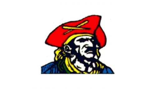
The wordmark was removed and the color palette switched from monochrome to red, yellow, and blue in 1958. The contours of the portrait were slightly refined and it became a bit wider and gained a more aggressive look. Though this version of the logo was only used for a year.
1960 — 1967
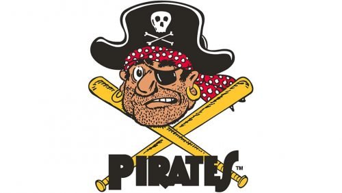
The emblem, created in 1960 always a funny pirate caricature executed in black, red, and beige. The pirate was turned to the left in ¾ and had a bit confusing face. Though it was more a humorous badge, it got recognizable fast enough and stayed with the Pirates for seven years.
1968 — 1986
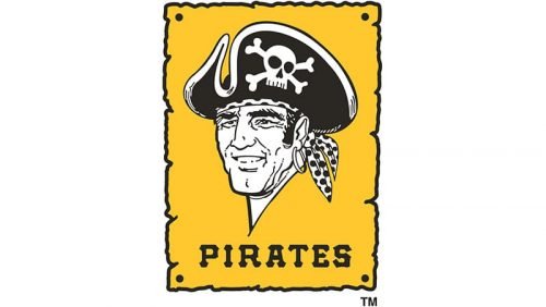
The redesign of 1968 brought a bright teal low rectangular badge to the Pittsburgh Pirates’ visual identity. It was vertically oriented and had a white and black pirate portrait in it, with the capitalized “Pirates” wordmark under it, executed in a bold typewriter-style font.
1987 — 1996
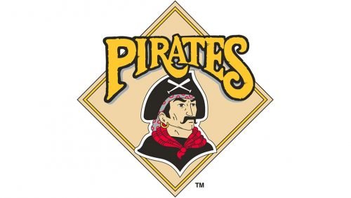
In 1987 the logo was redesigned again, and the vertical rectangle was replaced by a rhombus in pale yellow with a colorful portrait on it. The enlarged yellow wordmark in a black outline was placed on the top part of the emblem, having its bottom line slightly arched from the center; and its letters ends elongated and curved.
1997 — 2013
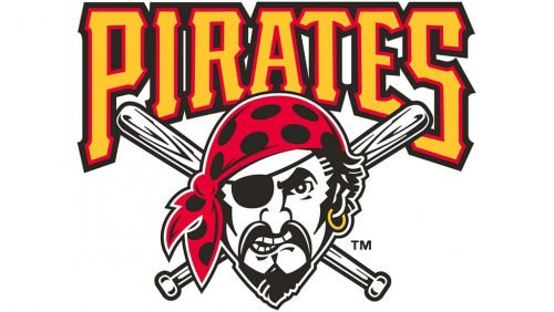
A more aggressive look was given to the Pirates logo in 1997. The wordmark gained square contours and an additional red outline, and the pirate’s face liaised dangerous and strong. The portrait was placed on two crossed baseball bats and overlapped the bright yellow lettering on its bottom part.
There were also two additional emblems used by the club during that period — a monochrome circular badge with a bright yellow “P” in the center, and a black pirate flag with the two crossed baseball bats replacing the sabers.
2013 — Today
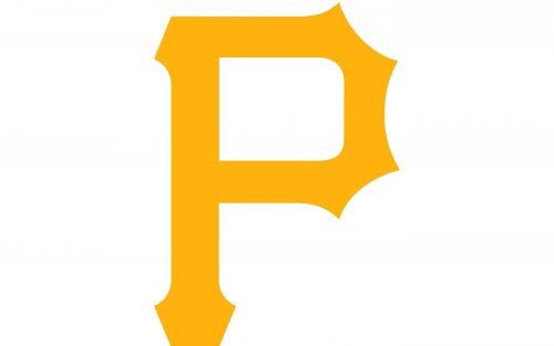
The visual identity was simplified and minimized to just one symbol again in 2013. This time it is a sleek yellow “P”, which was taken by the club from the additional emblem, created in 1997. Its custom typeface, arched bars, and sharp angles make the letter remarkable and memorable, and the new yellow color of the badge represents the energy, growth, and progress of the baseball club.
Font
A separate font was developed on the basis of the letter “P” from the logo. The type can be found in the Internet under the name of MLB Pirates. This is the typeface used on the wordmark, which features both the words of the team’s name in two lines. “Pittsburgh” is given in smaller and simpler black letters, while the lettering “Pirates” is comprised of large gold glyphs with a white and black outline. The yellow text is arched.
Color
The primary Pittsburgh Pirates logo comprises only two colors – gold and white. However, the cap insignia and the alternative logo also feature black, so it can be mentioned in the list of the team’s official colors, too.
Pittsburgh Pirates Colors
BLACK
PANTONE: PROCESS BLACK
HEX COLOR: #27251F;
RGB: (39,37,31)
CMYK: (0,0,0,100)
GOLD
PANTONE: 123 C
HEX COLOR: #FDB827;
RGB: (253,184,39)
CMYK: (0,31,95,0)


