

![]() Overwatch Logo PNG
Overwatch Logo PNG
The logo of the online video game Overwatch lends itself to numerous interpretations, as the company hasn’t given an official explanation.
Meaning and history
![]()
The game published by the US video game developer Blizzard Entertainment was introduced in the spring of 2016 for Windows, PlayStation 4, and Xbox One. However, it was actually unveiled at BlizzCon two years earlier and stayed in a closed beta version for some time.
When starting a game, every player can choose from more than 20 heroes. All the players are divided into teams comprising six members.
The game is Blizzard’s 4th major franchise. We can mention that prior to the release of Overwatch, in 2014, the company canceled the role-playing game Titan.
What is Overwatch?
Overwatch is the name of a popular video game, created by Blizzard Entertainment in 2016. Overwatch is an online game, where you team up with other players to win. The first-person shooter has its versions available for various consoles and PC operating systems.
Description of the emblem
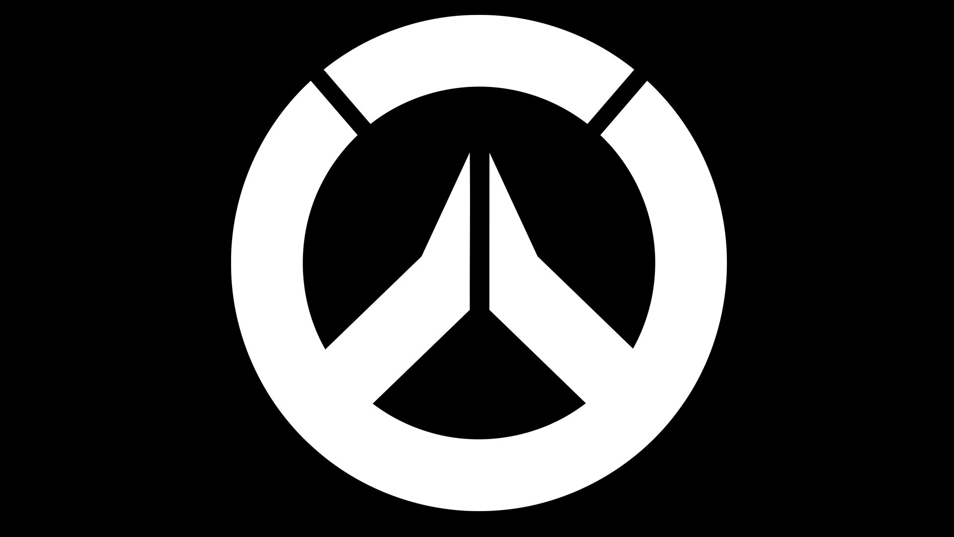
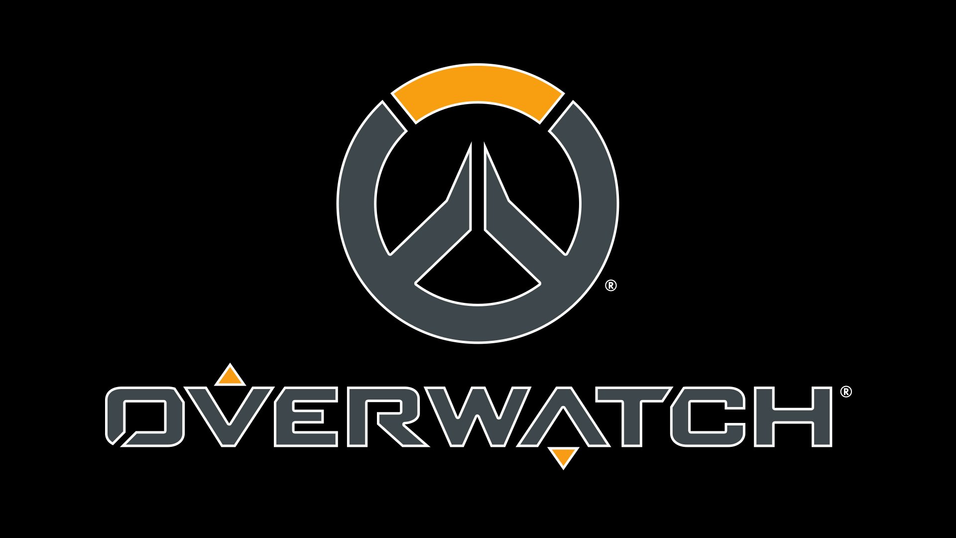
The complete version of the logo consists of the two parts: the emblem and the wordmark. Both are a combination of orange and dark grey. The emblem is a bold circle with two white gaps. The top part of the circle is orange. There is a symmetrical design inside the circle divided into two parts by a white gap.
Possible explanations of the symbol
As far as there’ve been no official comments on the topic so far, fans are free to suggest their own interpretations. Let’s see what the logo actually looks like. Thus, we will be able to make a couple of hypotheses as to the emblem’s possible meaning.
- The letter “W” superimposed on an “O.” This explanation makes perfect sense, taking into consideration the two parts that can be clearly identified in the name of the video game (“Over” and “Watch”).
- The peace sign. This can be explained by the fact that the Overwatch group’s original mission is to stop conflicts and keep the peace.
- The central part of the emblem may symbolize two hands put together, possibly praying for peace, while the gold top may represent the rising sun of hope.
- Some fans noted that the central part of the logo also looks like two hands high-fiving, which may represent teamwork (Overwatch is definitely a team-based game).
- In addition to all these explanations, we can point out that the overall roundel logo looks somewhat similar to a circular Spartan shield. The inner part of the “w” design seems to support this hypothesis, as it looks very much like the Greek letter “lambda.” The “lambda,” which is the equivalent of the letter “L,” stood for “Lacedaemon or Laconia” (the name of the place where Sparta was located).
Flag
The flag is based on the Overwatch logo. The logo is placed on the dark blue background. The flag could be seen in the official Cinematic Trailer.
Icon
For the icon, Overwatch uses its iconic recognizable emblem, which is executed in a gray and yellow color palette, and set on a gray background. The only difference between the emblem and the icon is in the gray shades. The elements of the circle on the icon are executed in a light silver shade, while the background is dark gray.
Font
![]()
The wordmark features a custom typeface. Interestingly enough, it looks somewhat similar to the letters used in the Nintendo/Namco/Sega’s Triforce system’s logo, with only subtle modifications.
The most characteristic glyph is probably the “A” looking like a “V” placed upside down. We can also point out the “R” and the “O” with the white gaps, the square “C,” as well as the “E” with a shorter central bar. Also, the angles in some letters are cut (“O,” “C,” “E”).
What does the Overwatch symbol mean?
There is quite a bunch of versions on the real meaning of the Overwatch logo. For some there is nothing but the stylized “OW” abbreviation, for others it’s a steering wheel, some see a Pacific sign in the badge. There is even a version with the Spartan shield taken as a basis for the Overwatch logo design. One more version says it looks like a greeting with two hands. Whatever the real meaning is, the Overwatch badge makes you look at it, explore it and think of it.
What is the font of the Overwatch logo?
The heavy uppercase lettering from the primary Overwatch logo is set in a bold futuristic sans-serif font with horizontally-extended shapes of the characters, softened angles, diagonal cuts, and interesting triangular horizontal bars, which fall out of the letters. The logotype is set in a custom font, which has something in common with such types as Winner Sans Wide Extra Bold, or 946 Latin Wide, but with significant modifications of the contours.


