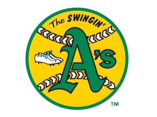
For most of its history, the logo of the professional baseball team Oakland Athletics has been based on one of the two motifs: an elephant or a capital “A.” The “A” insignia, in one form or another, has been used as the primary Oakland A’s logo since 1968.
Meaning and history
The Oakland Athletics visual identity is a derivative from the logos of Philadelphia Athletics, established in 1901, and Kansas City Athletics, which appeared in 1955, after the club’s relocation. During all three wars the team used one mascot for its logo — an elegant, but its color palette and execution varied from one redesign to another.
1901
The very first logo, created for Philadelphia Athletics, boasted a bold blue letter “A” in a traditional serif typeface with smooth angles and thick lines. The massive serifs at the bottom of the letter’s bars were a bit rounded but still looked solid and stable.
1902 — 1919
The redesign of 1902 made the “A” more classy and elegant, arching it right bar and elongation its tails, curving the upper one to the left, and the bottom — upright. The serif of the left bar was also emboldened and wavy.
1920
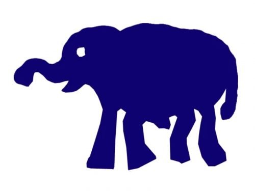
In 1929 the blue “A” gets an additional emblem — a solid blue elephants’ silhouette, drawn amateurish yet fun. The animal was facing to the left and drawn walking.
1921 — 1923
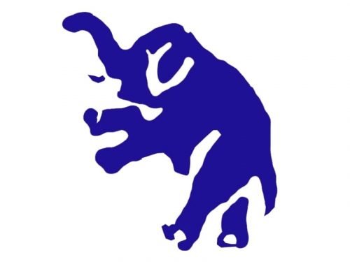
The elegant changes its pose in 1921, and the contours of the image were strengthened, making it more realistic and detailed. The color palette remained the same and the elegant blue “A” was still in use by the club.
1924 — 1927
In 1924 the color palette of the graphical emblem was switched to monochrome, though the “A” was still executed in blue and placed whether in a pale blue or white background.
1928 — 1930
For two years starting in 1928 the Athletics were not using an elephant emblem and made the blue elegant letter their main logo. It was the “A”, completely repeat ion the one, used in 1902, but in an elevated and brightened shade of blues which looked more energetic and modern.
1930 — 1938
The redesign of 1930 brought the elephant back, but removed the “A”. The animal was now drawn in a modern and confident style, having it’s blue contour thick and distinct.
1939 — 1953
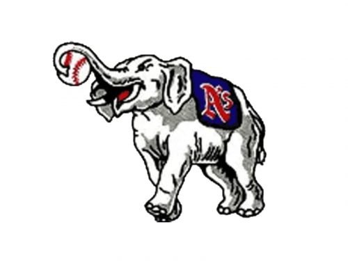
In 1939 the emblem gained a new color palette — some shades of gray and red were added to the elephant image, plus there was a small but important change — the animal was holding a baseball. The blue “A” was also used by the club during that period.
1954
The composition of the logo was changed in 1954. The animal was now standing on an enlarged baseball and was holding a bat with his trunk. The color palette was also refined and the blue gain a darker shade, while the red became a dominant color, representing professionalism, passion, and power.
1955 — 1962
In 1955 the club relocated to Kansas City, and the name change is followed by the visual identity redesign. The contours of the previous emblem were slightly modified and the elegant got colored red, while the white ball got its stitches in black.
1963 — 1967
The redesign of 1963 completely changed the Athletics visual identity, removing the elephant and switching the color palette to green and yellow. Now two ornate overlapping letters “KC” in bright green were placed on a white background and enclosed into a thick yellow circular frame.
1968 — 1982
Kansas City Athletics become Oakland Athletics in 1968. Despite the name change, the club decided to keep the color palette of the previous version, placing a smooth and sleek green “A’s” on a yellow baseball. On the left of the letter there was a white pair of sports shoes placed, and above — the black arched “The Swingin’” inscription.
1983 — 1992
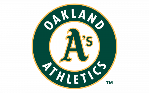
The gothic-style “A’s” remains in the center of the logo after its new redesign in 1983. The letter was now drawn in yellow and outlined in green and had the “Oakland Athletics” in all capitals written around the circular green frame of the badge.
1993 — Today
With the redesign of 1993 green becomes the main color of the Athletics’ logo. The “A’s” is now outlined in yellow and placed on a white circle, enclosed into an emboldened green frame with the white wordmark in sand-serif capitals on it.
Font
The highly legible sans serif type looks very much like a customized version of Gill Sans Bold Condensed.
Color
The three colors of the Oakland Athletics logo are Kelly green, yellow, and white. The combination of green and yellow was chosen by the team’s infamous owner Charlie Finley in 1963 instead of the standard for this kind of sport blue-and-red combination used before.


