The baseball team Milwaukee Brewers has gone through several logotypes, the 1978 version being probably the most well-known of them.
Meaning and history
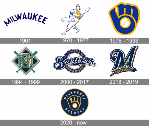
Milwaukee Brewers, established in 1970 as Seattle Pilots, has a very colorful and versatile logo timeline, which includes seven completely different badges, and only two of them are based on one symbol, while with others the club experimented a lot.
1901
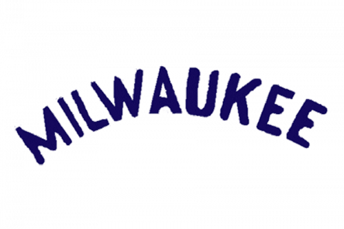
The initial logo was the word ‘Milwaukee’ written at a curve. The letters were all capital, blue characters that used a regular sans-serif font.
1970 — 1977
The first logo, created for the club after its relocation, featured a funny and cool caricature of a baseball player with a bat, executed in the white, blue, and yellow palette, which reflected energy, professionalism, progressive approach, and sense of humor of the club.
1978 — 1993
The redesign of 1978 introduced a new Milwaukee Brewers emblem, consisting of a stylized fist, formed by two lowercase letters, “M” and “B”, with the negative space of the “B” with a white and yellow ball in it. The main color of the new badge was bright blue, which looked delightful and dynamic in a yellow outline.
1994 — 1999
After more than a decade of using the previous logo, the club decided to bring something new to its visual identity and represents a strict geometric badge in 1994. It was a blue, gold, and green rhombus with two crossed baseball bats and a sharp and sleek monogram on it. The intertwined “MB” abbreviation was executed by a stylish serif font with the edges of the letters slightly elongated and pointed. The new color palette of the logo looked professional and chic, evoking a sense of creativity and success.
2000 — 2017
Another emblem was designed for the club in 2000. It was a traditional circular badge with a white and Ted baseball in the center and a white blue and gold frame with the wordmark around its perimeter. The enlarged script “Brewers” inscription was written in blue and gold and placed over the emblem.
2018 — 2019
In 2018 Milwaukee Brewers start using their secondary emblem, created in 2000, as the primary one. It was a smooth and chic letter “M” with its upper bar curbed, executed in royal blue and outline in white, with a delicate golden shadow. The “M” was underlined by a gold ear in a blue outline, which was a graphical representation of the club’s names and its symbol.
2020 — Today
The logo that the club introduced in 2020 is fully based on the version from 1978, and depicts a stylized “MB” fist placed on a dark blue circle in a yellow frame. The “Milwaukee Brewers” wordmark in white is arched around the badge’s perimeter and executed in a custom serif typeface with a clean straight line and a very confident and strict mood.
Font
The wordmark “Brewers” features a unique custom script, while the lettering “Milwaukee” above is made in a traditional sans serif font.
Milwaukee Brewers Colors
YELLOW
PANTONE: PMS 136 C
HEX COLOR: #FFC52F;
RGB: (255, 197, 47)
CMYK: (0, 23, 90, 0)
NAVY BLUE
PANTONE: PMS 533 C
HEX COLOR: #12284B;
RGB: (18, 40, 75)
CMYK: (100, 87, 42, 41)


