The Miami Marlins is one of the most well-known professional baseball teams in the US. It has been playing in Major League Baseball since 1993. For about 20 years the club was known as the Florida Marlins and used an emblem based on the image of the marlin fish. In 2012 it adopted a new logo, following the team’s rebranding as the Miami Marlins.
Meaning and history
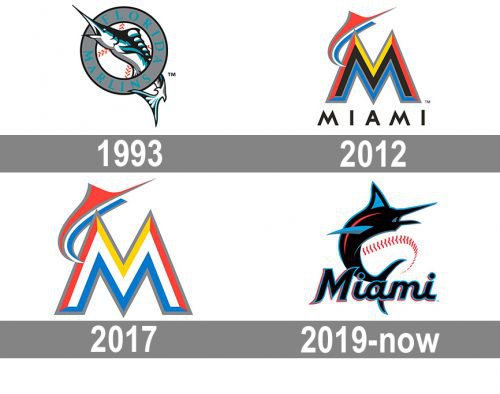
The baseball club, created in 1993 as Florida Marlins, has been pretty constant in its visual identity design and only created four logo versions, which reflect the evolution of the team, throughout its history. The first redesign was held after the change of the club’s name, so it was logical, while two more refinements were held to show the growth and development of the club, and its ability to keep a reinforcing connection to its roots.
1993 — 2011
The original logo of the club boasted a light and fresh badge, composed of an image of a marlin’s in black, sea-blue, and white, piercing a circular frame, where the wordmark was written around the perimeter. In the middle of the badge, there was a white and orange baseball, filling the negative space of an emblem.
The turquoise lettering on a light gray framing was written in all capitals and featured a classy and bold serif typeface with elegant thick lines and sharpened edges.
2012 — 2016
The club changed its name to Miami Marlins in 2012 and introduced its new logo in the same year. It was a very modern and colorful emblem, composed of an enlarged letter “M” in a striped bright pattern, with a stylized marlin placed above it left peak. The color palette of the new badge consisted of orange, blue; yellow, and black and was balanced by a minimalist and solid “Miami” lettering placed under it. The alternate version of the logo had its orange elements replaced by red ones.
2017 — 2018
The redesign of 2017 replaced the black elements of the logo with the white ones, removed the “Miami” lettering, and made the light gray outline of the “M” and the “Marlin” a bit wider and more visible. The emblem was fresh and delightful and evokes a sense of speed, energy, and joy.
2019 — Today
In 2019 the logo of the Miami Marlins was significantly changed. The light and bright “M” was removed and now the black and blue marlin became the main element of the badge. It is drawn in a sleek modern shape with sharp lines and the perfect balance of colors. The “Miami” wordmark got back to the logo, but now it is executed in a smooth custom cursive with some tails sharpened.
The whole composition is accompanied by a red line of stitches, which are placed on a white background and represent the baseball.
Font
The 2012-2016 version of the insignia included the word “MIAMI” in black lettering. It was given in a sleek sans-serif all-cap type.
Color
According to Jeffrey Loria, who owns the club, the current palette reflects the colors of Miami, the colors of sunsets and the ocean. This explanation seems quite logical for the combination of red, yellow, blue, and orange used in the current Miami Marlins logo.


