

![]() MGM Logo PNG
MGM Logo PNG
MGM (Metro Goldwyn Mayer) is an American media corporation. It started with the merger of Samuel Goldwyn’s studio with Marcus Loew’s Metro Pictures and Louis B. Mayer’s company (1924).
Meaning and history
![]()
Metro-Goldwyn-Mayer (MGM) – The greatest American media company, whose movies everyone is sure to have seen. The world-famous media company was opened not by a simple guy from the big road, but already the owner of a chain of movie theaters Marcus Lev. In 1924, it organized the merger of three film producers – Metro Pictures, Goldwyn Pictures, and Louis B. Mayer Pictures.” In this corporation, Mayer was appointed head of film production in California, and Nicholas Schenck (Marcus’ companion) was busy setting up movie theaters on the East Coast.
Louis Mayer’s first task as director of the new studio was to complete the shooting of the biggest-budget film in the history of silent movies, “Ben-Hur: The Story of Christ”, a project he inherited from Goldwyn Studios. The triumph of “Ben Hur” allowed MGM to overtake Universal Studios as the largest U.S. studio by revenue.
The famous roaring lion first appeared on the company’s logo in 1916. It was originally the symbol of Goldwyn’s company, and the motto for Metro-Goldwyn-Mayer was borrowed from them: “Art for Art’s Sake”. This lion went down in history as “The Original Leo the Lion”.
Due to the mass spread of television in the late 1950s, there was an exodus of viewers from movie theaters. The studio system was legally equated with monopoly, and under pressure from the state MGM was forced to give up its own network of cinemas. Three years later, the company recorded a loss for the first time.
This time began a gradual but irreversible decline of MGM, accompanied by a reduction in its share of the national film market.
In 2010, the company’s leaders recognized the inevitable: they no longer hide that MGM – bankrupt with a debt of $4 billion. On account of the film company 205 Oscar awards, including 15 – for best film.
1924 – 1964
![]()
The original Metro Goldwyn Myers logo was created in the middle of the 1920s and featured two independent parts, a logotype, which was used mainly for the official documentation, and an ornate emblem, which could be seen on the company’s products and posters. The logotype was written in two different typefaces, with the “Metro” and “Mayer” parts in an Art-deco style serif font, with the vertical bars of both letters “M” elongated, and the “Goldwyn” was set in elegant cursive with smooth shapes and curved tails.
The second emblem for the company featured a circular badge with the lion’s head on it and the wide framing with the “Ars Gratia Artis” slogan. The bottom part of the emblem was decorated by several smooth ribbons, and the badge with the wordmark in a classic frame was placed under them.
1924 – 1984
![]()
The redesign of 1924 brought a more ornate framing for the wordmark and had the lion’s head replaced with the laying animal’s silhouette. The “Picture” tagline was placed under the logo, underlined by a curved and pointed line. Two torches were placed on both sides of the horizontally stretched banner with the nameplate, adding elegance and romance to the whole logo look.
1939
![]()
There was also a one-off emblem in 1939 which pictured a ring as if made from ribbons, with two more ribbons protruding from its each side near the bottom. Beneath this ring of cloth, there were also two laurel wreaths, but straightened out into something like ears of wheat.
Inside the ring, there was a majestic head of a lion, and above its head there was the Latin saying that goes ‘arts for the sake for art’.
1964 – 1966
![]()
The logo from the 1960s featured a simplified version of the original emblem, depicting the lion’s head in a black circular frame and two black ribbons coming out of its bottom part to both sides. There was no wordmark on this version, and it made the badge look lighter and more balanced.
1966 – 1982
![]()
In 1966 the company adopted a modern style badge, where the lion in bold black and white lines was placed on a circle with no framing. The “MGM” wordmark was placed under the emblem, executed in a medium-weight sans-serif typeface with traditional shapes and cuts of the letters.
1982 – 1986
![]()
The logo, introduced in 1982, used the framing with ribbons from the original version, but the lion’s head was redrawn and now the animal had its mouth open, roaring. The enlarged wordmark in two levels was set under the emblem, with the “MGM/UA” in all capitals of the bold serif typeface, and the “Entertainment Co” placed under it, between two horizontal lines. The tagline was executed by a title-case of a simple and modest sans-serif font.
1984 – 1985
![]()
Another version of the 1980s had the same emblem, but the lettering was removed. Instead of the wordmark, there was one more ribbon under the rounded badge, where the “Entertainment Co” inscription was placed. The main nameplate was written around the lion’s frame perimeter.
1986 – 1987
![]()
In 1986 the company used the emblem, created in 1982, but with the “UA” lettering removed. All the other features remained the same, including the framed lion and the style of the nameplate, though the “MGM” inscription got extended and gained a delicate outline.
1986 – 1992
![]()
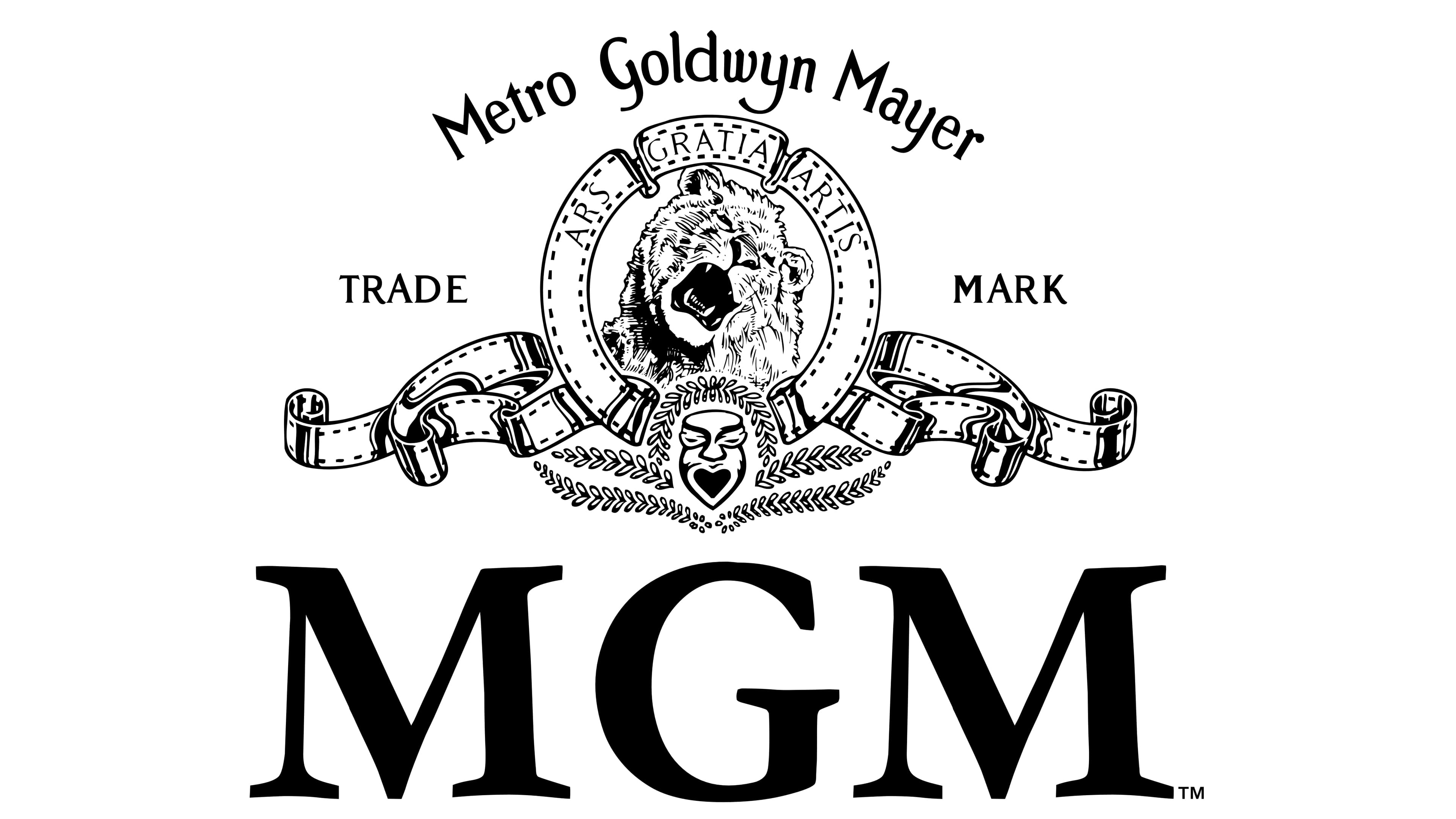
The ornate and classy version of the logo was introduced in the same, 1986, year. It was the iconic lion’s badge in ribbons, but with the lettering arched above it, and with the “Trademark” inscription placed on its left and right. Another change of this year was in a black and white mask, placed under the lion’s portrait, between the ribbons.
1992 – 2021
![]()
The contour of the emblem was cleaned and refined in 1992, making the image of the roaring lion more distinct, and the mask — slightly enlarged and more visible. The contours of the ribbons were redrawn more confidently, and the logo we all can see today looks timeless and professional.
2011 – 2021
![]()
One more change was made to the Metro Goldwyn Mayer logo in 2011, it was the same composition, designed in 1992, but with the enlarged and bold black serif “MGM” inscription under its. The wordmark of the logo uses a typeface, which is very similar to such fonts as Garamond and Poliphili.
2021 – now
![]()
The flat black-and-white MGM logo turned vivid and voluminous in 2021. The iconic gold and black combination of colors was brought to the primary version of the badge, adding gloss and a realistic image of a lion. All the elements remained the same and stayed in their place, but due to the three-dimensional shapes and metallic surfaces of the elements, it looks super sleek and bright.
Symbol
There is hardly a more expressive way to symbolize power, excellence, and beauty than by including a living lion in the MGM logo. The lion’s head appears inside a ribbon-shaped circle, and there is curling ribbonwork extending from it to both sides.
Font
![]()
The font is made conspicuously simple to draw a viewer’s attention.
Color
![]()
The matte gold color of the elements that make up the MGM logo complements the natural color of the lion’s fur.


