Maserati is a high-end automobile marque, which was established in 1914 in Italy and today is considered to be one of the world’s most popular luxury cars manufacturer. The brand is owned by Fiat Chrysler Group since the beginning of the 1990s and has its presence on all the continents.
Meaning and history
Like most of the luxury car brands, Maserati has found its symbol in the very beginning. The iconic Neptune Trident has been on the brand’s logo since the 1920s, and by today it became the symbol synonymous to “creme de la creme” of the automobile industry.
The iconic symbol was adopted by the Maserati brothers as a tribute to their home, Bologna, and the famous Fountain of Neptune, where the god of the sea is depicted with his trident.
1926 – 1937
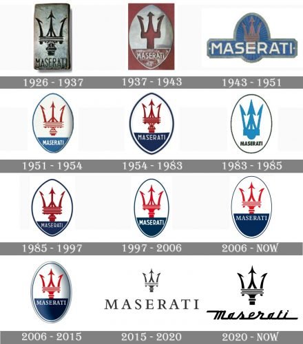
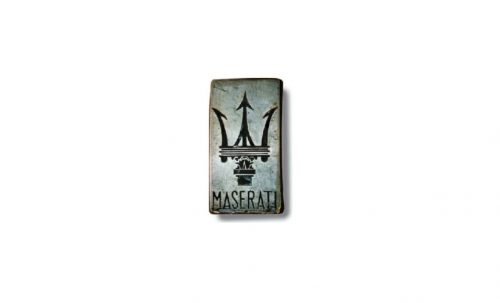
The logo, introduced by the brand in 1926, was composed of a vertical rectangle in silver metal with a very detailed image of a trident and a thin wordmark in sans-serif under it. The lettering was executed in all capitals and looked modern and laconic, balancing the ornate and sharp symbol.
1937 – 1943
In 1937 the logo was redrawn and the oval appeared inside the rectangle. The trident became simpler and bolder, and the wordmark was now placed on the bottom part of the oval, which was separated from the upper part with a horizontal line.
1943 – 1951
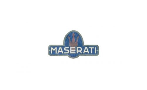
The redesign of 1943 brought a new color palette to the Maserati visual identity. Now the red trident was placed on a blue oval, which was crossed by a horizontal rectangular badge with the white massive inscription. The wordmark in sans-serif featured its capital letters solid and extended. The whole badge was outlined in silver-gray.
1951 – 1954
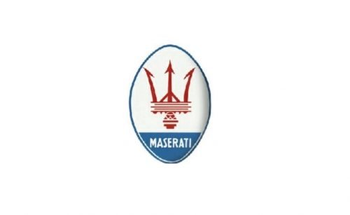
In 1951 the badge was redrawn again. Now the red trident repeated the one from the very first emblem but was executed in red and placed inside an oval, which was horizontally divided into two parts — the biggest, in white, where the image was placed, and the small blue on the bottom, where the white delicate wordmark was written. The oval was outlined in blue.
1954 – 1983
The emblem was refined in 1955, by changing the shade of blue to a darker one and enlarging the bottom blue part of the oval. The lettering was also enlarged and became more visible now.
1983 – 1985
The logo, introduced in 1983 did not last long — this experiment only lived for two years. It was a simplified version of the previous logos, featuring a light blue trident in thick lines, placed in a white background with black bold inscription in its bottom part. The white oval badge was outlined in black in order to balance the solid lettering.
1985 – 1997
The badge from 1954 comes back in 1985, but with its lines and contours cleaned and modified. The “Maserati” inscription in white was now executed in an elegant and lightweight sans-serif typeface, which looked delicate and modest, yet evokes a sense of style and luxury.
1997 – 2006
All the elements of the badge were enlarged and refined in 1997. The egg-like shape turned into a narrow oval, and the wordmark gained a bolder typeface, which made the whole image more balanced.
2006 – Today
The bottom blue part of the oval got extended in 2006, white the red trident became more delicate and light. The wordmark in white changed its typeface to a serif one, and now the sharp serifs of the letters resembled the dents of the iconic brand’s symbol.
2006 – 2015
In 2006 the brand makes its badge three-dimensional by adding gray gradient shades. The size of the letters is slightly smaller than on the previous version, but it doesn’t affect the balanced look of the sleek badges
2015 – 2020
The redesign of 2015 simplified the logo to a flat emblem with no framing. The massive logotype is complemented by a trident, placed above the letter “E”. All the elements of the new logo are executed in dark gray.
2020 – Today
In 2020 the logo is being redesigned again. The gray color palette is switched to black-on-white. The contours of the trident are being slightly modified, making the lines a bit longer and sharper. The main change of 2020 in about the wordmark, which now is executed in a custom cursive. The inscription in the title case has all of its letters connected to each other on their bottoms, which evokes a sense of speedy movement and progress.
Interestingly, even on the very first logo of the brand the base of Trident is heterogeneous. Where the Neptune staff flows into the Trident was a radiator grille, that is why the Trident was separated from the base. However, Mario Maserati, the creator of the logo, wittily emphasized the place of the transition by triple lines (“3” as a symbol of perfection and harmony). Subsequently, the triple line separating the harpoon from the base remained until the latest versions of the logo.
Symbol
According to various sources, the symbol of Maserati had appeared in 1909 or 1914, with the advent of a small family business of production of automotive motors. The company was named Società Anonima Officine Alfieri Maserati and has got the original logo with the Trident.
Thanks to the deep symbolism of this image, the original logo of Maserati has been preserved throughout the life of the company. Neptune was known as the deity of the sea and the wind. He showed his power using his magic Trident in respect of the of marine animals, waves and wind. In the eyes of our distant ancestors, the Trident was seen as an instrument of power, because in the hands of Neptune it meant success for those to whom the sea deity patronized, and for all others – a threat. Indeed, the Maserati symbol has become a real competitive threat to all sports car manufacturers.
Emblem
The original shape of the Maserati emblem was a vertically elongated oval and it remained virtually unchanged. The only fundamental change was short-lived – for about four years the Maserati emblem had smoothed, but still corners at the top and bottom. Thus, the creators had tried to give to the logo more similarity to the classical heraldic forms.
It is also interesting that sports and racing cars – perhaps the only area of technology in which Italy and Germany were constantly competing. German Mercedes and Italian Maserati have divided up the prizes of the majority of car racing 1920-1930-ies. And this despite the fact that Mercedes had extensive government support, and Maserati remained a small private manufacturer.
The latest version of the Maserati emblem acquired volume. Even on two-dimensional images, a shadow had appeared, emphasizing the convex nature of the logo.
Font
The font of the Maserati logo has been changed in different periods of the company, but not fundamentally. The color of the font has remained-it was always white on a blue background, as well as the fact that all the letters are the same height and, as well as the logo itself, look a little more slender.
Color
The original emblem of the Maserati was black and white – black Trident located on white background. However, quite quickly, the image became two-toned – the lower third of the oval received a blue fill, where the font name of the brand was placed. The Trident became red, and subsequently changed only the shades of these basic colors. Moreover, for a short time the background of the logo was also colored – ivory. However, later the company refused such additional color load. The combination of blue, white and red colors was more than enough to achieve the main objective of the logo – to attract attention while emphasizing the dignity and aristocracy of the brand.
What inspired the Maserati logo?
The iconic Maserati logo was inspired by the beautiful Fountain of Neptune, located in the center of Bologna, the city, where the founder of the brand, Mario Maserati lived. The Neptune on the fountain was holding a trident, which became the main symbol of the automaker and an inevitable part of its visual identity.
Where did the Maserati logo come from?
The logo of the Italian luxury automaker was originally created by the company’s founder, Mario Maserati, and redesigned several times throughout the years, getting a more modern and distinctive shape. As for the initial idea of the badge design, it was inspired by the Fountain of Neptune, one of the landmarks of the Italian city Bologna, the Maserati motherland.


