

![]() Makita Logo PNG
Makita Logo PNG
Makita is one of the oldest Japanese companies in the power-tool manufacturing segment. It was established in 1915 and keeps taking the leading positions on the market today. The company is mainly known for its cordless tools, and has its production facilities and distributing offices all over the globe.
Meaning and history
![]()
The Makita logo has been pretty consistent throughout the years, and it’s bright red and white color palette stays with the company until now. The combination, evoking a sense of power, strength, and progress, suits the brand like nothing else, perfectly reflecting its character, values, and purpose.
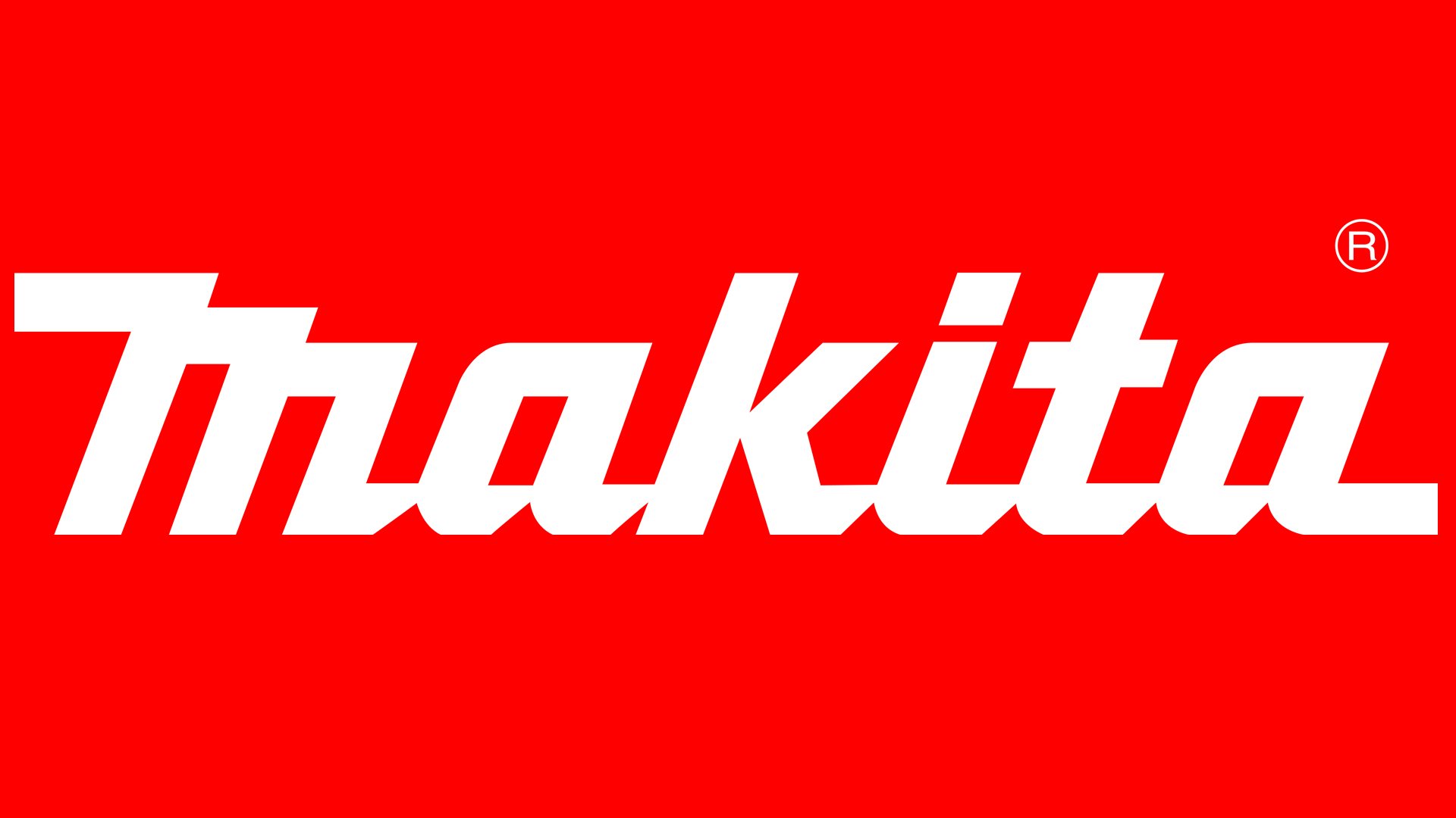
The Makita logo is composed of a stylized white inscription placed along the bottom side of the solid red rectangle, which is horizontally stretched. The simplicity of the composition is balanced by the unique elegant shapes of the letters and the brightness of the emblem’s palette.
Symbol
Makita has been using the same wordmark for a rather long period of time. It features the company name in red against the white background. An inverted color scheme is also possible.
Emblem colors
The Makita logo is based on the company’s corporate color, the bright shade of red that goes with the code Process DS73-1C in the Pantone system. The shade of teal that was used for the emblem earlier is not approved by the current brand guidelines.
Font and color
The typeface of the title-case Makita inscription is a custom cursive, resembling of Japanese hieroglyphics. Their bottom parts are arched down, being smooth and rounded, they are balanced by the straight cuts and angles of the letters, and square inner parts of the elements. A no other interesting detail of the wordmark is its first letter, “M”, which looks like stairs, as its upper horizontal bars are placed on two different levels. The font, which is pretty similar to the unique Makita typeface, is Aromicaboy Regular.
The red and white color palette is something very common for Japanese brands, as it is a scheme of the national Japanese flag, a tribute to the rising sun, and a celebration of the traditions and roots. But it also is one of the most powerful combinations, which points to the brand’s progressiveness, passion, and professionalism, along with loyalty to its customers.


