

![]()
Lufthansa Logo PNG
Deutsche Lufthansa AG is the EU’s largest airline by fleet size, which exceeds 270 aircraft. The number of destinations in Germany is around 20, while the number of international destinations reaches 200. In 1997 the airline became one of the founding members of Star Alliance.
Why is Lufthansa’s logo a crane?
The iconic crane logo of Lufthansa, designed by the renowned graphic designer Otto Firle in 1918, symbolizes elegance and precision. Initially created for Deutsche Luft-Reederei, the first German airline, this timeless icon reflects the company’s rich heritage and commitment to excellence. The crane, chosen for its significance of good fortune and longevity in many cultures, quickly became a globally recognized symbol, encapsulating Lufthansa Group’s ethos. Today, it graces the livery of the fleet, proudly representing Lufthansa’s legacy from its Frankfurt hub across Europe and beyond.
Meaning and history
![]()
The reputable German carrier boasts a unique and instantly recognizable visual identity, which is composed of an emblem, designed in 1918 and a strict and elegant wordmark. The company didn’t have many redesigns throughout its history, just two, which kept the original idea and mood, but not the color palette.
The iconic emblem for the airline was designed by Otto Firle, a German artist, and was first adopted by the predecessor of the company, Deutsche Luft Hansa, in 1926. The EMS ken was composed of a circle with a stylized image of a crane, flying up left, with its wings also up.
What is Lufthansa?
Lufthansa is one of the largest European air carriers, which was established in Germany in the middle of the 1950s. Today the company, based in Munich, has a fleet of almost 300 planes and makes flights to more than 200 destinations in 78 countries of the world.
1953 – 1963
![]()
Lufthansa as the company was formed in 1953 and adopted its first logo in the same year. It was a yellow crane placed above the yellow wordmark on a dark blue rectangle.
The wordmark was written in all capitals and executed in a strong and solid serif typeface, which is very similar to Circe Slab font, with its elongated serifs and bold confident main lines of the letters.
The yellow and blue color palette of the original logo was a reflection of progressiveness, creativity, and speed, along with protection and reliability, the calm blue stood for. It was a very well executed and powerful logo, which perfectly reflected the purpose and main principles of the German air carrier.
1963 – 2018
![]()
The redesign of 1964 brought a new style to the company’s visual identity, keeping the iconic symbol untouched. The crane was now enclosed in a circle frame and placed on the left of the wordmark in the title case.
The main color palette of the new logo was composed of a classic blue on a white background, there were also two additional schemes, used by the group — monochrome for printed documents and blue on yellow, which made the airline stand out from the list of its competitors.
The major change was made to the lettering. The nameplate was now written in a bold and modern sans-serif typeface, which is pretty similar to Helvetica and Sequel Sans. The font with clean and neat lines and contours accents on the company’s professionalism and expertise, reflecting the German quality and responsibility.
2018 – Today
![]()
The current Lufthansa logo was created in 2018 by Ronald Wild. And again — nothing was changed dramatically, the only minor redesign was held. The frame of the emblem I now thinner, the lines of the crane are refined, which makes it look more elegant and adds a contemporary feeling.
As for the logotype, Helvetica font is replaced by a custom sans-serif, which also has traditional and bold lines, but adds a unique and individual feature to the whole visual identity.
The color palette of the logo is still blue on white or monochrome, but the yellow and blue version is not in use anymore. It is replaced by white on yellow, a crispier and fresher combination.
What animal is on the Lufthansa logo?
The Lufthansa logo features a crane, an animal meticulously chosen for its positive connotations across different cultures. This emblem, crafted by the esteemed graphic designer Otto Firle, was originally conceived for Deutsche Luft-Reederei, heralding the dawn of commercial aviation in Europe. The crane’s depiction is not only a nod to the pioneering spirit of the Lufthansa Group but also symbolizes the airline’s dedication to safety, reliability, and innovation. From its roots in Cologne to its status as a leading global airline, the crane logo remains a testament to Lufthansa’s enduring values and commitment to connecting worlds.
Luftag acquires symbol and name
The Deutsche Luft Hansa company was liquidated in 1951, but its name and emblem were bought three years later by a German airline, Luftag (Aktiengesellschaft für Luftverkehrsbedarf), created in 1953. So, in 1954 Luftag was rebranded as Lufthansa to emphasize that it is continuing the tradition of a German main airline, although it actually wasn’t its legal successor.
![]()
Emblem
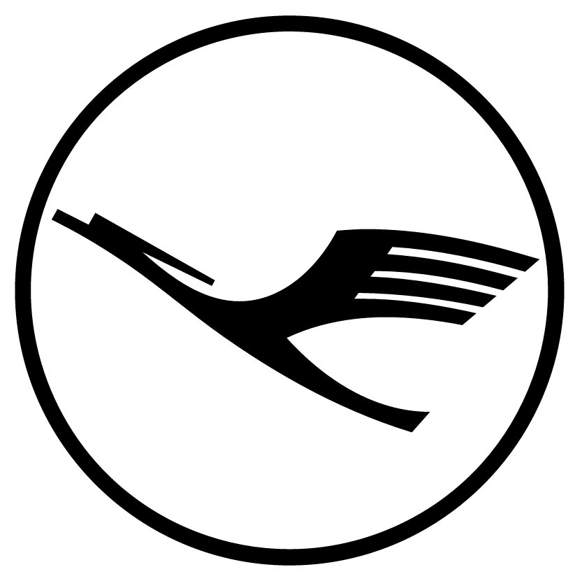
The Lufthansa logo features a bird in flight. The bird is believed to be a crane, which is quite logical, taking into consideration the bird’s long neck. Next to the encircled bird, there’s the name of the company, given in a minimalistic, legible type.
Font
![]()
The Lufthansa wordmark features a simple sans-serif type. The name of the company is capitalized, and every character looks exactly as it should. Although some may claim that as a result of this the logo doesn’t look unique or doesn’t leave a lasting impression, yet it is instantly recognizable.
![]()
Color
![]()
The combination of dark blue and a saturated shade of yellow is the core of the Lufthansa emblem. In some versions of the emblem white is also used. This is the color in which the “Nonstop you” inscription is given.
What is the bird symbol on a plane?
The bird symbol adorning many aircraft belongs to Lufthansa and represents a crane, a choice reflecting wisdom and vigilance. This emblem, created by Otto Firle, a graphic designer with a vision that transcended his time, was initially introduced for Deutsche Luft-Reederei, marking a milestone in aviation history. The crane, gracefully designed, serves as a beacon of trust and professionalism, guiding Lufthansa from its early days in Döhren to its present status as a titan of the skies. This symbol, deeply embedded in the airline’s identity, echoes through its operations, from security checks to the cutting-edge AI technologies ensuring unparalleled service, embodying the spirit of discovery and innovation that propels Lufthansa forward.


