

![]() LA Rams Logo PNG
LA Rams Logo PNG
For more than 80 years of their existence the Los Angeles Rams have changed their location several times. First it was Cleveland (from 1936 to 1946), then Los Angeles where they played for nearly half a century. In 1995 St. Louis became the place of their residence until the club returned to Los Angeles in 2016. These facts help understand the Rams logo history and explain why their name has changed several times.
Brand Overview
Los Angeles atlas is one of the most popular football clubs in the NFL. The team has two wins in Super Bowl, in 1999 and 2021, and has been pretty frequent guests in a playoff. The rams are also known as one of the most “traveled” teams in the league. The club has played in many cities.
They started in Cleveland in the 1930s and even managed to give the city the NFL title in 1945. Then the club owner actually gave the league an ultimatum – either he was allowed to move the Rams to Los Angeles and occupy a stadium with 103 thousand seats, or he closed the team, so the Rams safely moved to LA. Thus the NFL became the first U.S. sports league to be represented on both coasts.
From 1949 to 1955, the Rams reached the NFL finals four times and won it once. Then there was an era of a lull until the seventies. From 1973 to 1989, the Rams missed the playoffs only three times, but won the conference finals only once and did not win the championship.
The Rams had a rough patch in the first half of the nineties. The team was at the bottom of the standings. Many people attributed this to the fact that the stadium should have been rebuilt a long time ago, and since that never happened, the team moved to St. Louis. However, the new location did not change the situation, and for four years the Rams were still notorious as league underdogs.
Suddenly, in 1999, everything suddenly changed, thanks to rookie quarterback Kurt Warner. In three years, the Rams went to the Super Bowl twice, won it once, and had a marvelous offensive game. However, the lucky streak didn’t last long, and since 2005, the team has been listed as a loser again.
In 2016, the Rams returned to Los Angeles and soon appointed the youngest head coach in history, Sean McVay. Under McVay’s leadership, the Rams quickly became a contender. In five years, they won their division three times, made the playoffs four times, and were in the Super Bowl twice, winning it in 2021.
Meaning and history
![]()
The visual identity of LA Rams can easily be called iconic, as both original and modern versions of its logo are instantly recognizable across the globe. The initial emblem, designed for the club in the 1930s has evolved into an outstanding stylized monogram without losing its main features and connection of the team to its roots.
What are Los Angeles Rams?
Los Angeles Rams are the name of a professional football club from the United States, which was established in 1936, and today competes in the National Football League as a member of the West Division of the NFC. The club has SoFi Stadium as its home arena since 2020, and Sean McVay as the head coach.
1937 — 1942
![]()
The very first emblem for LA Rams was introduced in 1937 and featured a graphical representation of the club’s name — a ram’s head in blue and white. The lamb was drawn in profile, facing right, and had its curved horns blue with many white accents, creating a pretty realistic pattern.
1944 — 1945
![]()
The redesign of 1944 turned the animal’s head to the right and switched the color palette of the logo to yellow and blue. Now the blue color was used for the bottom part of the ram’s head, while the front line and the enlarged horns were colored yellow. The contours of the head were modernized and made sleeker and stronger.
1946 — 1947
![]()
Originally the team was based in Cleveland, and modern to Los Angeles only in 1946, changing their name to the current one. As for the logo, the LA Tams kept using its previous version, designed in 1944, for one more year after the relocation.
1948 — 1971
![]()
The logo was redrawn in 1948, replacing the blue color with white and modifying the contours of the mutton and its horns. The ram’s head was now drawn more detailed, though was all executed in monochrome, as for the yellow curved horns, they were outlined in black and had numerous black horizontal stripes over their bodies, creating a ribbed surface feeling.
1972 — 1974
![]()
The head of the sheep was turned to the right in 1972, also the color palette was simplified to just white with black outline and accents. The emblem started looking minimalist yet stylish, representing the club’s professionalism, reliability, and loyalty.
1975 — 1980
![]()
The original blue and white color palette came back to the Rams’ visual identity in 1975, drawing the head with horns in white and outlining it in blue, with come additional blue accents.
1981 — 1983
![]()
In 1981 the club changed the color scheme of its logo again, replacing white with a bright yellow, which looks delightful and energetic, showing the positive mood and progressive approach of the team, along with its strength and determination.
1984 — 1988
![]()
In the middle of the 1980s, the club decides to try something new and starts using a text-based logo, executed in the same bright blue and yellow color palette. The head of the mutton was completely removed from the official version of the logo, where now only the “Rams” inscription in blue capitals and “LA” in yellow, placed over the main wordmark, were present. The logo was usually located on a white background which contrasted with its bright palette, making it more distinct and memorable.
1989 — 1994
![]()
The experiment with the wordmark didn’t last long and already in 1989 the club introduced its new logo, which featured a colored in the blue and yellow helmet. The blue background had a curved yellow horn on its side, drawn in smooth sleek lines it looked elegant and bright. The massive grill of the helm was executed in blue and white and looked light yet safe.
1995 — 1999
![]()
The name of the team was changed again in 1995, due to its relocation to St. Louis. The new visual identity was adopted in the same year and featured two text lines, arched with a sleek blue and yellow line, resembling the elements of the previous logos. The lettering on this version boasted two different styles, with the enlarged “Rams” part in a title case, executed in a fancy serif typeface in blue, with a thin yellow outline, and a small and delicate “St, Louis”, written in yellow italicized sans-serif over a thin blue banner with its left side elongated and sharp.
2000 — 2001
![]()
The modern and trendy emblem was designed for St Louis Rams in 2001. It was a blue and dark-gold image of the ram, placed in profile facing right, with the upper part of its body and head in dark blue, with some white accents around the animal’s nose, mouth, and eyes in white. The smooth curved horn featured a dark gold shade and added sophistication to an intimidating and determined ram’s image.
2002 — 2012
![]()
With the redesign of 2002, the color palette was slightly changed, by adopting a lighter shade of gold for the mutton’s horns and outline. This made the emblem lol more elegant and friendly, though did not affect the sense of strength and professionalism it used to evoke in its first color variation.
2013 — 2015
![]()
The gold shade of the emblem was lightened up again in 2013 and now was closer to beige. Along with the change of the color, the team also introduced its newly designed secondary logo, which was composed of a stylized blue letter “R” placed on the beige-gold background. The upper part of the letter was curved, repeating the contours of the ram’s horns.
2016
![]()
In 2016 the Rams return to Los Angeles and change their name back. Both versions of the logo, introduced in 2013 were in use by the team for one more year after its rebranding, with only the logotype modified according to the name change.
2017 — 2019
![]()
The redesign of 2017 keeps the element of the previous versions untouched, but switched the gold and blue color palette to blue and white, celebrating the very first logo version of the LA Tams, though using a deeper and more intense blue shade, which evokes a sense of professionalism and luxury.
2020 — Today
![]()
Los Angeles Rams adopt a fresh visual identity design in 2020. The logo of the new generation is based on the combination of blue, yellow, and white colors, an iconic curved horn shape, and modern lettering. This mix of progress and traditions perfectly reflects the character and values of the football club, showing it as a professional and serious one, though evoking a sense of joy and energy.
The new emblem of the club is composed of a stylized “LA” monogram in gradient white and yellow, with both letters outlines in blue. The “A” has its upper line elongated and curved, just like the horn of the ram from the previous emblem designs.
The logo is also available in a reverse color palette, with blue as the main color of the letters. This variant is usually used with the “Rams” inscription on its right, which is executed in a bold traditional sans-serif typeface with a little inclination to the right.
Helmet
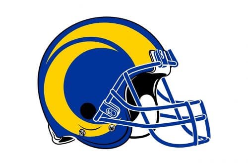
The bright glossy helmets of the Los Angeles Rams are colored in blue and yellow, with stylized ram horns on the sides. The enlarged yellow horns look very stylish and elegant, like an abstract modern pattern with smooth circular contours and sharp ends of the lines. The yellow and blue combination looks delightful and at the same time very confident, representing the strength and determination of the players.
Uniform
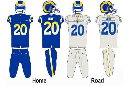
The official color palette of the Los Angeles Rams uniforms is composed of just two colors, Royal blue and sol yellow, which are usually used along with white or light-gray shades, for a lighter and more balanced look. There are three options for the players’ uniform: the color one, with both the jersey and pants in blue, with yellow accents and stripes on the sides; the white one, where the jersey is white and the pants are yellow, decorated with blue stripes; and the alternate uniform, set in light gray, with stripes set in yellow, and numbers — in blue.
Home ground
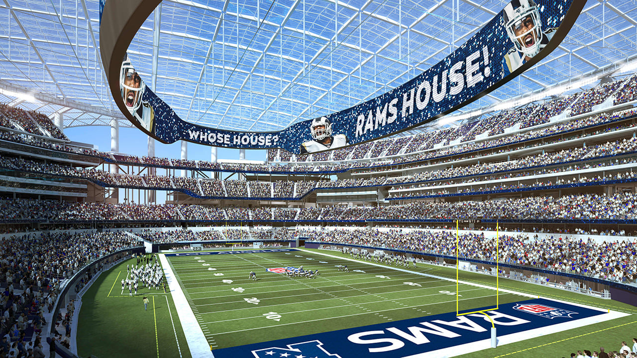
Since 2020 the team, which has probably played in the largest number of stadiums in the league, has had the SoFi Stadium as its home arena. The Rams share this super modern stadium with a capacity of 70,240 seats, with the Los Angeles Chargers club.
Before moving to SoFi, the Rams were playing in Edward Jones Dome for twenty years, and on Busch Memorial Stadium for just one season, in 1995. The 1980s Rams spent at Anaheim Stadium, and before that — at Los Angeles Memorial Coliseum, where the team then came back in 2016.
In their early years, the Rams spent on Cleveland Stadium, League Park, and Shaw Stadium (only in 1938).
Los Angeles Rams Colors
BLUE
PANTONE: PMS 661 C
HEX COLOR: #003594;
RGB: (0, 53, 148)
CMYK: (100, 90, 10, 2)
GOLD
PANTONE: PMS 137 C
HEX COLOR: #FFA300;
RGB: (255, 163, 0)
CMYK: (0, 42, 100, 0)
DARK GOLD
PANTONE: PMS 151 C
HEX COLOR: #FF8200;
RGB: (255, 130, 0)
CMYK: (0, 60, 100, 0)
YELLOW
PANTONE: PMS 109 C
HEX COLOR: #FFD100;
RGB: (255, 209, 0)
CMYK: (1, 16, 99, 0)
WHITE
PANTONE: PMS P 1-1 C
HEX COLOR: #FFFFFF;
RGB: (255, 255, 255)
CMYK: (0, 0, 0, 0)
Why did LA Rams change their logo?
The Los Angeles Rams decided to change its iconic logo to celebrate the new 2020 NFL season and the opening of the SoFi Stadium. This is how the legendary club wanted to show its fans that they are developing and growing, following the latest trends in design, and not afraid of any changes.
When did the Los Angeles Rams change their logo?
The logo of the Los Angeles Rams football club was changed in 2020, completely redesigning the iconic badge, which has been used by the team since the 1930s. The new logo of the Rams kept the curved horn element in it, placing it as the extension of the letter “A” in the stylized blue and yellow “LA” monogram.
What was Ram’s old logo?
The old logo of the Los Angeles Rams featured an image of the ram’s head, drawn in profile, turned to the right. The animal was executed in blue and white in the last version, but throughout the years, there were several versions of the iconic ram: blue and gold, blue and yellow, and simple white and black at the very beginning of the club’s historic
Why did the Rams rebrand?
The Rams decided to completely change their visual identity and uniform in 2020 to celebrate the new era in the club’s history, and to bring something fresh to the logo. It was also made to celebrate the opening of the SoFi Stadium, which was scheduled for 2020, by the beginning of the NFL 2020 Season.


