

![]() Levis Logo PNG
Levis Logo PNG
The history of Levi’s started in 1853, but it was only 20 years later that the company introduced the legendary blue jeans and a patented way of securing clothing with rivets. Several years later the company’s first emblem (the two horse label) was created. One more emblem the blue jeans manufacturer has is a red tap logo.
What is the symbol of Levi Strauss&Co?
The symbol of Levi Strauss & Co is its iconic red batwing badge with the bold white lettering written across it. Apart from the geometric minimalistic banner, the company has one more symbol — The Two Horse image, which was first introduced in 1892 and can still be seen on the labels of the brand’s denim items.
Meaning and history
![]()
Levi Strauss & Co. was founded by Levi Strauss, an immigrant from Bavaria, in 1853, during the California gold rush. This period marked the beginning of a long history that would see the company evolve from a small outfit supplying rugged workwear to miners into an iconic brand synonymous with the very concept of jeans. A pivotal moment in this journey was the collaboration between Levi Strauss and Jacob Davis, a tailor who suggested the idea of using copper rivets to reinforce points of strain in jeans. This innovation led to the creation of the first pair of Levi jeans, revolutionizing the durability of workwear and laying the groundwork for the patent that would set Levi’s apart from competitors.
Over the years, Levi’s has been at the forefront of innovation in the fashion industry, from introducing the first pair of jeans for women to engaging in collaborations that blend timeless style with contemporary trends. The company’s commitment to quality craftsmanship and authenticity has remained unwavering, reflected in its diverse range of products that cater to a global audience. Levi’s has also made significant strides in sustainability and positive change, striving to reduce its environmental impact and foster a culture of inclusivity.
Today, Levi’s stands as a family of iconic brands, a testament to its enduring legacy and its ability to resonate with generations of consumers. Its logo design, characterized by the memorable image of two horses pulling a pair of jeans in opposite directions against a dark red background, encapsulates the brand’s strength and the timeless appeal of its products. As Levi’s continues to navigate the ever-changing landscape of fashion, its focus on innovation, collaboration, and authenticity ensures its position as a leader in the industry, committed to driving positive change and inspiring a rich culture of denim enthusiasts worldwide.
Its most iconic logo was created in 1892 and is still in use by the brand today. The interesting thing about it is that the graphical part was added under the lettering for better recognizability, as many people across America, especially in its Wild West, were not able to read in English.
1853 — 1892
![]()
The very first logo for Levi’s was introduced in 1853 and featured a strict rectangular badge with the “Levi Strauss & Co” inscription embossed on it. The metal badge featured a gray background and white lettering and looked solid and powerful.
1892 — Today
![]()
The most iconic logo version for the brand was designed in 1892. This is also the most ornate badge of the label, as was created with the people who can’t read in mind.
The badge consisted of a waved capitalized inscription in bold sans-serif on its upper part, a black ribbon with a white outline, and “Original Riveted” lettering on it, some additional text and an image of two men and two horses on the bottom part, underlined by two more ribbons.
1925 — 1929
![]()
The redesign of 1925 brought a simples yet brighter logo to the brand, writing the name of the label in red with a black outline and using a rounded sans-serif typeface, which made it look friendly and playful.
1929 — 1943
![]()
In 1929 the logo was changed again, and now the inscription featured an extra-bold geometric sans-serif with straight ranges and cuts. It was executed in blue and placed on a solid red background. Each letter was outlined in black and had a thick white shadow on its right side. The “America’s Finest Overall” tagline was placed under the main wordmark in dark blue capitals.
1943 — 1949
![]()
The color palette and contours of the logo were changed in 1944. Now the lettering was in a calmer shade of blue, and the background turned light yellow. As for the tagline, it was executed in light gray but enlarged. The letters’ outline and shadows were removed, but this did not affect the brightest and contrast of the emblem.
1949 — 1954
![]()
The red and white color palette first appeared on the ale I’d logo in 1949. The bold white sans-serif inscription was placed on a scarlet-red background and had a “When There’s Work To Be Done Wear” slogan above it. The slogan was written in the lowercase of a rounded sans-serif, softening the strict logotype.
1954 — 1969
![]()
The redesign of 1954 brought a modern and stylish logo version for the famous denim brand, writing its logotype in a sleek custom typeface with softened angles and diagonal cuts of the “E”: the new tagline, “Vintage Clothing”, was placed under the brand’s name and executed in a traditional bold sans-serif font. The red color of the background on this version was darker and more intense than on the previous one.
1969 — 2003
![]()
The badge we all know today was introduced in 1969 and featured a geometric red background with white “Levi’s” lettering, with all letters, but the “E” capitalized. The simple and modest sans-serif typeface of the white inscription looked neat and calm, though the color contrast between red and white made Levi’s emblem remarkable and chic.
2003 — Today
![]()
The contours of the iconic badge were refined and the color palette elevated in 2003. The red became darker, and the badge itself — a bit wider, so did the lettering. The current Levi’s logotype is executed in a bold sans-serif typeface, which is very close to such fonts as Favela Semi Bold and Black Bull.
Red tab symbol
The red tab Levis logo was first used in 1936, eight years after the brand adopted its current name. Its characteristic shape is somewhat similar to the wings of a bat, so this emblem is sometimes referred to as the batwing logo.
The 2011 emblem
The 2011 modification of the Levis logo was made by designers from Turner Duckworth. One of the most interesting elements in the design is a “cropped” trademark symbol. It has been present in the company’s emblem for decades.
Levi Strauss chose quite a simple brand for his family business – Levi’s. The very first logo was more like a full-fledged picture – two horses looking in different directions and tied to jeans, and two people whipping horses to tear off the jeans tied to them. The later logo, located on the back of the pants and made of technical fabric, emphasized the shape of the owner’s buttocks.
Although it appeared due to utilitarian reasons (there was too little space for the whole registration mark on the small tag), eventually Levis top managers and designers whom they commissioned decided to make the “folded” “R” the signature of the brand. Due to this, as well as to the fact that the recognizable batwing shape stayed the same, the Levis logo is instantly identifiable without the need to include the company’s wordmark.
Font
![]()
The rad tab Levis emblem uses a highly legible sans-serif font. It has remained almost identical since its introduction in 1936, the most notable change being made in the shape of the “e” letter.
Color
![]()
The bright hue of red the company chose for its emblem guarantees excellent visibility as this color never fails to attract attention.
What does the Levi’s logo represent?
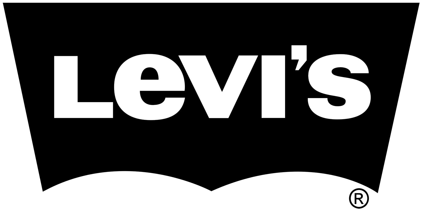
The iconic Levi’s logo is red and white represents the name of the brand, written across the solid banner in a very recognizable shape, with the pointed bottom part, adding sharpness and character to the whole composition. The heaviness of the letters’ bars balances the edgy distinctive contours of the banner, creating a harmonized look, and showing the brand as a progressive and cool one.
What is the Levi’s logo called?
Levi’s logo got its “Batwing” nickname due to the interesting shape of the red banner, with the bottom line of the trapezoid sharpened in the middle and arched on the sides. It is, probably, the second-famous Batwing emblem after the iconic Batman logo.
Why is the Levi’s logo red?
The red color was brought to Levi’s visual identity concept in the 1930s when more denim brands strayed from emerging on the market, and Levi’s had to think of ways to distinguish itself from its competitors. It started with a small red label, placed on the jeans, which worked like a quality mark for the brand’s products.


