

![]() iOS Logo PNG
iOS Logo PNG
The mobile operating system iOS was designed by Apple with the purpose of using in its own mobile devices. The list of devices where it is currently employed includes the iPhone, iPad, and iPod Touch. Although iOS is exceptionally popular, it is still used by fewer consumers than Android. Each year Apple updates the operating system.
Meaning and history
![]()
The iOS visual identity was redesigned with almost every system update, made by Apple, but always featured the brand’s wordmark, starting its launch in 2007, until today.
2007 – 2014
![]()
The first iOS logo was designed in 2007, with the debut of the first iPhone. It was the only logo composed not only of “iOS” lettering, but features a full hardware name “iPhone OS”. The monochrome lettering was executed in a traditional sans-serif Helvetica. It was clean and laconic. The brand kept using its logo until 2014, alongside other versions created in 2010.
2010 – 2016
![]()
In 2010 Apple simplifies the iOS logo, removing the “iPhone” part from it. The “iOS” lettering now executed in a two tones of silver, which makes it look alive and dynamic, adding volume to bold and thicker lines. The logo looks technological and futuristic.
2010 – 2017
![]()
Another visual identity design of 2010 features monochrome two-dimensional wordmark, which is a simple and timeless classics, and was used until 2017.
2012 – 2017
![]()
The iOS logo design of 2012 comes back to metallic and voluminous lettering, but in a dark gray color. It looks sleek and sophisticated, completely different from all the other brands on the market. Apple kept using the logo until 2017.
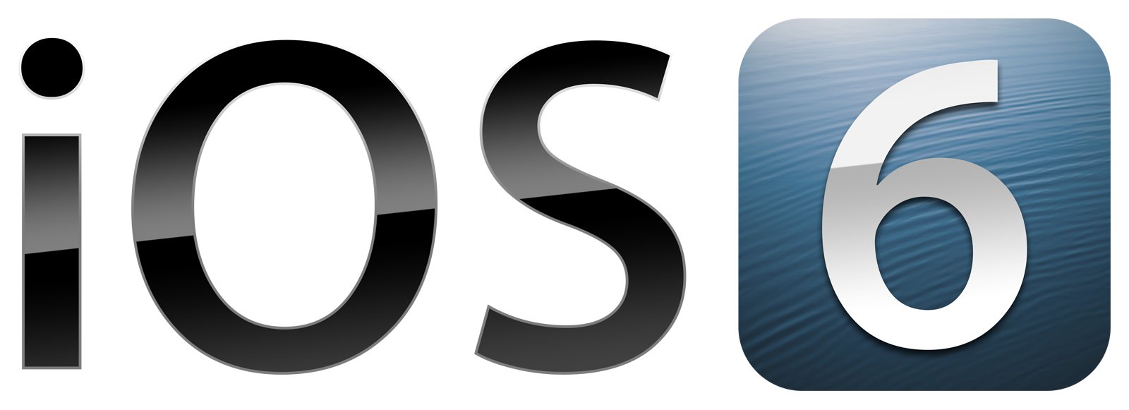
2013 — Today
![]()
In 2013 Apple starts using Myriad font with thin and fine lines for iOS logo. It looks light and elegant, the lettering is airy and sophisticated. Apple still uses the logo today.
2016 — Today
![]()
In 2016 iOS 10 was launched with the new logo, which was composed of the bolder San Francisco typeface lettering. The monochrome color palette remains, but the brand creates additional logo in thin Myriad, which features colors of the rainbow. It is playful, creative and welcoming. Both logos are still in use by the brand.
2017 — Today
![]()
The 2017 version of iOS visual identity is composed of thickened lettering in a sans-serif font, which is bright and confident in black, reflecting the brand’s influence and power.
iOS 11 Logo
![]()
With the launch of iOS 11 Apple designs a new colorful logo, which almost repeats the version of 2016, but the lettering is more compact and lines are fuller, which creates a feel of balance and harmony, yet has a playful and funny character. The logo is stylish and modern.
iOS 12 Logo
![]()
The logo for iOS12 is executed in fine lines of San Francisco, which is used both in monochrome and rainbow palette, but the colorful version is more common. Placed on a white background, it looks playful and full of joy.
iOS 13 Logo
![]()
For the 13 version of iOS, Apple uses San Francisco bold. The lines are thicker and more confident in comparison to the previous version, and the priority is still given to the rainbow color scheme, placed on white.


