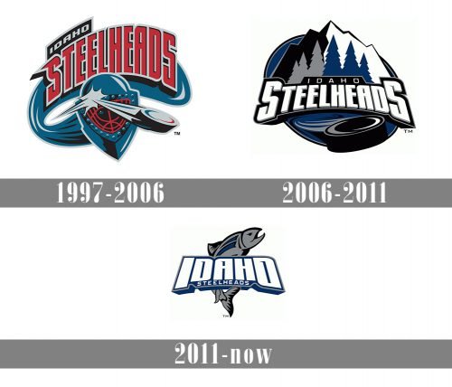
The ice hockey team from Boise the Idaho Steelheads have been playing since 1997. Their logo has changed several times since the year of their formation. All in all, there are three primary logos in their collection including versions with minor alterations.
Meaning and history
Founded in 1997, the Idaho Steelheads were aptly named after the feisty rainbow trout native to Idaho’s rivers. Their logo reflects this connection, featuring a stylized wave cresting alongside the team’s name. The Steelheads quickly carved a niche for themselves, becoming a dominant force in the West Coast Hockey League (WCHL) throughout their tenure. Their success was evident – they never missed the playoffs during their WCHL years. This impressive streak continued after their transition to the ECHL (East Coast Hockey League) in 2003.
The Steelheads’ trophy cabinet boasts two Kelly Cup championships, earned in 2004 and 2007. These victories solidified their reputation as a powerhouse in the minor league hockey scene. Currently, the Idaho Steelheads compete in the ECHL’s Western Conference, Mountain Division, serving as a proud affiliate for the Dallas Stars (NHL) and Texas Stars (AHL).
What is the Idaho Steelheads?
The Idaho Steelheads are more than just a hockey team; they’re a community anchor. They provide high-octane entertainment for Boise residents, fostering a love for the sport and a sense of local pride. As a minor league affiliate, they serve as a vital training ground for future NHL stars, contributing to the growth of professional hockey in North America.
1997 — 2006
Though the team name derives from a species of rainbow trout which is found in the streams and rivers of Idaho, their original logo didn’t incorporate any image of this fish. It featured a hockey mask, a puck bouncing off it, the Boise River and the team name at the top. A trout appeared in 2006 and only in their alternate logo.
2006 — 2011
The Idaho’s primary logo of 2006 includes the wordmark “Idaho Steelheads” against the background of mountains and trees and a puck sweeping along the river, everything in silver, white, black and navy blue.
2011 — Today
Beginning with 2011 the franchise’s primary logo is their alternate logo of 2006 with a trout (or Steelhead fish) placed vertically beneath the team name, while their primary logo of 2006 serves as an alternate one. For the 2017-2018 season the primary logo was altered with new fonts and an improved color palette in order to stay current. Thus, they eliminated black and made the lettering sharper.


