HSBC Holdings PLC is a London-based banking and financial services company and the world’s 6th largest bank by total assets. The company’s history dates back to 1866, but it was established in its current form in 1991 by The Hongkong and Shanghai Banking Corporation.
Meaning and history
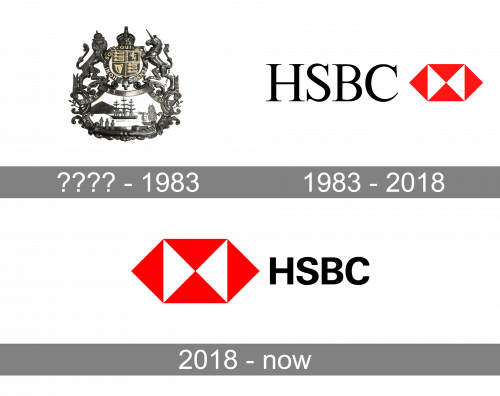
The HSBC visual identity hasn’t changed much since the date of its introduction in 1983. The only redesign, held by the company in 2018, was more about refinement and strengthening the existing structure, and elevating it to suit the modern needs.
Until 1983
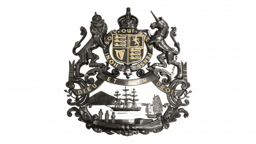
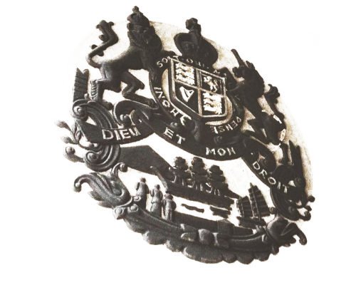
The very first logo for HSBC featured a classy old-school emblem full of ornaments and heraldic symbols. It was a small crest surrounded by numerous ribbons and with two rampant animals on the sides — a lion on the left and a uniform on the right. Under the vest, there was an image of the sea with a clipper and a boat and a triangular mountain in the background. It was a beautiful logo with thin lettering and clean contours of all elements.
1983 – 2018
The logo, designed for HSBC in 1983 was composed of a black serif lettering with elegant lines and tall shapes, and a geometric emblem on its right. The red and white emblem featured a figure, consisting of two white and four red triangles, making up a shape, resembling an opening envelope or box, or even chocolate candy.
The geometric bow-emblem was a representation of the stability and power of the financial organization, along with its passion and energy in moving further and growing. The elegant font of the logotype and its elongated serifs balanced the solid angular badge, adding a touch of elegance and traditional approach.
2018 – Today
The colors of the emblem and the typeface of the inscription were refined in 2018. The red became a bit darker, which made the whole logo look stronger and more serious, while the sophisticated serif font was replaced by a bold and solid sans-serif. The letters became a bit shorter, which made the emblem the star of the whole logo, accenting on the creativity and strength of the financial institution and its progressiveness.
Symbol
In 1998 The Hongkong and Shanghai Banking Corporation announced that it was going to use the HSBC brand and the hexagon emblem as a single brand in all the countries where it is present. According to the company, the purpose of this was to enhance recognition among customers, employees, and shareholders.
Emblem
The logo wasn’t created from scratch; it was based on the bank’s house flag. The flag comprised a red hexagon with a white hourglass shape inside. Having a closer look at the shapes, you may notice vague resemblance to the cross of St. Andrew, the Scottish flag. This is not mere coincidence. In fact, Sir Thomas Sutherland, who established The Hongkong and Shanghai Banking Corporation, came from Scotland, and he wanted this fact to be reflected in the flag. Interestingly enough, there were quite a few companies started by Scottish expatriates in Hong Kong at that time, and many of them used the cross of St. Andrew as the basis for their corporate flags.
Colors
The bright shade of red is considered the color of energy, passion and action. When performed in black, the logo accentuates elegance and perfection.
Font
The minimalistic serif typeface used for the HSBC insignia looks very much like Times New Roman or Baskerville Old Face.


