

![]() GTA Logo PNG
GTA Logo PNG
The action-adventure video game series Grand Theft Auto has a distinctive logo. Its history falls into two periods: before and after 2001.
Meaning and history
![]()
When the first game of the series was introduced in 1997, it came with a wordmark logo including the full name of the game. The words “Grand Theft Auto” were given in three lines. The color palette included shades of orange and yellow with a black outline. The characteristic flame conveyed the idea of speed.
Also, a print version of the Grand Theft Auto logo existed, which featured only black and white.
The visual identity of one of the world’s most famous video games hasn’t changed much since 2001, but before the emblem created in that year, there were two completely different logo versions, used by the brand.
1997 – 1999
![]()
The original GTA logo was created in 1997 and has been used by the game for only two years. It was a gradient yellow lettering in a bold black outline, surrounded by contoured five-pointed start and an orange and yellow flame, coming out of the middle line of the wordmark. The inscription was set in three levels and was executed in an italicized extra-bold sans-serif typeface with massive shapes of the letters.
1999 – 2001
![]()
The redesign of 2001 brought a strict and laconic logo to the video game. It was a black “GTA” lettering with the “A” in the lowercase, though the same size as two other letters, enclosed in a horizontally stretched rectangular frame with rounded angles. The “Grand Theft Auto” inscription was placed under the frame, executed in a lightweight sans-serif typeface, in black.
2001 – 2008
![]()
The redesign of 2001 mixed two previous versions in one, and now the logo was composed of a three-leveled inscription in white lowercase letters, outlines in black and glued to each other. The bold black contouring of the wordmark made it look strong and professionals and made it possible to place it on any background.
2008 – 2013
![]()
The contours of the logo were refined in 2008, by adding some light gray lines to the outline of the inscription, which added volume and dynamics to the whole picture. The letters became a bit smaller and more elegant, though did not lose their strength and confidence.
2013 – Today
![]()
The redesign of 2013 made the inscription flat again, though the contours were cleaned and refined. The new logo looks lighter and more delicate than the previous ones, showing the professional approach of the game’s developers and their attention to detail.
Font
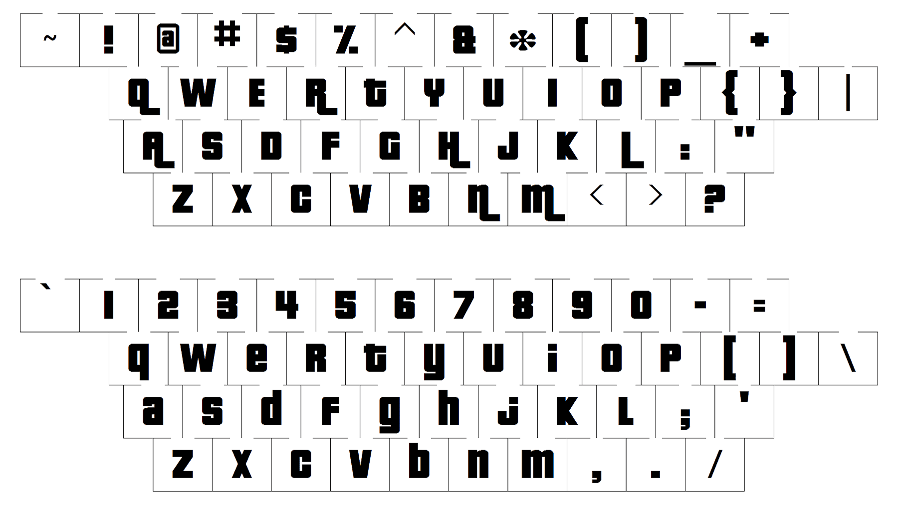
The GTA logo is a custom modification of a font known under the name of Pricedown Black by Typodermic Fonts. As soon as the original type was altered, you can’t reproduce the logo using any ready-made typeface.


