The history of the Fort Wayne Komets started in 1952 in Fort Wayne, Indiana. Since then there have been two franchises with the same name. The first franchise stayed in Fort Wayne till 1990 when they were relocated to Albany, New York to become the Albany Choppers.
Their place in Fort Wayne was taken by the Flint Spirits who had already had a five-year history as an ice hockey team. Having moved to Fort Wayne, they inherited the “K’s” name and history.
Meaning and history
The Fort Wayne Komets, a prominent ice hockey team, were founded in 1952 by Ernie Berg, a lawyer, and his partners. Originating in Fort Wayne, Indiana, this team has been an integral part of the city’s sports culture for decades. Over the years, the Komets have achieved numerous milestones, marking their journey with significant victories and titles. They have won several championships in various leagues, including the Turner Cup in the International Hockey League and the Kelly Cup in the ECHL. Notably, their 2011-2012 season was marked by triumph in the CHL, claiming the Presidents’ Cup.
Currently, the Komets are a member of the ECHL, continuing their legacy in professional ice hockey. The team maintains a robust presence in the sport, drawing large crowds and fostering a passionate fan base. Their journey from inception to present day has been marked by resilience, sporting excellence, and an unwavering commitment to their community and fans. As of now, they continue to compete at a high level, aiming to add more accolades to their already impressive history.
What is Fort Wayne Komets?
The Fort Wayne Komets are a professional ice hockey team, known for their competitive spirit and rich history in American ice hockey. Competing in the ECHL, they hold a legacy of multiple championships and continue to be a significant force in the sport.
1952 — 1970
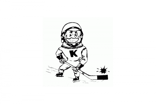
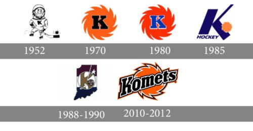
The initial logo for Fort Wayne Komets was designed in 1952 and stayed with the club for 18 years. It was a naive and simple monochrome drawing of a hockey player in the astronaut helmet and with a hockey stick in his hands. The bold black letter “K” was drawn on his Jersey, and the hockey puck was replaced by a stylized black image of the comet.
1970 — 1980
The redesign of 1970 simplified the Komets visual identity to a solid orange badge with a bold serif letter “K” written in black and outlined in white. The badge had its contours stylized as a circular blade with sharp curve ends, representing movement and dynamics.
1980 — 1985
In 1980 the contours of the badge were refined and the orange and black color palette was switched to bright red and blue. The white outline of the letter stayed in its place but became bolder, while the lines of the “K” got thinner and more elegant.
1985 — 1988

In 1985 the concept of the Komets visual identity was changed and now the main element of the badge was a dark blue stylized letter “K” set above the delicate sans-serif “Hockey” inscription and decorated by a stylized orange puck on the right.
1988 — 1990
The redesign of 1988 brought a new image to the hockey club from Fort Wayne. It was a silhouette of Indiana State with a horizontally striped pattern — dark purple, white and dark blue. In the center of the emblem, there was a white outlined circle with a stylized letter “K” and a hockey stick on it. The “Fort Wayne” inscription was written in burgundy inside a small white circle, symbolizing a puck. The logo was accompanied by a smooth white star, placed on the upper part of the badge, on the right from the central element.
2012 — Today
The current Komets logo incorporates only three colors (orange, black and white) and is simple and elegant. This fact proves that a logo does not need to have many details to look cool. The logo consists of just two elements. The first one is the name “Komets” in large black letters with white and black outlining. Each next letter is smaller than the previous one.
The second one is a background element. Some fans are skeptical about it. They say the image doesn’t look like an actual comet. But it is a fireball which is to some extent relevant to the name of the team.
People also wonder why the team name is spelled with the letter “K”. It was the first owner’s idea. His wife spelled her name Catherine with the letter “K”, so he did it after her.


