The car brand Ferrari today is associated with wealth and prosperity. A reared horse with a logo is literally known all over the world.
Meaning and history
One of the legends of the world’s luxury cars industry, Italian Ferrari, is the company, that has always been very consistent with its visual identity. The iconic symbol, designed in the 1920s has never left the automaker’s visual identity, as was put there as a tribute of the real Hero.
It is interesting that on the Barak airplane the image appeared as a kind of military trophy. The horse had migrated there from another plane, shot down by Barakka. At the helm of this very first aircraft was a native of German Stuttgart (on the coat of arms of this city is represented exactly such a horse, only slightly more fattened). However, there is also a version that the black horse adorned the coat of arms of the Barakka family.
What does SF on the Ferrari logo mean?
The SF monogram from the iconic Ferrari logo stands for “Scuderia Ferrari”, which can be translated from Italian as “Stable”, where the racing horses were kept. The Ferrari racing team is also known as Scuderia.
It is also surprising that on the first motorcycles of the Ducati brand the same symbol was used – a rearing horse (with reference to the coat of arms of the same Stuttgart). However, with the increasing popularity of the Ferrari brand, the motorcycle corporation decided to replace its own logo.
What is Ferrari?
Ferrari is the car brand from Italy, synonymous with the most luxurious and chic sports cars, which are usually designed in one of three corporate colors of the company: red, black, or yellow.
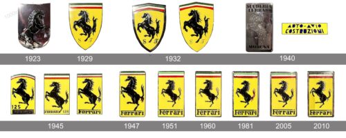
1923 – 1929
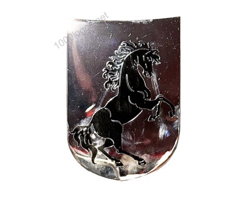
The Ferrari logo, used by the luxury car brand in the 1920s was executed in glossy metallic, with the smooth silverfish crest featuring a black stallion image on it. All the thin contours and small details of the iconic horse were also set in silver. The stallion was the only element of the logo, with no lettering or other colors added to the composition.
1929 – 1932
The black prancing horse on a yellow shield first appeared on the Ferrari cars in 1929, but not many know, that the roots of this iconic emblem are deep in the aviation industry and Italian history.
The prancing horse was the symbol, the national hero Francesco Baracca, placed on his planes during the World War I. And the horse was taken by Ferrari after the mother of the famous pilot asked about it, in order to keep the logotype about her son alive.
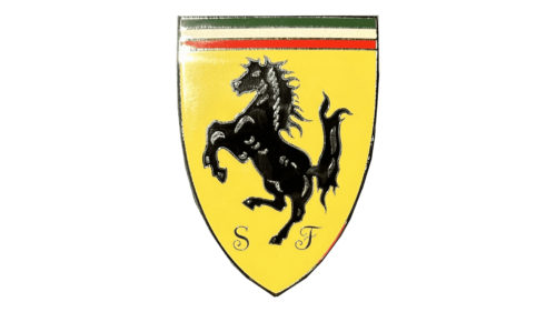
The original Ferrari logo was composed of a yellow shield with black, red, and white lines on its top and letters “S” and “F” (standing for Scuderia Ferrari) on the bottom. The black horse was placed in the middle of the emblem, drawn in profile, turning left.
1932 – 1940
In 1932 the shield was slightly modified. Its upper curved part became straight horizontal and was now colored in the Italian flag palette — green, white and red.
The horse was also redrawn with its contours more distinct and clean, all the white accents were gone and replaced by yellow. The thick black outline of the shield was removed, now the emblem looked brighter and fresher.
1940 – 1945
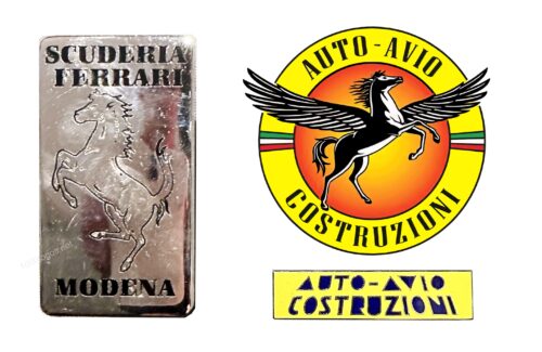
The Ferrari logo, introduced in 1940 is slightly different from all the other badges of the brand. And the main difference here is the shape. The badge from the thirties was composed of a gradient orange medallion in a thick yellow frame with a thin black outline and an elegant black “Auto-Avio Construzioni” inscription. The iconic black horse on this logo was also modified — the graceful animal was turned to the right and had two elegant widespread wings behind its back.
1945 – 1947
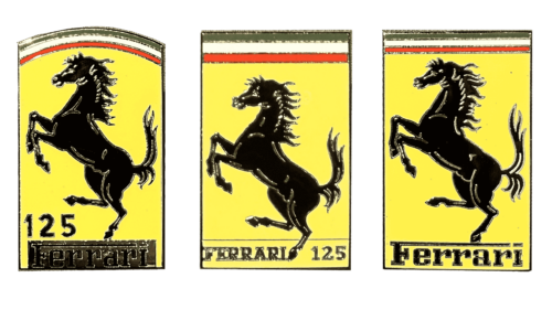
There were three options for the Ferrari logo, used by the company in the middle of the 1940s. Two of them featured a vertically oriented rectangular shape, while one had its top part with the Italian flag tricolor arched. The stallion looked more or less the same on all the options, while the lettering varied in size and the intensity of color.
1947 – 1951
The redesign of 1947 has strengthened the corners and wides of the Ferrari rectangle, and made the flag on top wider and more visible. The lettering was also refined, with the characters getting taller. As for the black stallion, it gained a thicker silver outline, balancing the outline of the letters in the insignia.
1951 – 1960
In 1951 the color palette of the Ferrari logo was brightened up, with yellow getting lighter. Also, the contours of all elements have been refined and cleaned up, creating a more professional and distinctive look for the iconic badge.
1960 – 1981
The redesign of 1960 has intensified the yellow shade of the Ferrari logo background and modernized the shape of the characters in the main wordmark, written at the bottom of the badge. The letters became taller and more elegant, balancing the graceful black horse.
1981 – 2005
In 1981 the colors of the Ferrari visual identity got intensified, with all contours cleaned up and emboldened. The vertically-oriented rectangle was now enclosed into a thick silver frame, which was supporting the outlines of all the decorative elements on the banner.
2005 – 2010
The silver frame on the Ferrari logo was redesigned in 2005, becoming thinner and glossier. With the refined contours of the rectangle, the badge started looking more elegant and exquisite, perfectly showing the essence of the luxury brand and its vision of beauty and style.
2010 – Today
The redesign of 2010 didn’t change much is the classy Ferrari logo. The contours became slightly cleaner and the only visible change was made to the flag — the black lines between green, white and red stripes were removed, which made the whole badge look smoother and more elegant.
Symbol
The main symbol of the brand Ferrari, therefore, is a horse that has got up on its hind legs. The association, which evoked in Enzo Ferrari’s contemporaries this image, can be formulated as “rampant”, “speediness” or, in other words, “speed.” However, in heraldry, this position of the racehorse symbolizes also power and victory.
Emblem
The shape of the emblem varied depending on the fashion trends in industrial design. Initially, the emblem was more like a festive flag, hung vertically from the windows of the Italian palazzo at the time of the big celebrations. On a red background there was a banner, made in the colors of the national flag. On it, in turn, the heraldically authentic image of the horse, standing on its hind legs, inscribed in the triangular form of the coat of arms, is laid out. Later the form changed, the red color was almost eliminated, but the heraldic structure (the figure on the coat of arms) was preserved in almost all variations.
1952
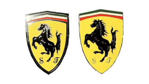
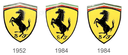
The Ferrari emblem from 1952 was executed in the shape of a classic triangular shield, slightly extended to the sides, and with the top part triangular. As on the main logo, the top part of the logo my pen was colored green, white, and red, and the main hero of the composition was the black stallion. The crest was accompanied by two black initials “SF”, written in an elegant custom font.
1984
The emblem from the middle of the 1980s was set in the same style and concept as the previous one, but with the contours of all elements refined, the letters — rewritten, and the crest getting a bit narrower and taller. With the small change in the shape of the emblem, its yellow part became even bigger and the whole image started looking more balanced.
2000
The Ferrari emblem from 2000 looked pretty much like the badge, used by the automaker in the 1950s, but with fewer silver details on the stallion. Hence, the black horse was looking brighter and more sleek. As for the two black letters, “S” and “F”, they were also rewritten but kept its elegant style and elongated bars.
Font
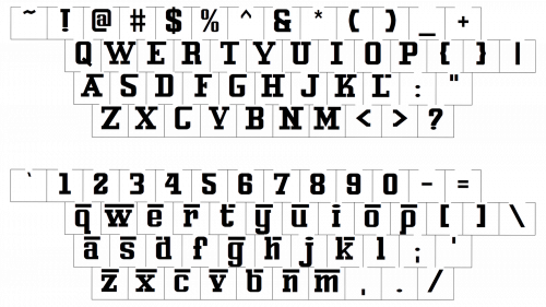
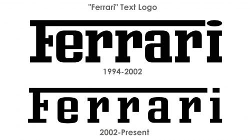
Throughout the history of the brand, the font has changed, but insignificantly. Speaking figuratively, it “lost weight”, the lines became more elegant and subtle. But the very form of font writing, in which the continuation of the first letter is simultaneously the pinnacle of the entire text element, remained unchanged.
Color
Black horse, the central figure of the logo, in its very color symbolizes power and extravagance. Equally important is the Italian tricolor that was present on all variants of the logo.
But the yellow background color has not only the symbolism of the color itself and its shrill brightness and festivity. The flag of the city of Modena, the birthplace of Enzo Ferrari, has a distinct yellow segment in its composition. By the way, not far from this city is still the headquarters of the “Ferrari stable”.
What is the hidden meaning of the Ferrari logo?
The hidden meaning of the black stallion from the Ferrari badge is a celebration of one of the heroes of the First World War, Francesco Barraca, who had an image of the black horse on his plane. Apart from this, the logo of the Italian luxury brand stands for elegance and power.
What emblem does a Ferrari have?
The emblem of Ferrari depicts the graceful black stallion on a yellow-gold background, which is the embodiment of the beauty and power of the cars produced by the Italian company.
Why does Ferrari have a horse logo?
The logo of Ferrari has already become iconic and it’s impossible to imagine the famous cars of the Italian automaker with another badge.The he black horse in the Ferrari logo appeared as a tribute to Francesco Barraca, a pilot and heroes of World War I.
What is Ferrari’s emblem?
The emblem of Ferrari is composed of a vertically oriented rectangle with rounded corners, a bright yellow background, a thin stretched Italian flag at the top, and stylized black lettering at the bottom of the badge, with the central part of the composition taken by an image of a black stallion.
Why did Ferrari choose their logo?
The famous Ferrari logo is directly related to the events of the First World War. During the war, the image of a black horse standing on end decorated the fuselage of the plane of the brave pilot Francesco Barraca, who later received the proud title of Hero of the First World War.


