

![]() Deutsche Bank Logo PNG
Deutsche Bank Logo PNG
Deutsche Bank is the name of the largest and the most reputable bank structures in Germany, which was established in 1870, and by today is working worldwide, having almost 15 million clients on all continents. The bank has its offices and subsidiaries in more than 70 countries.
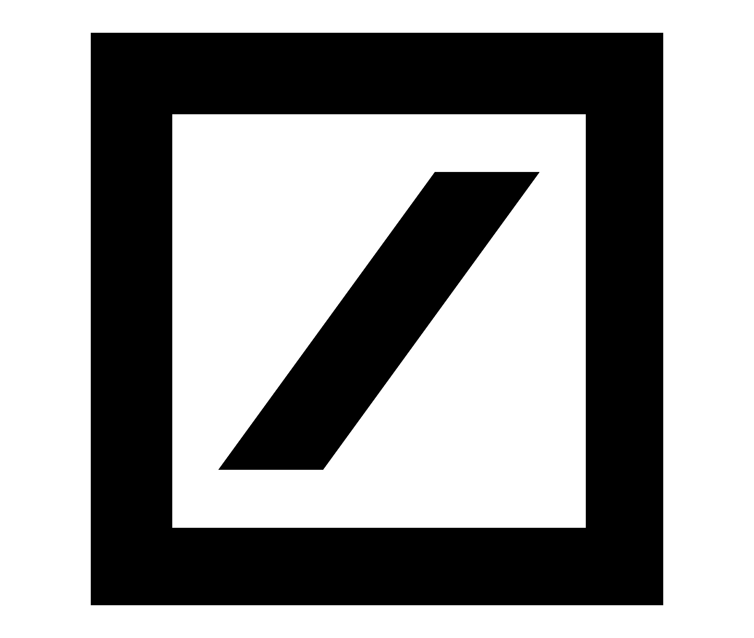
What is the symbol of Deutsche Bank AG?
The symbol of Deutsche Bank AG is a bold slanted line, enclosed into a square frame of the same color. This minimalistic geometric emblem was designed for the bank by Anton Stankowski in 1972. The Deutschmark Bank emblem symbolizes growth and progress, with the square frame standing for protection and security.
Meaning and history
![]()
Deutsche Bank is a symbol of stability and quality of financial services. This bank was established in Germany in the middle of the 19th century and has always been doing its best to create and then keep supporting its perfect reputation in the international arena. Today Deutsche Bank has branches in more than 70 countries of the world, with over a hundred thousand employees working in them.
Deutsche Bank is an institution that provides a full range of services in investment, corporate, private, and commercial banking, as well as set management and financial consulting. The largest shareholders of the bank are the American investment company BlackRock, Hamad bin Jasim bin Jaber Al Thani.
What is Deutsche Bank?
Deutsche Bank is the largest private bank in Germany, which is headquartered in Frankfurt am Main. It was founded in Berlin in 1869. The bank has about 100 thousand employees worldwide, more than 40 thousand of them in Germany. The financial institution has its subsidiaries in more than 70 countries of the world.
1870 – 1918
![]()
The original emblem featured and imperial eagle. It was used for almost half a century with a single variation (a different shape of the shield on the eagle’s chest).
1919 – 1928
![]()
The Deutsche Bank logo, created in 1919, was a bold and elegant circular medallion with an intertwined monogram in the middle. The “DG” letters were executed in a fancy custom typeface with a slightly elongated and sharpened tail of the “G”, which was balanced by a double circular frame. The tail of the “G” was also resembling an arrow, pointing into the future and showing the progressive approach of the bank and its readiness to move and progress.
1929 – 1930
![]()
When Deutsche Bank merged with Disconto-Gesellschaft in 1929, the eagle was updated. The bird adopted a cleaner, more minimalistic shape. It now looked less like an eagle from a medieval coat of arms. We can hardly notice any influence of the visual identity of Disconto-Gesellschaft, which featured the interlocking letters “D” and “G” inside a thick white ring with black trim.
1930 – 1946
![]()
The eagle was gone. Instead, the company adopted an ellipse logo housing the interlocking letters “D” and “B.” The “B,” which was larger, could be seen at the forefront, while the “D” was placed behind.
1947 – 1952
![]()
During World War II, Deutsche Bank incorporated several banks of Eastern Europe that fell into German hands. It also provided banking facilities for the Gestapo. In 1948, the bank was forced to break up into ten smaller banks, each responsible for a certain area.
Their logotypes were based on the “DB” oval used in the 1930s. Four of the logos featured two letters. In this case, one of the letters was positioned at the forefront, while the other was placed behind. All the other emblems featured three letters in the same serif type and of the same size standing next to each other.
1952 – 1957
![]()
The Deutschland Bank logo, introduced in 2010, is fully based on the previous version, designed in 2010, but is more laconic and bright. The logo is composed of a square emblem in a thick blue outline with a diagonal line inside, executed in the same shade of blue. The emblem, which already became iconic, doesn’t even need any lettering to be recognizable and memorable. It is a representation of strength, stability, and expertise. The blue and white color palette in the bank’s logo stands for reliability and loyalty, showing the strongest points of the financial organization.
1957 – 1973
![]()
The three banks were consolidated into Deutsche Bank AG. The company returned to the 1957 Deutsche Bank logo.
1974 – 2009
![]()
The logo nicknamed “Slash in a Square” was developed by the painter and graphic artist Anton Stankowski.
2010 – Today
![]()
The Deutschland Bank logo, introduced in 2010, is fully based on the previous version, designed in 2010, but is more laconic and bright. The logo is composed of a square emblem in a thick blue outline with a diagonal line inside, executed in the same shade of blue. The emblem, which already became iconic, doesn’t even need any lettering to be recognizable and memorable. It is a representation of strength, stability and expertise. The blue and white color palette in the bank’s logo stands for reliability and loyalty, showing the strongest points of the financial organization.
Emblem
The current logo was created between 1972 and 1974 by the painter and graphic artist Anton Stankowski. The company chose it out of a variety of emblems developed by eight graphic artists. Originally, the emblem consisted of a slash in a square together with the wordmark, but in 2010 the lettering was removed.
Font
![]()
In fact, the Deutsche Bank logo does not include lettering, as the slash symbol stands on its own. However, the company does have a logo. The type used in it is Univers Next 630 Basic Bold developed by Adrian Frutiger.
Color
![]()
For most of its history, the logotype was given in black and white. However, the current version features the dark blue symbol on the white background.


